Wynn Bullock (1902-1975) worked almost exclusively near his home in the Monterey Peninsula, yet in his pursuit of what exists in the world beyond ordinary perception, he created mysterious photographs that reached a universal, almost metaphysical quality. Their metaphorical meaning reveals the extraordinary behind the surface of things. In the mid-1990s, Moe’s bookstore shelves prominently displayed his just-published major Aperture monograph. Although his vision was opposite to my literal approach to photography, the work immediately caught my attention. It was the second book of black and white photography that I bought – the first one was The Portfolios of Ansel Adams.
My previous surveys of books by photographers who influenced me
(Ansel Adams,
Eliot Porter,
Philip Hyde,
and Galen Rowell) listed titles mostly about a specific subject, generally a place. In contrast, retrospectives are a collection of an artist’s greatest hits. Wynn Bullock’s books consist almost exclusively of retrospective monographs. To understand why, we should start with the fact that his initial career was as an internationally acclaimed lyric tenor. He took his first photos in 1929, but it was not until 1938 that he fully embraced photography by enrolling at the Art Center School in Los Angeles. To support his family, who initially lived in a trailer, Bullock operated a commercial photography business – often associated with Ford Ord – which occupied a large part of his time until he stopped taking assignments in 1968. His carefully considered seeing did not lead to a prolific output compared to other photographers working in the Monterey Peninsula such as Ansel Adams or the Westons, who sometimes overshadowed him. His photographs were never about specific subjects or places, but rather they concerned themselves with universal qualities such as space and time, the unity of opposites, and the distinction between existence and its perception. Although visually and thematically diverse, rather than forming distinct bodies of work, each of his photographs is part of a wider oeuvre. His first book The Widening Stream (1965) appeared quite late in his career and contained only 13 photographs, each faced with a short poem by Richard Mack. It wasn’t until 1971 that his first major monograph was published, and he would make his last photograph in 1973.
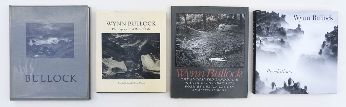
As of 2024, there are four major retrospective monographs devoted to Wynn Bullock’s work. All of them are out of print, but readily available on the used book market, at low cost except for the last one. Because their contents are relatively similar, comparing them provides instructive insights on the different ways one presents photographs in a book. For the sake of completeness, this article also briefly mentions all the other significant Wynn Bullock monographs.
There are a total of 349 reproductions in the four books drawn from a pool of 181 photographs. 81 appear in only one book, 50 appear in two books, 34 appear in three books, and 17 in all four books:
- Light, 1939
- Old Typewriter, 1951
- Driftwood, 1951
- Woman and Thistle, 1953
- Woman and Dog in Forest, 1953
- Burnt Chair, 1954
- Del Monte Forest, 1956
- Woman’s Hands, 1956
- Stark Tree, 1956
- Log and Horsetails, 1957
- Navigation Without Numbers, 1957
- Tide Pool, 1957
- Child on Forest Road, 1958
- Erosion, 1959
- Sea Palms, 1968
- Leaves in Cobwebs, 1969
- Pebble Beach, 1970
In addition, the following appear in the three later books, but were created after the printing of the first book:
- Point Lobos Rock, 1970
- Sycamore Tree Scar, 1971
- Tree Trunk, 1971
- Rock, 1973
- Wood, 1972
- Wood, 1973
Many of those photographs and others can be
viewed on the Wynn Bullock Estate website.
In the spirit of the
“meta-list”, one can count a selection for a book as a vote for a photograph’s importance. If a photograph appears in three books, one could consider that the only book that doesn’t include it “missed” an important photograph.
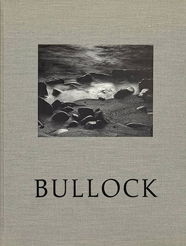
Wynn Bullock (1971)
Scrimshaw Press was an independent publisher of fine art books operating out of San Francisco from 1969 to 1976. The wilderness photographer Dave Bohn, a multi-talented creative about whom I may write in the future, was one of its principals. After looking at the seven photographs in the catalog of an exhibit that Bullock just had at the San Francisco Museum of Art in 1969, Bohn immediately phoned Bullock to offer him a book. During the course of a single day, Bohn, Wynn Bullock, and his daughter Barbara selected the photographs, falling in agreement for all but one. Barbara would get involved in all the subsequent Wynn Bullock monographs either as a writer, editor, or consultant. Bohn spent the winter with those selections in a remote cabin in (then) Glacier Bay National Monument, where he designed the book. Nowadays, ambitious photographers with fewer than ten years of work feel that they need a book. Bullock first exhibited at the Los Angeles County Museum of Art (LACMA) in 1941 and regularly had shows in prestigious institutions worldwide since. Yet his first major monograph came at age 69 due to that fortuitous happening. Check out this remarkable video of an interview with Bohn and Bullock discussing the book.
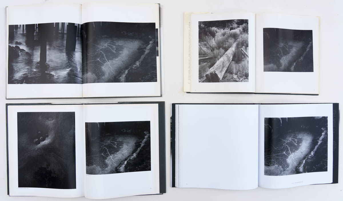
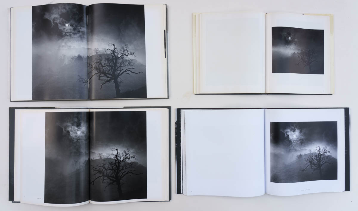
Tide Pool, 1957. Top: Scrimshaw (note bleeds), Morgan & Morgan; Bottom: Aperture, High/Texas. Click to enlarge
Wynn Bullock is a well-crafted production with a tipped-in illustration on the cloth cover (10.25″x12.25″) under an acetate jacket. Inside, the attention to detail manifests itself in the use of two different paper stocks, a semi-glossy paper for the plates, and a matte paper for the introduction by Barbara Bullock and afterword by Dave Bohn, printed by letterpress. The reproduction quality is quite good, especially considering when the book was printed. The book is divided into four decades (40s, 50s, 60s, 70s), and adding further pauses, a few spreads consist of quotes from Bullock without images. Wanting to avoid the staidness of a catalog-style book, Bohn’s layout mixes image sizes ranging from quarter-page to double-page spread and also mixes bleeds in an unconventional way. In order to focus the attention on the images, the designer omitted photo titles and page numbers. As a result, photographs aren’t easy to reference. I was nevertheless able to determine that of the book’s 64 photos, 10 were not reprised in the three other books, and that the Scrimshaw Press book “missed” (in the sense defined earlier) 13 photos, including some of my favorites. Of those 13, the 6 previously listed had not yet been created. However, its production values, quirks, and debut character make it an endearing book. I was lucky to find a copy with the signature reproduced as the header of this article.
Wynn Bullock. Photography: A Way of Life (1973)
Willard Morgan introduced 35mm Leica photography to the United States in 1928, was the first picture editor of LIFE Magazine, and the first director of the Department of Photography at The Museum of Modern Art. Together with noted photographer Barbara Morgan, they founded
Morgan & Morgan, a publisher of photography books that appears to have been active until 2004. Morgan & Morgan published a series of monographs uniform in a general format surveying the work of a single photographer. Like the previous title, the book starts with an introduction by Barbara Bullock which is also mostly about Wynn Bullock’s philosophical approach to photography. That essay lays out in more detail and with examples the four creative periods of Wynn Bullock’s life, spliting them with more precision than plain decades (1938-48, 1948-57, 1957-68, 1968-), however, the sequence of plates is continuous.
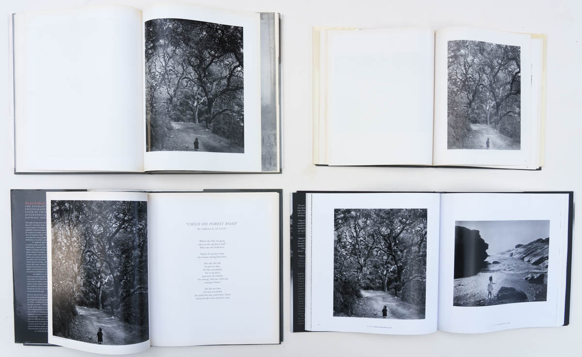
Child on Forest Road, 1958. Top: Scrimshaw, Morgan & Morgan (note brightness and contrast); Bottom: Aperture, High/Texas. Click to enlarge
Of the four books reviewed, Morgan & Morgan’s Wynn Bullock. Photography: A Way of Life has the smallest trim and the lowest reproduction quality. However, it is a solid reference book. The format is similar to that of a catalog, concluding with the usual list of plates, biography, bibliography, exhibitions, and collections. All the plates are reproduced with the same white margin and at the same size, half-page for horizontals and full page for verticals – a drawback of the 8.5×11″ format of the book. Their sequencing is mostly chronological. The last reproduction in the book, Wood, 1973 would turn out to be Bullock’s last photograph. Out of the book’s 88 photos, 62 did not appear in the Scrimshaw Press book, the last 20 because they are more recent. 26 photos would not appear in the two subsequent books, and 7 were “missed”, including Child in Forest, 1951. The book has the distinction of being published during Bullock’s lifetime while not preceding any new work. As announced by Tree Trunk (1971) on its cover – can you figure out the double reversal?,
it is particularly strong on images of his later period, which are more abstract and anthropomorphic. A selection of six of those later images would be included together with six paragraphs of writing by Bullock in the handcrafted artist book
The Photograph as Symbol (1976), the first title of The Artichoke Press, issued in an edition of 200.
Wynn Bullock. The Enchanted Landscape. Photographs 1940-1975 (1993)
Aperture is a non-profit organization founded in 1952 by Ansel Adams, Minor White, Barbara Morgan, Dorothea Lange, and others to publish fine art photography, a concept new at that time. They published a Wynn Bullock (1974) monograph as volume 4 of the series “Masters of Photography” and
reissued it
several times. That series, which is still in print, comes in a small trim and with only 96 pages. Because of that, and also that Aperture subsequently released the more substantial monograph Wynn Bullock. The Enchanted Landscape, I do not count the “Masters of Photography” book as a major monograph on the same level as the four reviewed in this article. The same can be said of the diminutive Wynn Bullock (2001) monograph in Phaidon’s 55 series.
Barbara was clearly close to Wynn, but in the essays in the two previous books, she refrained from biographical details, which photographer and writer Shevelev does not. Reading that after meeting Edward Weston in 1948, Bullock bought exactly the same 8×10 equipment that Weston was using before starting photographing in Weston’s style, made me feel better about my own imitative impulses. Bullock’s mature images could not be confused with Weston’s! And that he was able to flourish artistically only after his re-marriage to Edna, or that models in his nudes were frequently his daughters underscored the importance of a supportive family in one’s creative pursuits. Barbara was physically uncomfortable posing for the cover photograph Child in Forest, 1951. Yet she would go on to author
Wynn Bullock Photographing the Nude: The Beginnings of a Quest of Meaning (1984) with editing by Edna. Edna took up photography a year after Wynn’s passing, resulting in Edna’s Nudes (1995) from Capra Press, the publisher of two of Dave Bohn’s books.
Stark Tree, 1956. Top: Scrimshaw, Morgan & Morgan; Bottom: Aperture (note spread), High/Texas. Click to enlarge
Wynn Bullock. The Enchanted Landscape shares several similarities with the Scrimshaw Press book: an identical trim and a few double-page spreads that make the design more dynamic, a design often used for a vertical format book with many horizontal images. The use of white margins and of Bullock quotes facing photographs (rather than other quotes) feels more classical, while discreet image titles are helpful.
Using a less chronological and more visual sequence, true to its subtitle, the book puts more emphasis on the landscape. Out of the book’s 86 photos, 13 did not appear in the two previous books, including Let there be Light, 1954. Besides Child in Forest, 1951, Steichen’s landmark exhibit “The Family of Man” included as its opener Bullock’s beach moonlight photograph that came to be known after its caption in the exhibit, “And God said, let there be light – Genesis 1:3” and was the most popular in the entire show. Curiously, the famous photograph was omitted in the two previous books. It is reproduced here as a spread. Of all the four books, Wynn Bullock. The Enchanted Landscape was the best at featuring the consensus images for which Bullock is best known, “missing” only one.
Wynn Bullock: Revelations (2014)
Co-published by the High Museum of Art and the University of Texas Press, Wynn Bullock: Revelations, the catalog of a traveling exhibit that opened at the Museum in Atlanta did not need to qualify its claims to be “the most comprehensive assessment of Bullock’s career” with “in nearly forty years”. To start with, the publication features more plates (111) and pages (196) than any other, and its 11×11″ square format gives equal presence to vertical and horizontal images. Benefiting from 21st-century technologies, the reproductions are excellent. The book has all the apparatus that one would expect from a formal catalog: a clean presentation with image titles, a detailed illustrated chronology, and the usual lists. In the introduction, curator Abbott tries to shed new insights into the artist’s work through his relationship with science, an idea at the core of Bullock’s latest monograph Relativity: Wynn Bullock and Albert Einstein (2017), a most exclusive volume with platinum prints issued in an edition of 15.
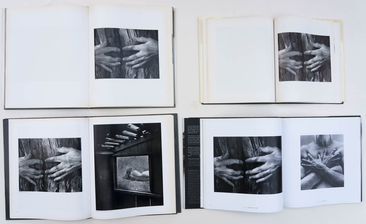
Woman’s Hands, 1956. Top: Scrimshaw, Morgan & Morgan; Bottom: Aperture, High/Texas (note pairing). Click to enlarge
Only three spreads disrupt the conservative one-image-one-page format. It would seem that the consensus among book designers is that Woman and Dog in Forest, 1953 needs to be seen large since that photograph is reproduced as a double spread in all of the books except in Morgan & Morgan – which does not include double spreads. The two other spreads serve to open and close the color light abstractions section. The format avoids interrupting images by the gutter, while a few bleeds with vertical images add a bit of variation. Within that format, the image sequence is enlivened by judicious pairings and groupings, for example photographs that revolve around a portal. The book introduces 40 photographs not seen in the three previous books (60 not seen in the Aperture book), and “misses” only 4. Those photos are mostly experimental work. In images from the 1940s, before his decisive encounter with Edward Weston who taught him the value of straight photography, Bullock relied on sophisticated solarization techniques (for which he would get a patent!) and also tried abstract photographs of light – paying homage to what he thought as a unifying force in the universe. In the early 1960s, he extended those abstract photographs of light to color slides but felt that they could not be reproduced adequately with current technologies. That work was published by the Bullock Estate as Wynn Bullock: Color Light Abstractions (2010) but is included here for the first time in a retrospective monograph, making it indeed the most comprehensive of its kind.

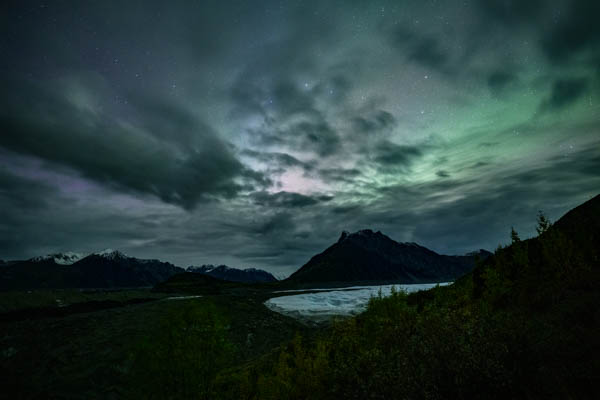


 Voyageurs National Park, Minnesota (original color capture)
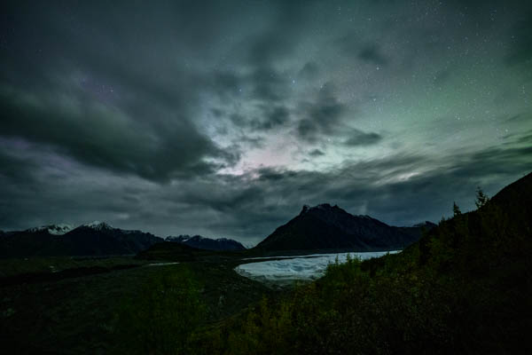