Autumn Colors in Black and White
No Comments
Creating photographs of autumn colors in black and white may sound like an absurd idea. Besides the paradox, isn’t black and white photography best deployed in those instances where the subject lacks strong colors? And isn’t black and white’s ability to exaggerate drama – unfettered from the need to present a realistic rendition of a scene – more suitable for bold and moody scenes with dynamic light? Photographs centered around fall foliage tend to be of forest scenes, which are often understated and soft. And finally, wouldn’t you be simply missing out?
Thankfully, in the digital age, the latter is the least of our concerns. There is no need to set out in the field to create black and white photographs. It is not even necessary to conceive of black and white photographs in the field. When working in digital, there is no practical technical advantage in capturing images in black and white over converting color images to black and white in post-processing. You stick to color for capture. While browsing through your archive, you can safely try out black and white using the software. Several offerings include sophisticated tools for translating colors into tones with a level of control exceeding what the most proficient darkroom practitioner could muster with a black and white film. By utilizing all the color information, you can adjust the brightness and contrast of the black and white image by mobilizing the luminance of each of the colors in the scene. As a case in point, all the images that illustrate this article were originally captured on color slide film, scanned in color, and then converted to black and white using the Black and White adjustment layer of Adobe Photoshop. Those are fairly common compositions, but presenting them in black and white offers a different take.
As a result of your experimentations, you may find that transforming those natural scenes to black and white can open new avenues of creativity and achieve worthwhile artistic goals. Fall colors are often so prominent that they get in the way of noticing other attributes of the subject such as shapes, patterns, and textures. Sometimes, the photograph is more about those attributes than about the color, and eliminating color puts back the emphasis on them. In a fall foliage scene, it can be the case that everything is so colorful that nothing stands out. Converting the image to black and white can favorably trade a variegated, but uniform color palette for a more dynamic set of greyscale tones with amplified contrast. Although the resulting image does not exhibit directly any of the brilliant foliage colors, it still critically depends on their prior existence to create its symphony of tones. An image that could be only made in the fall? A fall color photograph!
Emphasizing shapes and textures
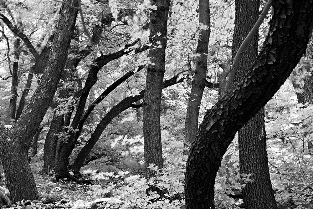
Smith Springs. Guadalupe Mountains National Park, Texas.
Guadalupe National Park in West Texas is not a location most think about when chasing fall color, but if you have missed most of the season, it is an excellent choice since the color lasts until mid-November due to the southern latitude. Despite the aridity of the surrounding desert, hidden water sources deep in incised canyons sustain a wondrous variety of deciduous trees whose fall colors rival even New England. The great photographer Alex Webb writes that “color is emotion”. Indeed, the colors often present in fall foliage elicit strong emotions that may be beyond the point you are trying to convey in a photograph. I was mostly attracted to the lyrical lines of the twisted dark trunks set against the bright foliage. When I made the photograph, recognizing that what caught my attention was not primarily the leaves, I did not photograph during a lull, but instead during a breeze that blurred them a bit. After converting the image to black and white, with the distraction of the joyful yellow colors and emotionally intense red colors gone, the shape of the trunks took center stage.
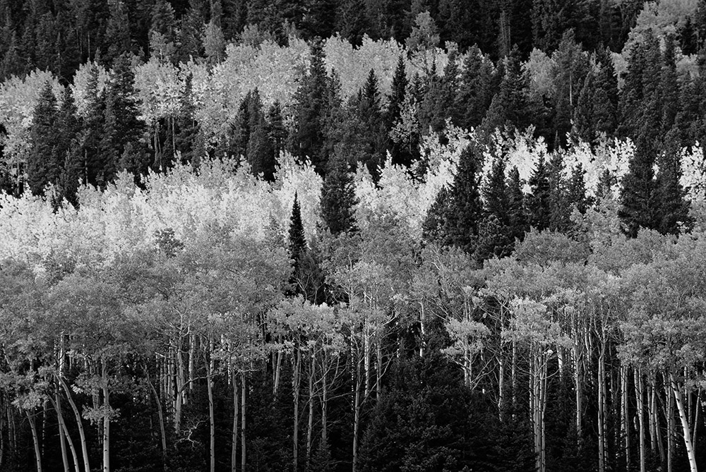
Horseshoe Park. Rocky Mountain National Park, Colorado
The fall foliage displays of the American West are generally dominated by aspen trees, and Rocky Mountain National Park is no exception. While aspen in fall foliage are always a striking sight, in that particular scene, it is their brightness in the landscape that makes them so noticeable rather than their hue, an acid shade of yellow adjacent to green. That hue didn’t provide much color contrast against the surrounding greens both of the aspen not yet turned and of the conifers. I magnified the focus on the pattern of horizontal layers of the photograph by eliminating the distraction of color, and instead created interest through a complete range of greys, which is often the key to a successful black and white photograph. That approach worked well because each of the layers exhibited a block of fairly consistent tone. I translated the yellows of the turned aspens into bright values and the light greens of the not yet turned aspens into medium greys, both contrasting with the darker tones of the conifers. A simple desaturation would not have produced that effect. For more details, refer to the final entry in this article.
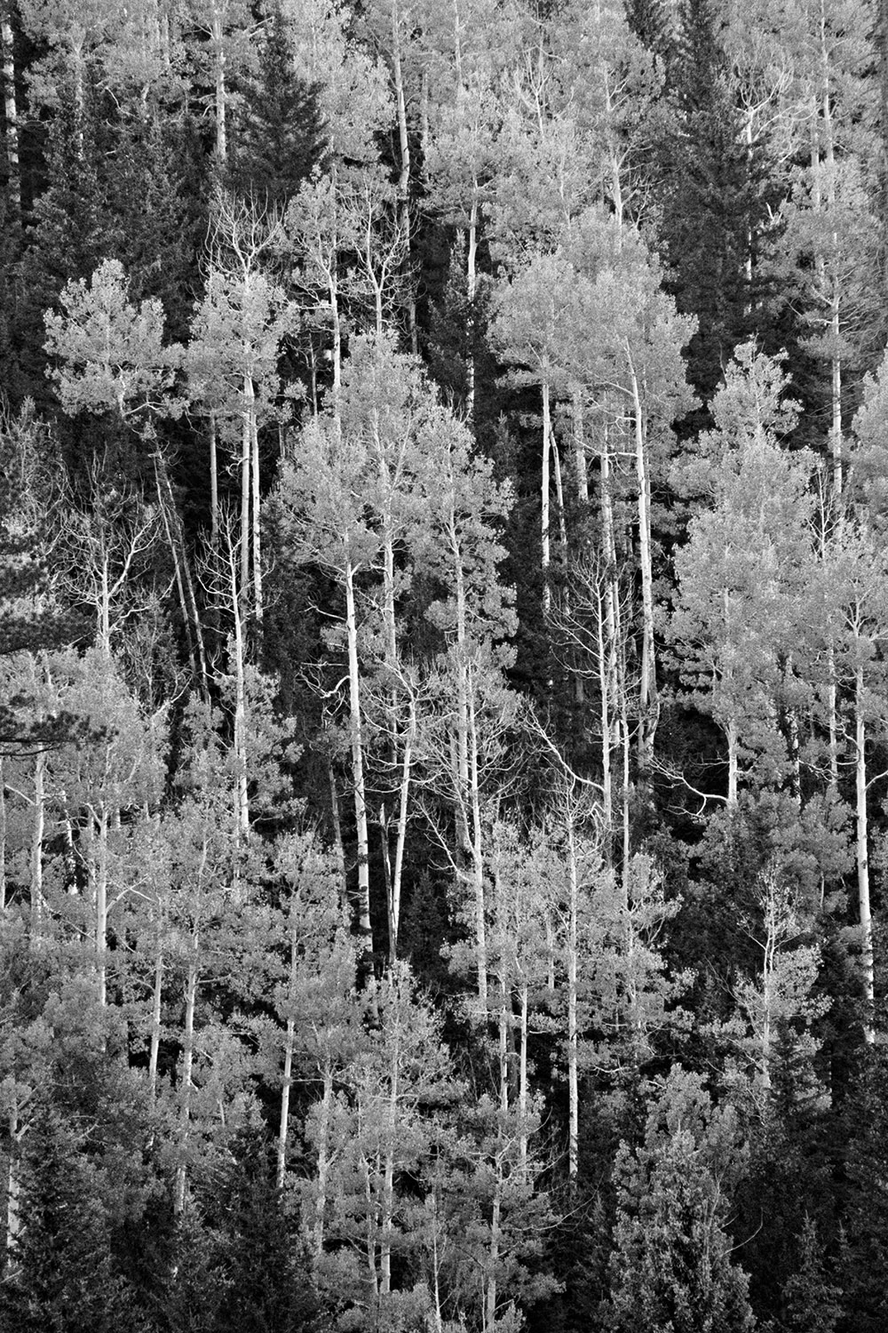
Kaibab Plateau, North Rim. Grand Canyon National Park, Arizona
More than 90% of visitors to Grand Canyon National Park head to the South Rim. The North Rim is almost a different park with a much quieter atmosphere. It is 1,000 feet higher than the South Rim and wet enough that the Ponderosa Pine forest that dominates both rims is intertwined with stands of aspen. I noticed the vertical pattern of their graceful rectilinear white trunks and their fuzzy light foliage standing out against the dark greens of the evergreens on a steep hillside. In my conversion to black and white, I darkened the conifer’s greens so they would recede. Adjusting the tones of the yellow leaves, I made sure to hold them back midway between the darks of the conifers and the whites of the trunks so that the tones of the trunks would remain much brighter. They stand out more against the aspen leaves than in the color version, creating a three-tone composition that exactly corresponded to the patterns.
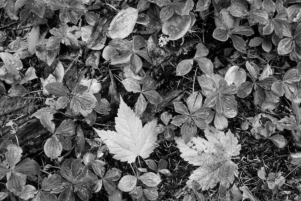
Forest near Windigo. Isle Royale National Park, Michigan
The color version of this forest floor close-up exhibits an exquisite color palette, but it can still feel like a documentation of a subject that appears common, even if the image was made in an uncommon place, Isle Royale National Park, the most remote and least visited national park in the continental United States. Sometimes, by just being in such places, you begin to notice little things that you may have other passed. The black and white version feels more like an artistic interpretation, different from our everyday perception, and therefore more mysterious. The composition borders on the chaotic, but without eye-catching color to grab a viewer’s attention, there is less information to sort out, and we see more clearly the intriguing graphic expression of the shapes, both opposite and repeated.
Amplifying natural tonal contrast
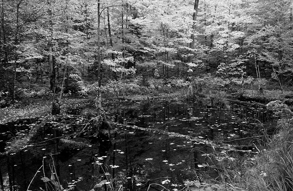
Ottawa National Forest, Wisconsin
When one thinks about fall foliage photography, the subjects that come to mind are trees, close or far. If you have timed your trip later than fall foliage peak or if a strong overnight storm has stripped all the branches bare, don’t despair, since fallen leaves can also offer great opportunities for dynamic black & white photographs at all scales, from sizeable forest scenes to close-ups. The scene in Ottawa National Forest, Wisconsin could be found in many places. What makes the photograph dramatic is the contrast between the dark surface of the pond and the bright spots of the leaves, especially the fallen leaves that create texture in the pond. Although I had used a polarizing filter to darken the pond surface, the color version did not display much contrast and looked a little flat. In the black and white version, I was able to increase that contrast considerably without making the image look unnatural. As a black and white photograph is by its nature a departure from reality, there is more latitude for interpreting a scene with aggressive processing.
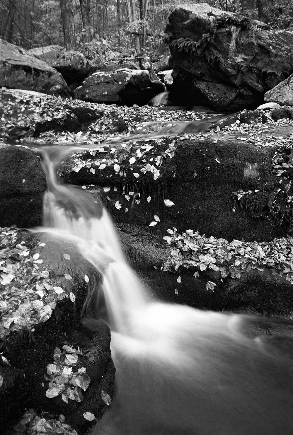
Hogcamp Branch of the Rose River. Shenandoah National Park, Virginia
The Appalachian Mountains are one of the prime locations to observe fall foliage on the east coast. Most visitors equate Shenandoah National Park with its 105-mile Skyline Drive and overlooks. However, leaving the car to hike down a trail along a poetically named river revealed a multitude of cascading streams invisible from the road. Although the scene of a creek and mossy boulders would be beautiful in all seasons, the fallen leaves added another measure of interest. As they are brighter than the rocks and moss, they created an eye-catching polka-dot texture all over the image. With enhanced contrast and no color to detract from the tones, the conversion emphasized this texture. Harsh light is often beneficial for black and white photographs because it creates heightened contrast. However, when photographing a forest scene, harsh light is difficult to work with because it tends to create bright spots in unwanted places, and the shadows often break organic shapes. In general, to photograph such intimate forest scenes, soft light is more favorable. This applies even more so in black and white when we don’t have the benefit of color continuity to delineate and separate subjects. Photographing in soft light, you rely on natural tonal contrast to provide a starting point that can be emphasized by a black and white conversion.
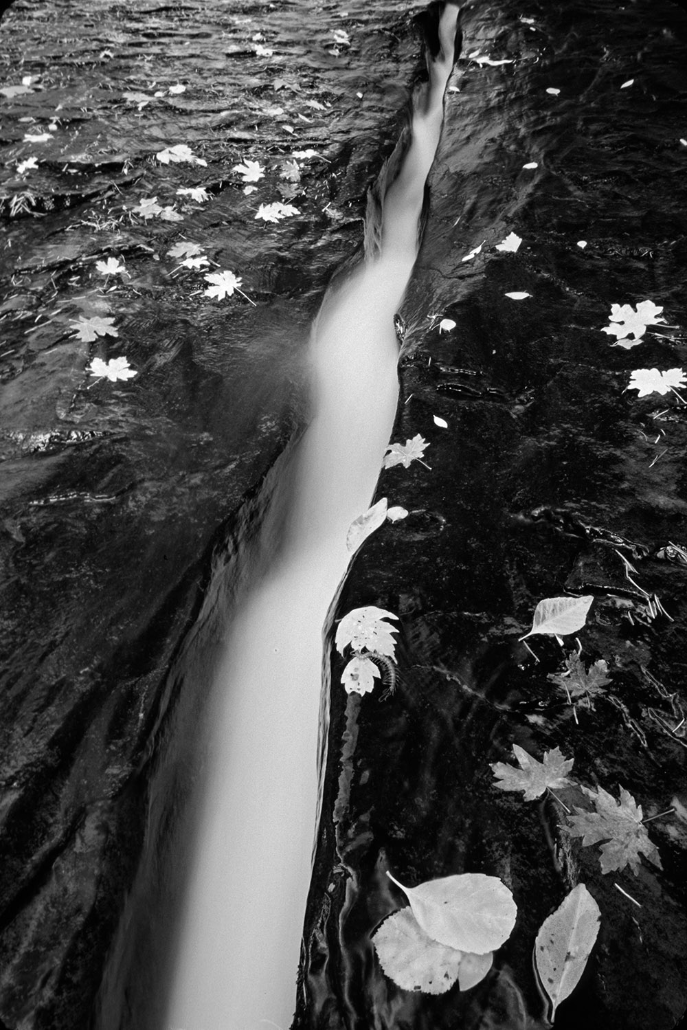
Left Fork of the North Creek. Zion National Park, Utah
An oasis in the desert, Zion National Park’s canyons are home to lush deciduous vegetation. On the way to the famed Subway, I hiked past a unique six-inch-wide crack that channels most of the flow of the Left Fork of the North Creek. Leaves turn color because the disappearance of the chlorophyll pigments reveals the other pigments. With fewer pigments overall, fallen leaves have a lighter tone. In a color photograph, their brightness can be distracting, particularly when they are almost bleached of color. However, the leaves energized the black & white version by adding focal points with high contrast and a sense of depth as they recede in size from the bottom of the image to its top.
Using color to create tonal contrast
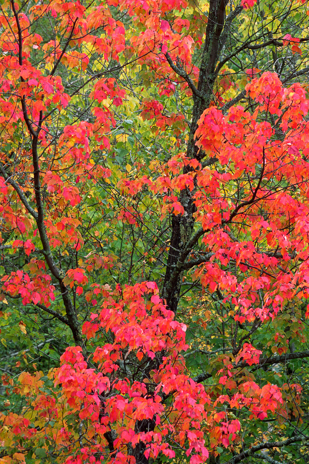 Voyageurs National Park, Minnesota (original color capture)
Like most of the entire Upper Midwest, Voyageurs National Park is a quiet destination with fall foliage displays equal to the better-known locations further east. One of the main attractions of photographing fall foliage scenes is that with the right timing, before the peak, you can capture a varied color palette that can include anything from greens to yellows, oranges, reds, and purples. At first, it may seem that those images would not work as well in black and white. Color contrast in fall foliage can be strong, whereas greyscale contrast may not be there, causing elements to blend and resulting in a lifeless photograph with weak separation. For instance, in this close-up of the branches and leaves, the contrast between the complementary reds and greens is striking in color. However, with a straightforward conversion to black and white (desaturate), there is little separation in the greyscale between the red leaves and the green leaves, as they have a similar tone in black and white. Generally speaking, color contrast is easier to find than tonal contrast, which could be one of the reasons that color photographers appear to be more productive in the field than black & white photographers in terms of the number of photographs captured. With added tone contrast, the resulting image would still hold interest thanks to the dark linear branches standing out against the foliage’s exuberant texture, but we can do better and recapture the color contrast as tonal contrast.
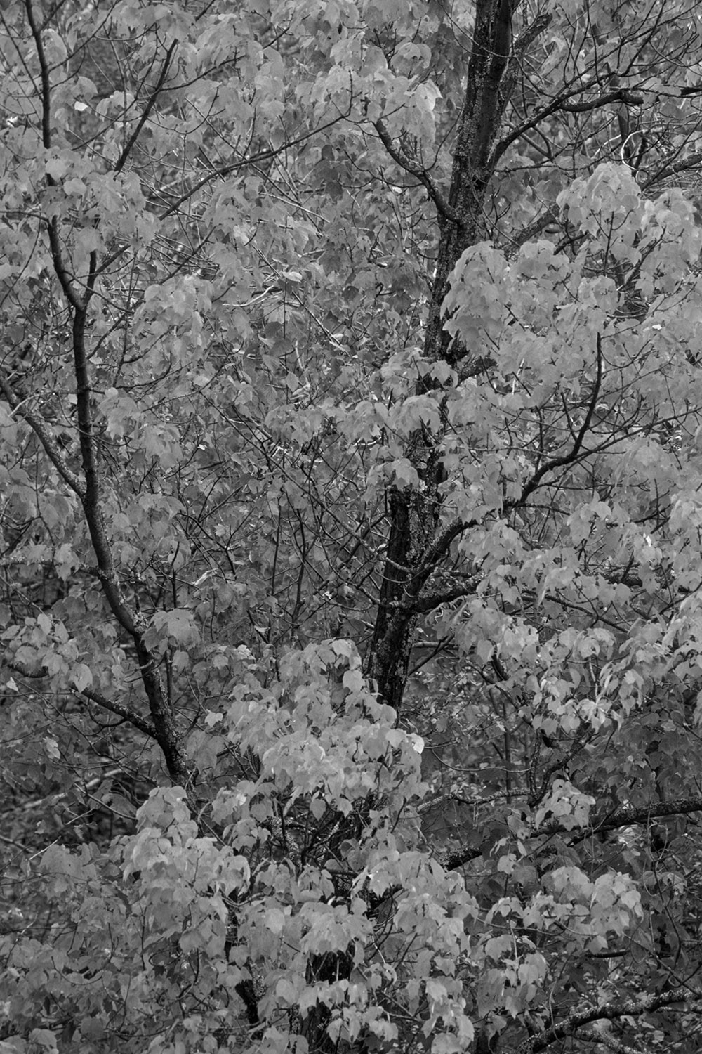
Straight black-and-white conversion by basic desaturation
When using black and white film, a workaround to this problem has been to use colored filters. They affect the way colors are translated to black and white. Each filter lets through its color of light and blocks to some degree other colors. For instance, a red filter lets reds through and blocks most greens and blues, resulting in reds being rendered in light tones and greens and dark tones. When working in digital, I recommend that you use a RAW format, which captures a full-color image and then perform the conversion to black & white in processing, where you can make adjustments in a finer and more flexible way than is possible with filters. Nik Software’s Silver Efex Pro offers the equivalent of those filters, and more importantly, fine adjustments targeted by tone ranges. With software such as Adobe Lightroom, Camera Raw, or Photoshop, the control over each of the colors in the scene is even finer, as you can easily set the relative tone brightness for each of them. In the example, I mapped the red leaves to light tones, making red leaves glow, while the green leaves were mapped to darker greys, adding depth to the image. This type of contrast adjustment is possible to create only in the fall since in spring and summer, the vegetation is a fairly uniform hue of green. Using this approach, you are fully taking advantage of colors in the fall for your black & white photographs! There is no reason you cannot have it both ways: a seducing color image, and a dynamic black and white photograph.
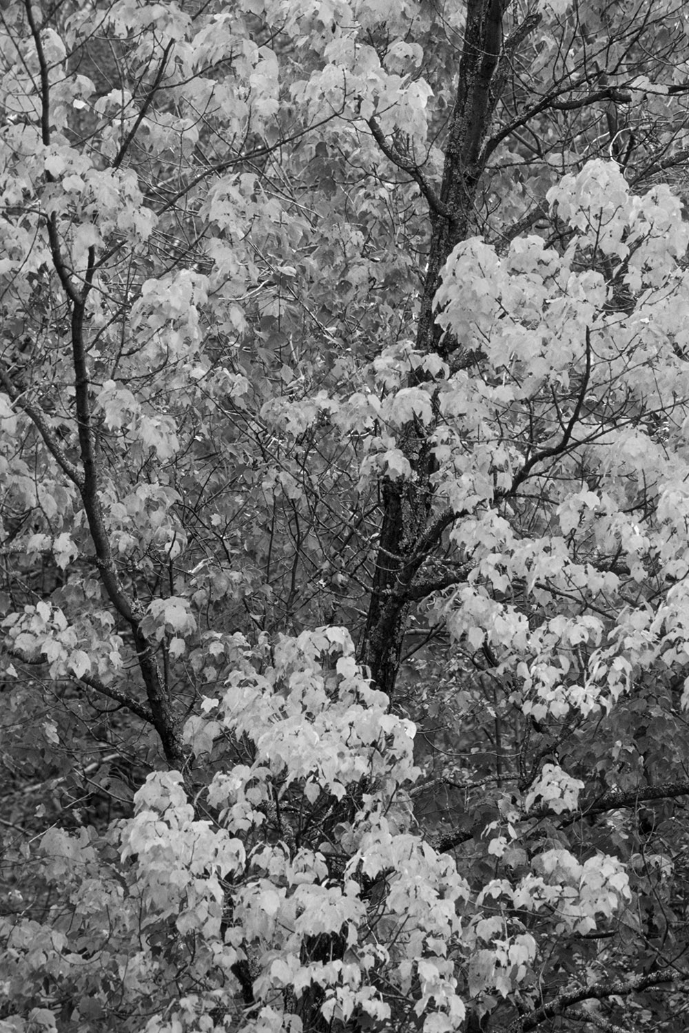
A more refined black-and-white conversion with mapping colors to tones
This article initially appeared in the Sept 2022 issue of Outdoor Photographer Magazine. Due to challenges that would eventually result in the magazine ceasing publication it was not printed but delivered only electronically, so many subscribers had missed it.