National Park Service Visitor Guides through the Years: Looking In
2 Comments
On the 106th anniversary of the National Park Service (NPS), this article continues where my previous write-up about the official NPS visitor guides stopped. As an introduction to the history of those publications over the years, we examined their front cover. In this article, we are going to open them and take a quick look inside.
Part 2 of an on-going series: 1 | 2 | 3 | 4 | to be continued
1917 to 1933
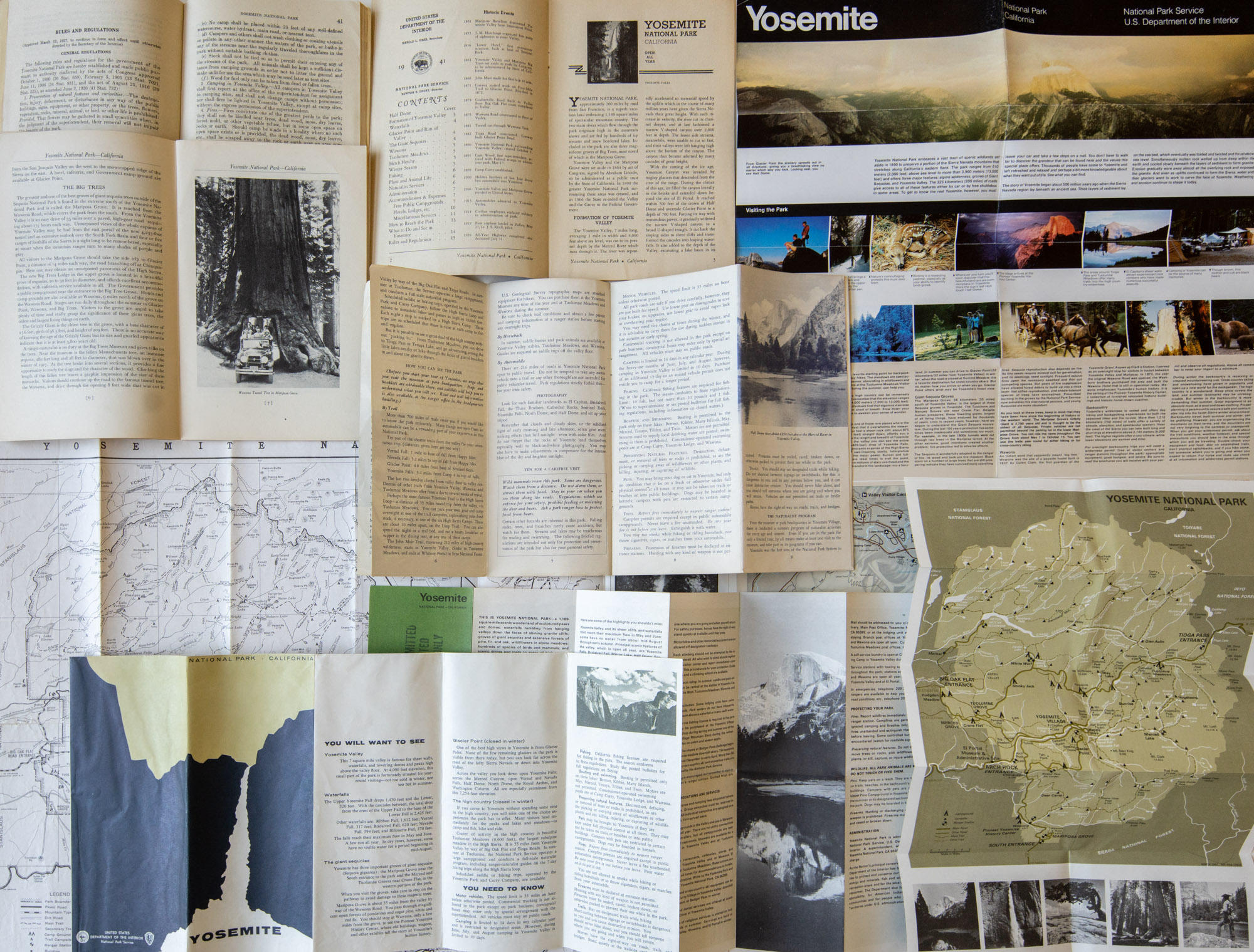
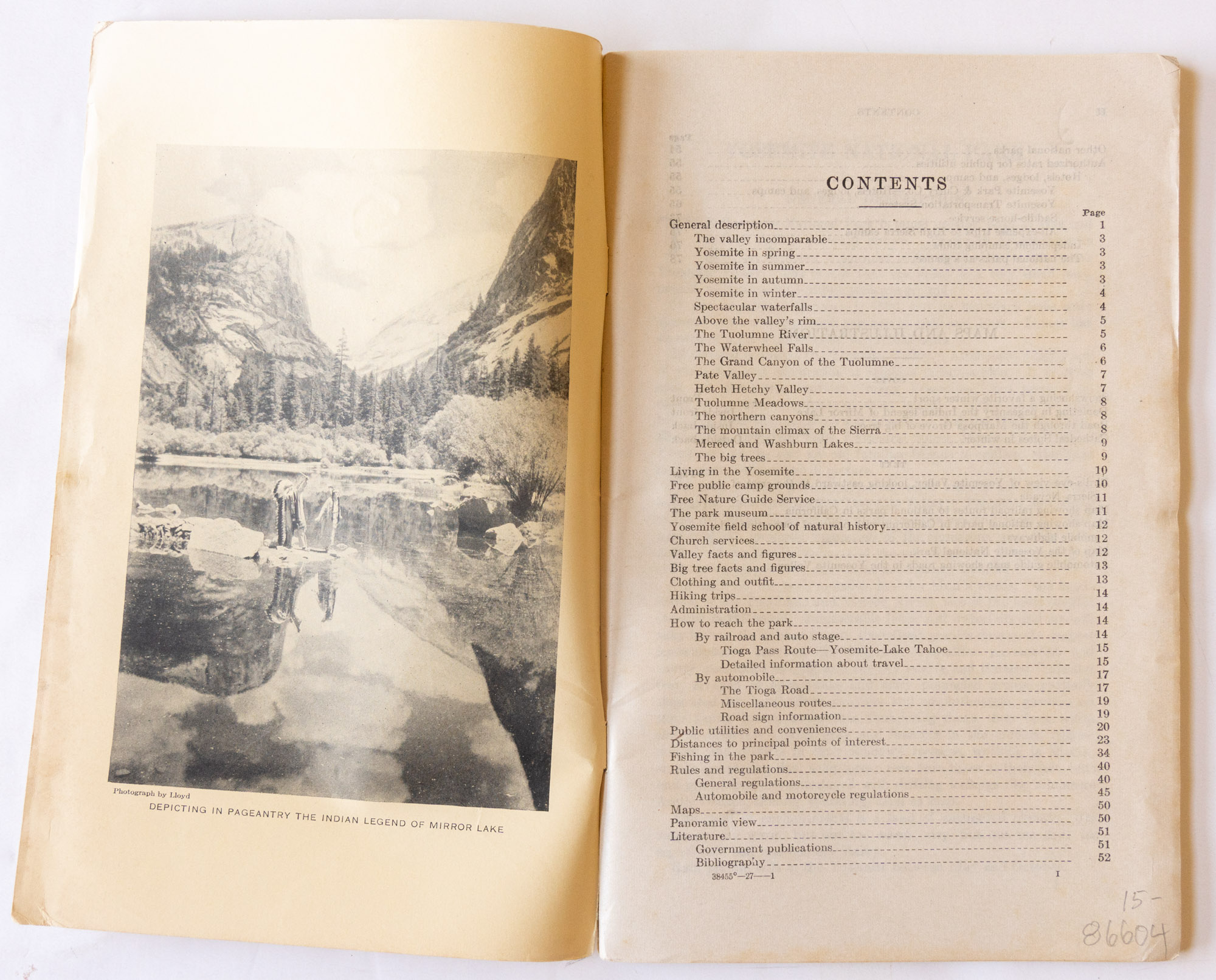
The first generation of national park visitor guides was in the format of a booklet, between 16 pages (Wind Cave National Park) and 100 pages (Yellowstone National Park, 1930). The contents consisted mostly of densely laid text that enumerated and described at length. The covers were glossy paper and most booklets took full advantage of those four pages (recto and verso of front and back cover) supporting the printing of photographs. With a few rare exceptions, the interior pages, printed on thinner uncoated paper, did not feature any photographs, although line-drawing illustrations appeared.
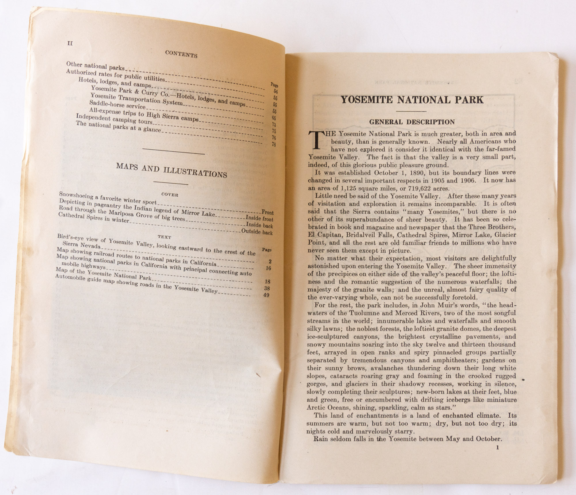
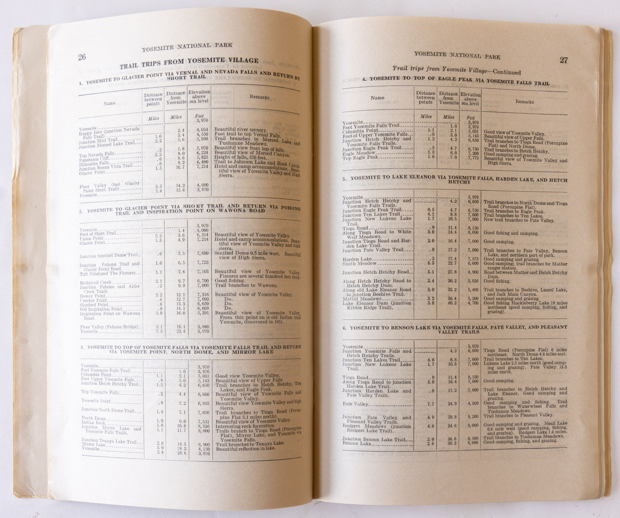
The booklet starts with a general description of the park. This is typically followed by practical sections, such as “How to reach the park” detailing, in that order, railroad routes and automobile roads, with often mention of other sights on the way, and information about park facilities such as post offices, camps, or transportation within the park. Detailed information about the park can be quite extensive. For instance, the 1922 Yosemite National Park booklet includes the following lists: all 122 lakes in the park with fishing notes, streams, trees, shrubs and herbs, mammals, and birds – in 4 pages of dense type for the birds alone. In later years, most of that information would be omitted. The Mesa Verde National Park booklet includes a 5-page description of Spruce Tree House and a 8-page description of Cliff Palace. Other lengthy lists may include trails or points of interest.
The booklet ends with a section “Rules and Regulations”, which true to its title, enumerates the totality of the public regulations in the park, followed by a bibliography and a section “Authorized rates for public utilities”. The latter meticulously lists the price for each and every service item in the park, from the usual hospitality expenses to feeding a horse (by grain or by hay) or a men’s shampoo (plain, tonic, or oil). Far from dry reading, it is fascinating to learn about the range of services provided back then in Yosemite besides the plentiful trip and transportation options: swim lessons, daycare, dancing, apparel and equipment rentals of all kinds, you name it. It was a different time in the Sierra:
A campfire program is held every evening during the summer season by the ranger-naturalists, assisted by talent from the campers. Following the camp fire, dancing may be enjoyed at the pavilion every evening except sunday. The social life at Giant Forest is one of the great attractions and holds many people beyond the time allotted for the visit. Many stay all summer, and the average population is about 3,000 people.

The 1917 booklets included no photographs at all. The 1920 booklets had no “Authorized rates for public utilities” sections, but by 1921, the format was all set. The year 1933 marked a transition with some reduction of the information, and a few brochures acting as precursors. For the first time, a few booklets included photographs within the inside of the brochure. For the Yellowstone, Yosemite, Glacier National Parks booklets, this was done by inserting in the middle of the brochures a few pages of glossy stock paper identical to the cover’s material, while the rest of the booklet was still printed on uncoated paper. The first brochure for Carslbad Caverns National Park used thicker paper stock throughout, on which photos were printed. That booklet, like the Yellowstone booklet, also featured cover pages made of a matte, thicker textured paper, almost like cardboard.
1934 to 1939
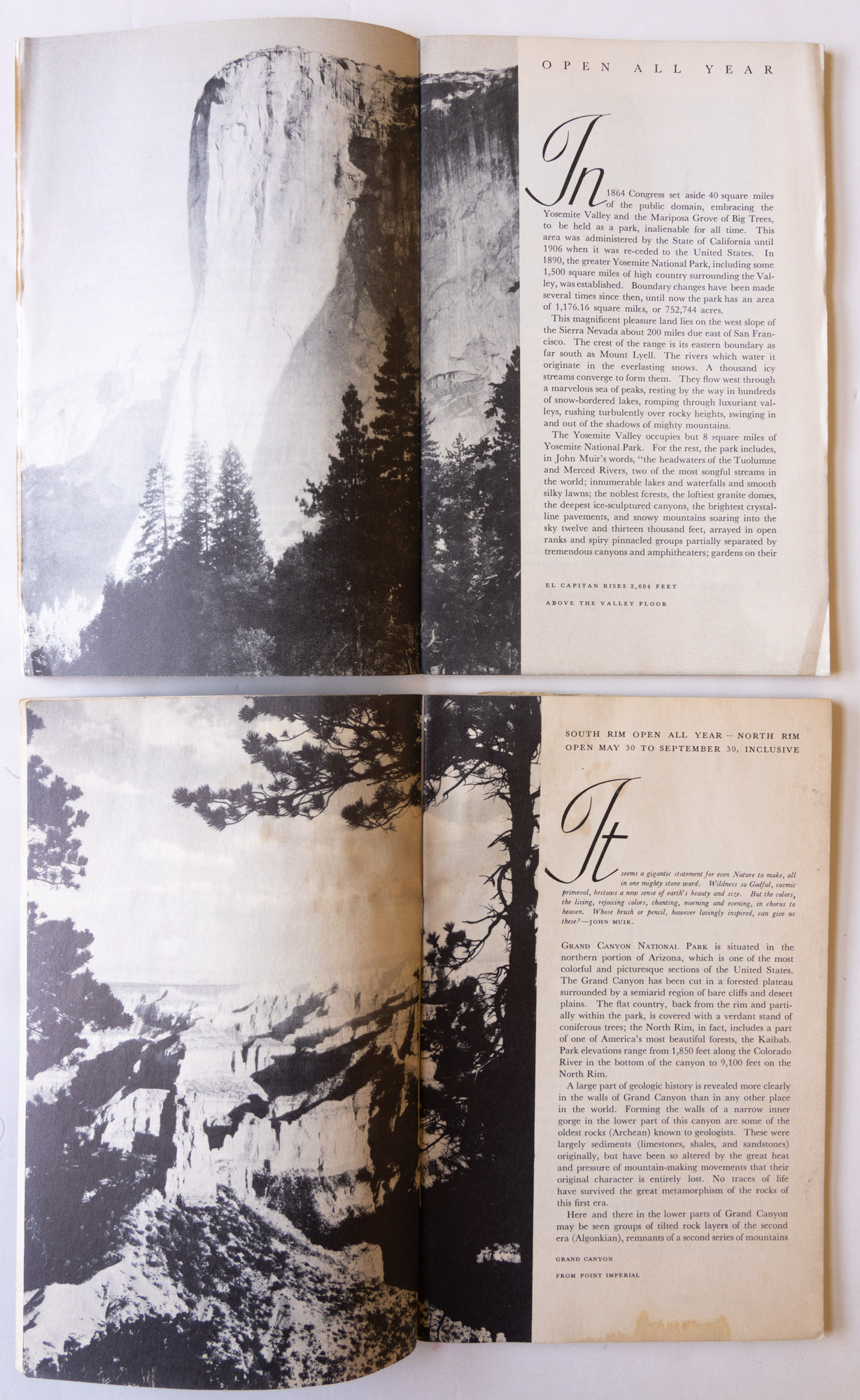
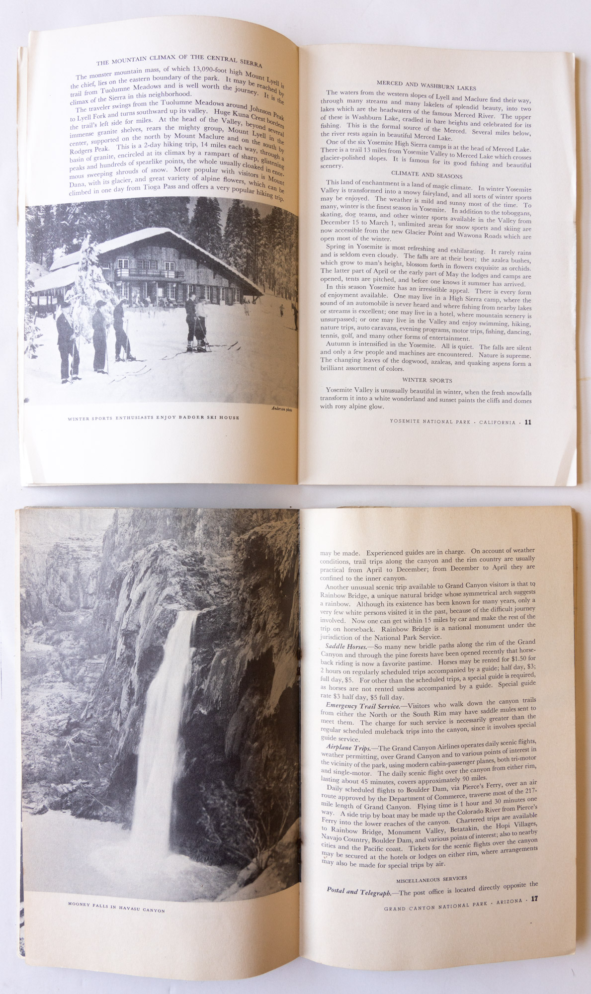
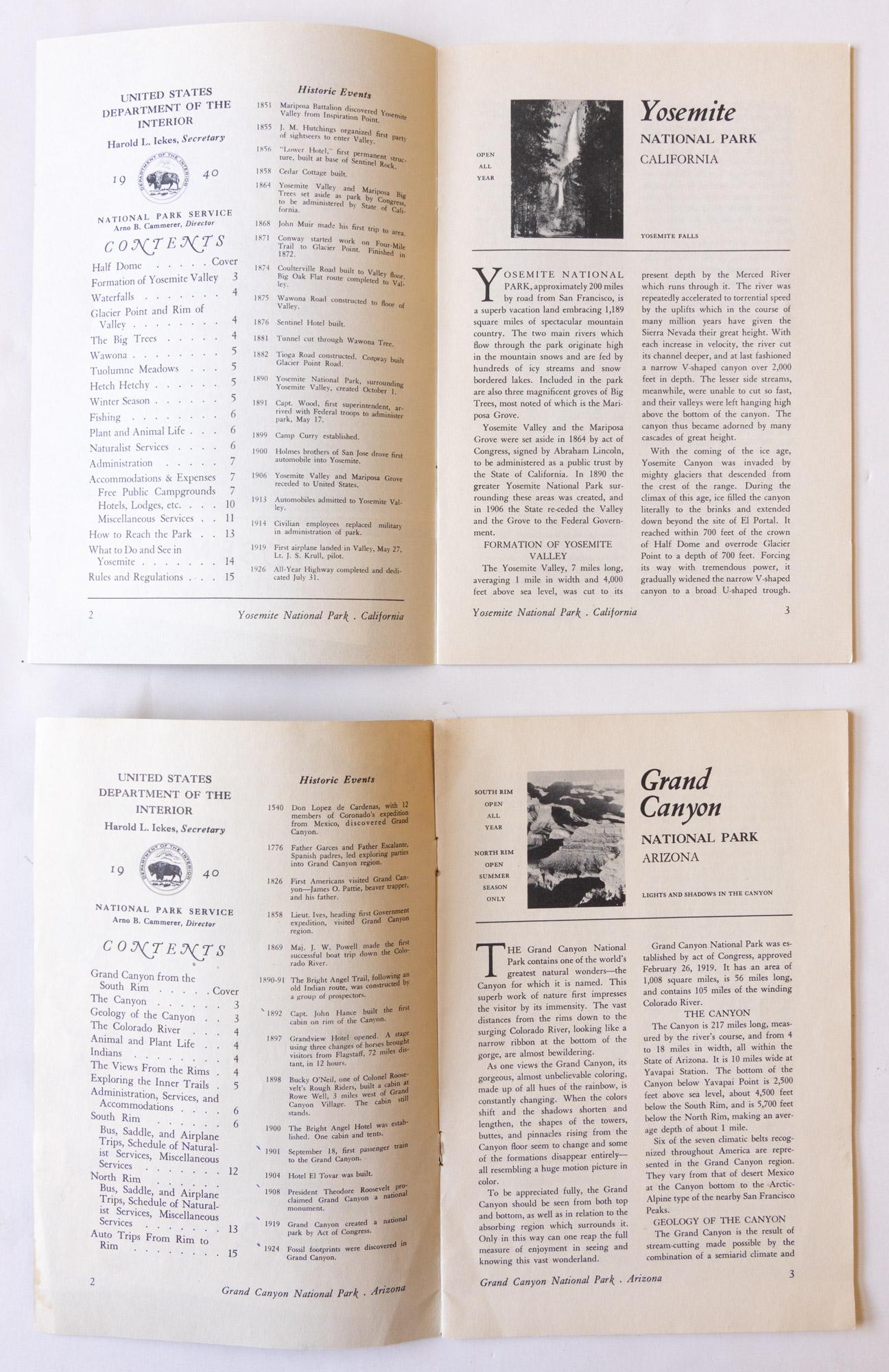
The next generation of booklets started in 1934. All interior pages used a thicker paper stock supporting the printing of photos, which are now running concurrently with the text. While all the first-generation brochures remained relatively similar in content from year to year, in 1934, the text content underwent major changes towards readability. Besides more airy typography, the extensive listings were gone and replaced with more succinct interpretive comments. The bureaucratic “Rules and Regulations” sections were omitted and replaced with a single page of “Rules and Regulations (briefed)”, while only the most important service costs such as rooms, meals, and tours, were kept. All those changes resulted in booklets that were still very detailed but became more visitor-oriented. With a page count varying between 24 and 52 (average 44), they provided considerably more information than today’s brochures, and I learned a lot about the parks by reading them. From 1934 to 1939, the number of pages in the booklets shrunk steadily as the information was streamlined further to the point that in 1939, the page count ranged from 16 and 32. The booklets from 1934 to 1938 featured cardboard-like, cover pages, but this changed in 1939 when for the first time the covers used the same paper stock as the interior pages. As an acknowledgment of the change, the pages were now numbered starting from the front cover.
1940 to 1942
Since the beginning, most of the booklets had included information about all the other national parks in the system, and sometimes also national monuments, using pages with titles such as “The National Parks at a Glance” (1917-1933), “Do you know all the national parks?” (1934), “Do you know your national parks” (1937), and finally “National Parks in Brief” (1938-1939). They even included a national map showing all the national parks. In the 1933 vintage, that map was a three-color foldout while the rest of the booklet was all black and white.The year 1940 marked a departure as the number of pages in each booklet was standardized to 16, including covers. With that drastic reduction, all the materials about the other parks in the system were dropped. While still based on the previous contents, all the sections were also shortened, resulting in a more succinct and practical presentation. To further enhance legibility, for the first time, the text design switched from single column to two columns. The booklets of the years 1941 and 1942 followed the pattern established in 1940. While that year 1940 marked a culmination of standardization that would not be seen again until the late 1960s, it is also when the visitor guides began to evolve towards a new format – a fact readily evident only if one considers the entire set of brochures for those years.
1946 to mid-1950s
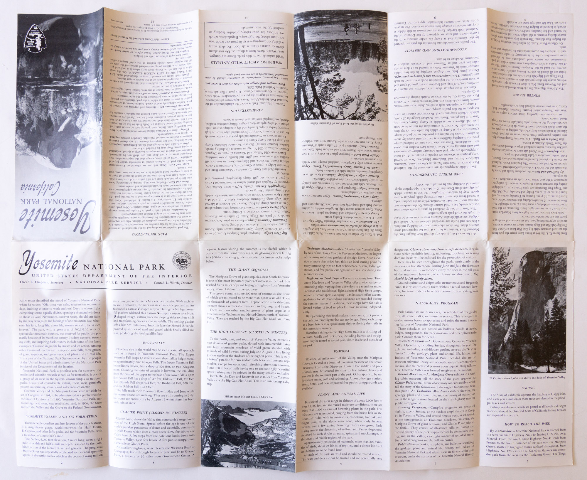
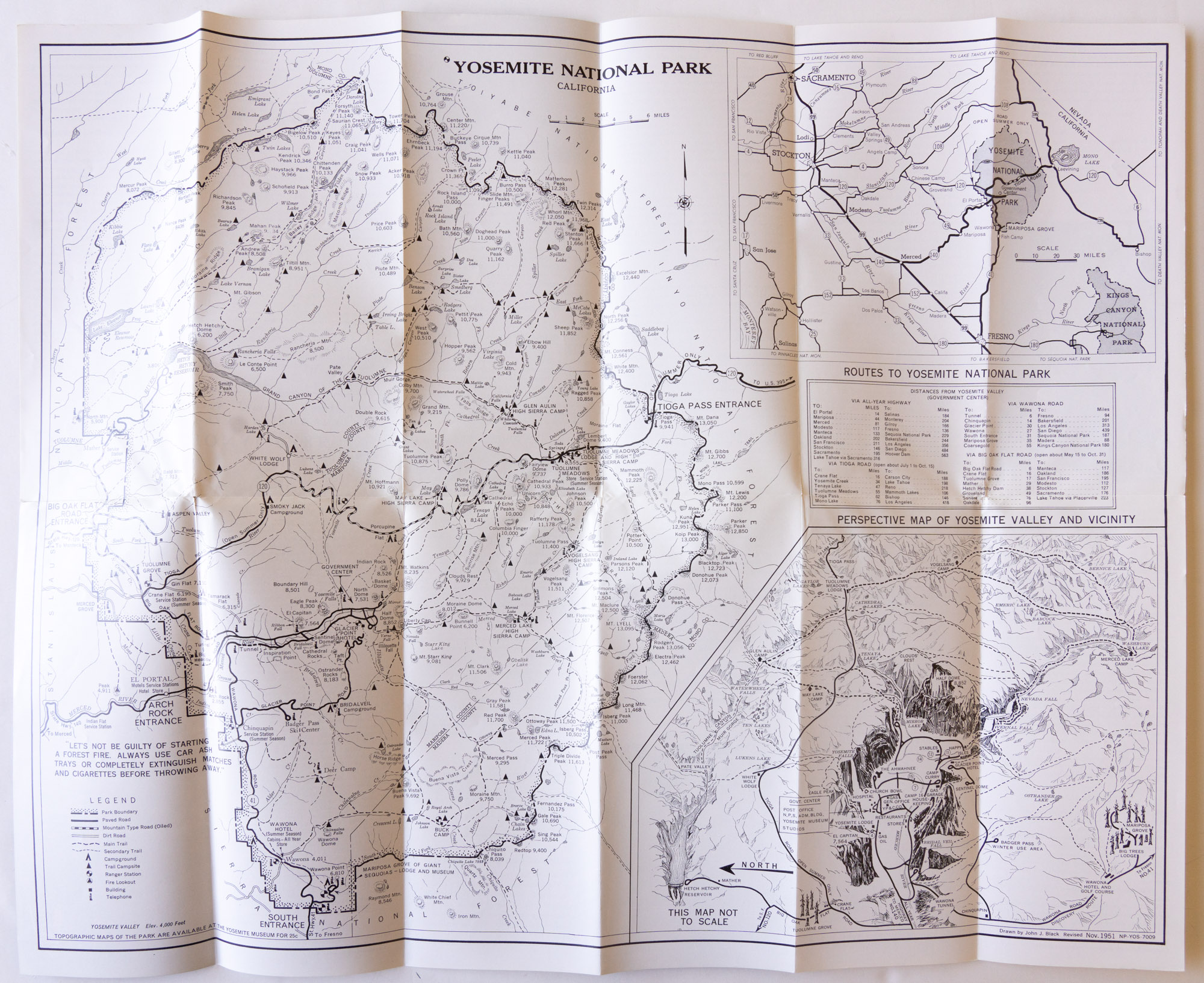
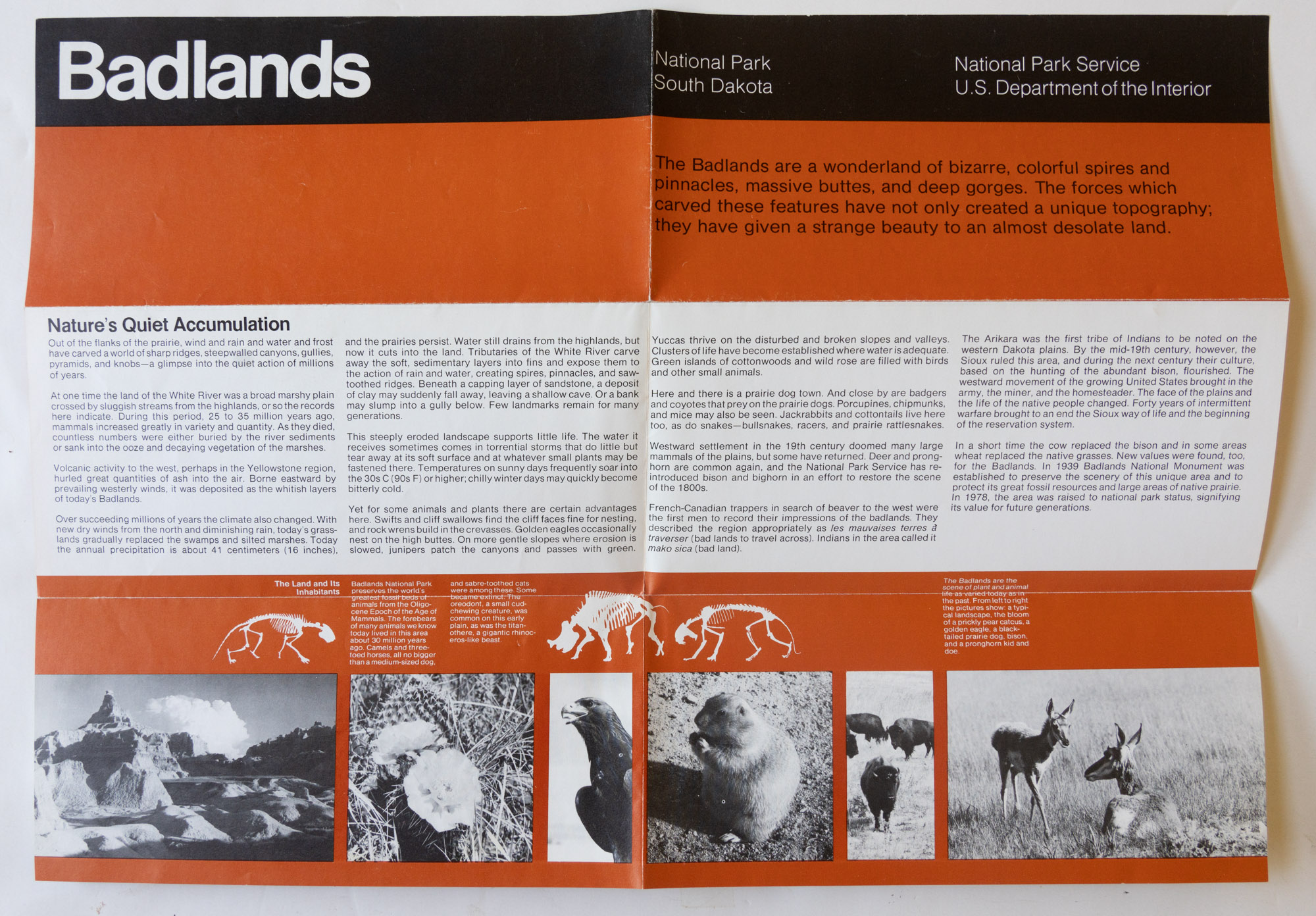
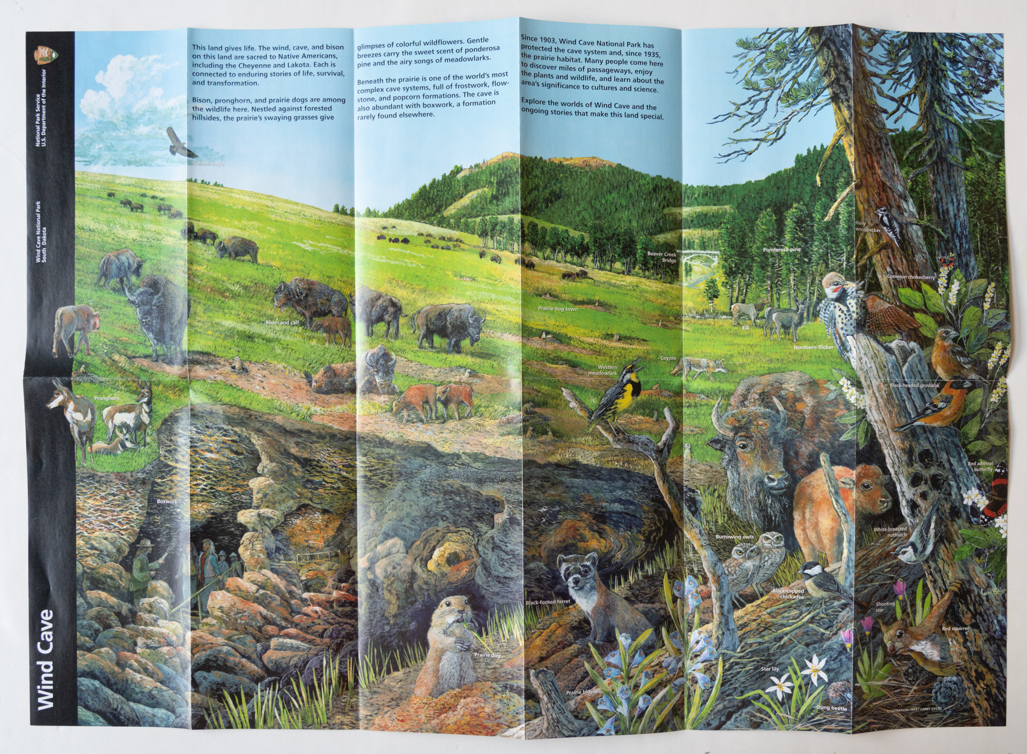
The postwar period saw looser design standards, with the coexistence of stapled booklets and single-page fold-out brochures. Unlike the booklets up to the early 1940s, the post-war booklets were not subject to uniform design standards. Most of them remained at 16 pages, but there were exceptions like Grand Canyon National Park which went to 24 pages so that more photos could be included.Most of the brochures for national parks adopted a 4×9.25″ format folded both horizontally and vertically, with 6 horizontal panels and 2 vertical panels, opening to a single sheet of 24×18.5″ and providing the equivalent of 24 pages. However, national monuments and a few parks with less diverse resources such as Carlsbad Cavern and Wind Cave National Parks used a brochure with a 6×9″ trim folded only horizontally, for a total number of pages ranging from 6 to 8. The foldout brochures format made it possible to reproduce the maps at a large size, whereas some of the maps in the booklets were barely usable without a magnifying glass. Apart from those changes, the text content often remained the same as in the early 1940s brochures, with only minor revisions, most often made to the introduction to make visitors feel more welcome.
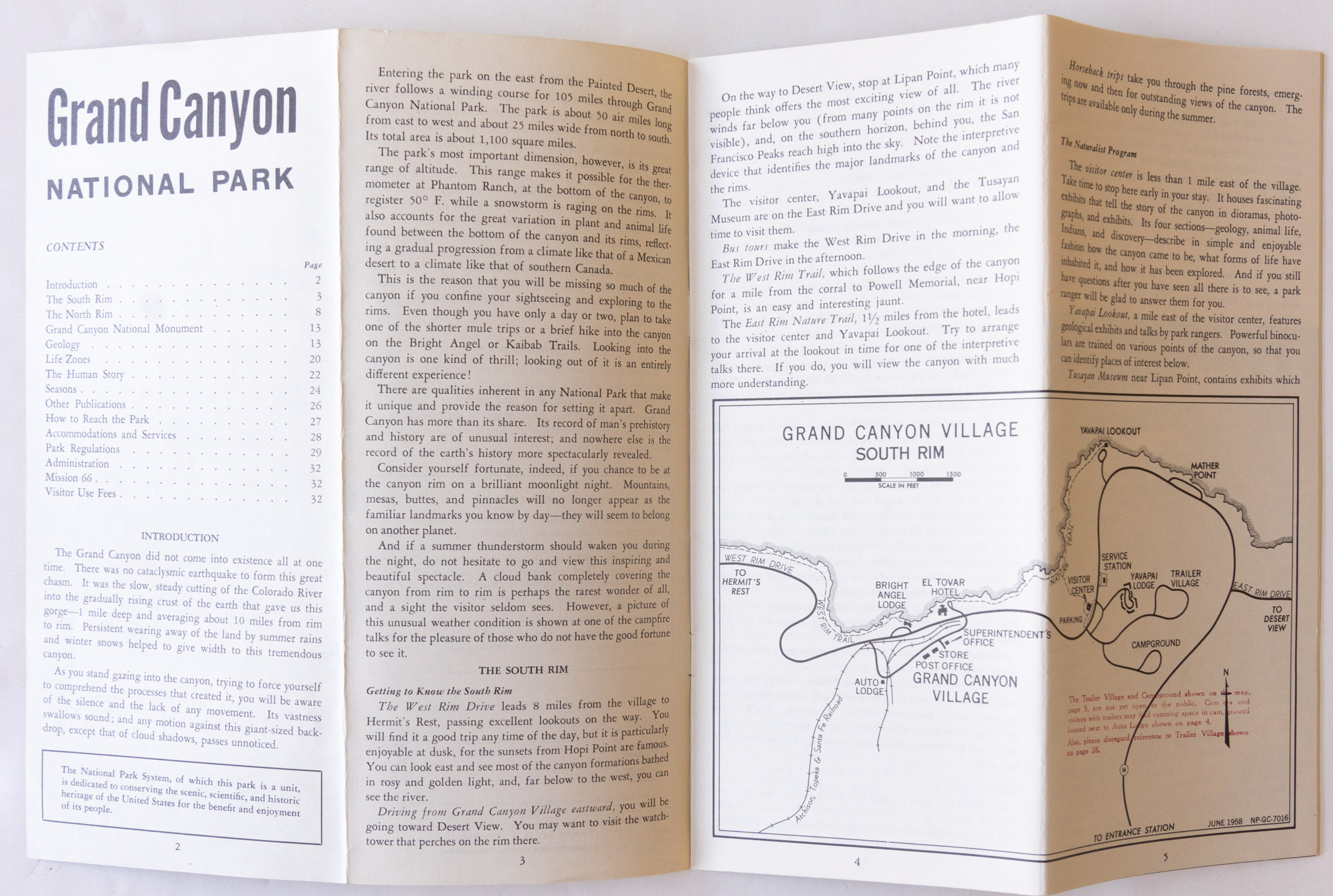
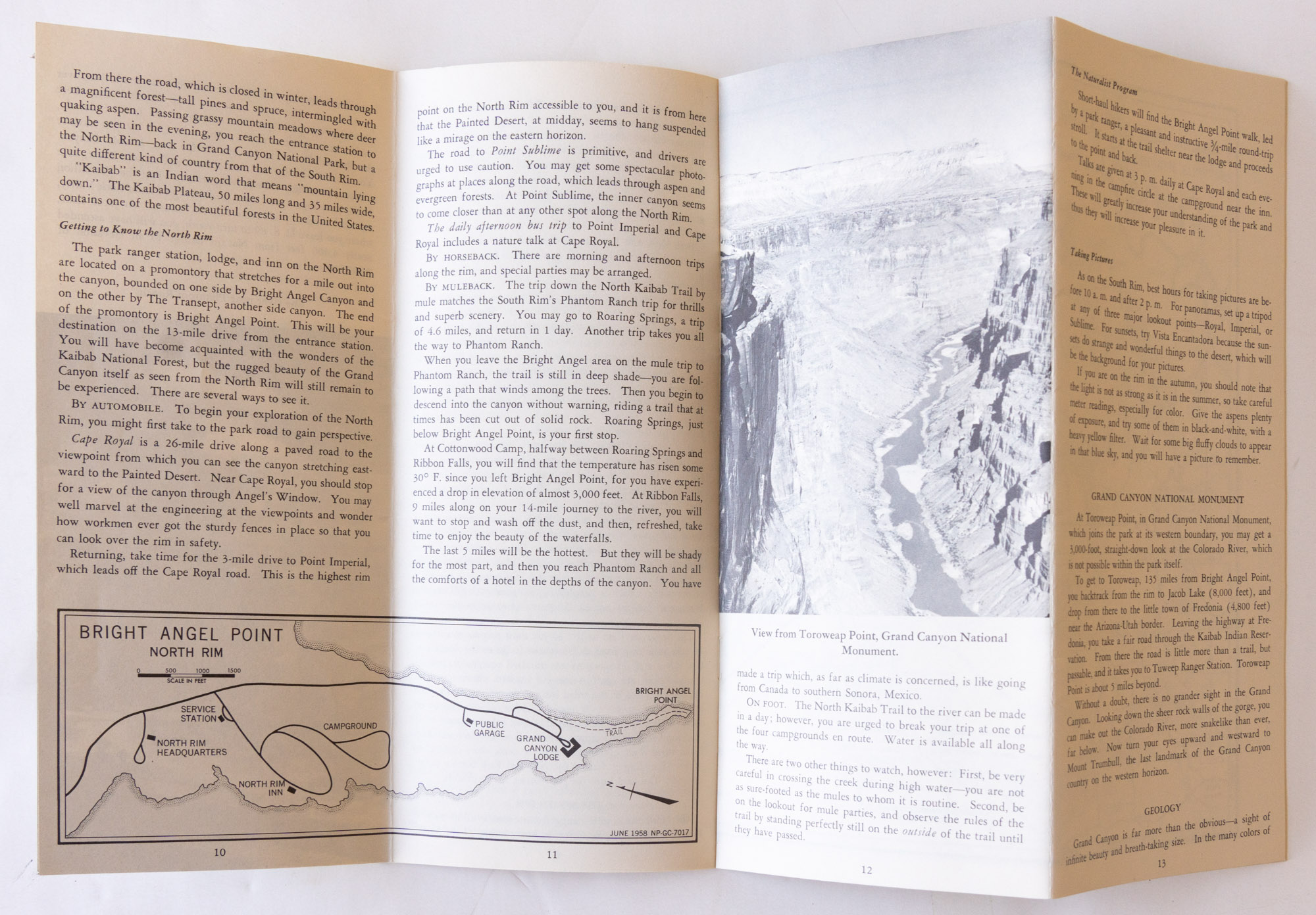
Late 1950s to early 1960s
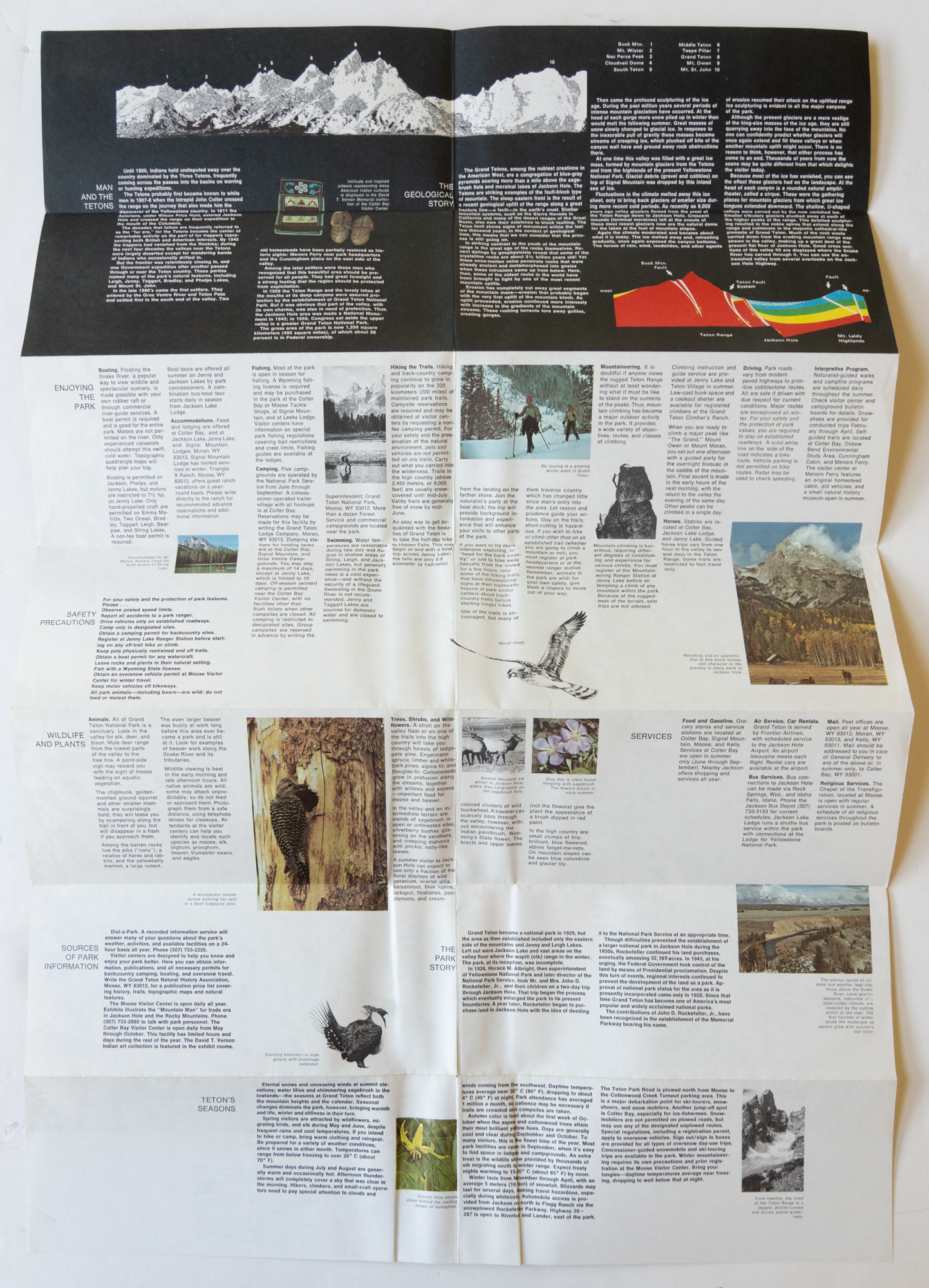
When closed, all the 4×9 brochures appear to share a similar design, but opening them reveals two distinct types. The first one was the previously mentioned single sheet 24×18.5″ folded in two directions. The second one is a new design introduced in the late fifties that became more generalized by the mid-sixties. It was a stapled booklet of trim 8×9.25″, generally of 16 pages. Once folded in half along the long dimension through the middle of its pages, it also resulted in a folded size of 4×9.25″, but with the equivalent of 32 4×9.25″ pages laid out in spreads of 16″ wide. Compared to the previous brochures, there was twice as much content, and it was all mostly new. That increase in pages was a consequence of the Mission 66 investment, which had its own section in several brochures, for instance:MISSION 66 is a program designed to be completed by 1966, which will assure the maximum protection of the scenic, scientific, wilderness, and historic resources of the National Park System. Under this program, parking facilities, campsites, restrooms, and wayside exhibits have been added in Crater Lake National Park, and more are to be constructed. Better trails will make more scenic spots easily available.Besides bringing back some of the information omitted since the 1940s, the expended contents brought a new priority to the forefront: the visitor experience centered on nature. Right from the start, rather than using a neutral tone as in previous brochures, the text addresses directly the visitor as a “you” and urges them to read carefully the brochure and learn about the park, to have a great experience, and to care for the park, with sections bearing titles such as “Getting to know your park”, “Preparing for your visit”, “What do see and do on your own”, “You can protect your park”. Most of those brochures include a section “How to enjoy the park” that invariably urges visitors to explore the park on foot, for instance:
You will be missing so much of canyon if you confine your sightseeing and exploring to the rims. Even though you have only a day or two, plan to take one of the shorter mule trips or a brief hike into the canyon on the Bright Angel or Kaibab Trails.
Mid 1960s
Except for a few maps (a focus of a future installment of this series of articles), up until now, brochures had been monochromatic. As a departure from black and white brochures, starting from the late fifties, a few of them had been tinted, but it only meant that the black inks were replaced with one colored ink (for instance blue, green, or brown), sometimes in an otherwise identical design, but they remained monochromatic. The mid-sixties were the first time the National Park Service made use of more than one color in its brochures. That was an extremely conservative attitude, given that back in the 1920s, commercial brochures had been printed in color. Yet, the use of color was limited to one or sometimes two accent colors, rather than full four-color printing. Moreover, the photographs remained monochrome and would do so for at least one more decade and in some cases into the early 1980s – maybe paralleling the disdain for color photography as an artistic medium exhibited in critical circles of that time. Still, together with the new emphasis on graphic design, the infusion of color resulted in a dramatic change in the look of the brochures. In terms of contents, those brochures were fairly similar to those that immediately came before, although in some cases the increased design compelled an entire rewriting.

1970s
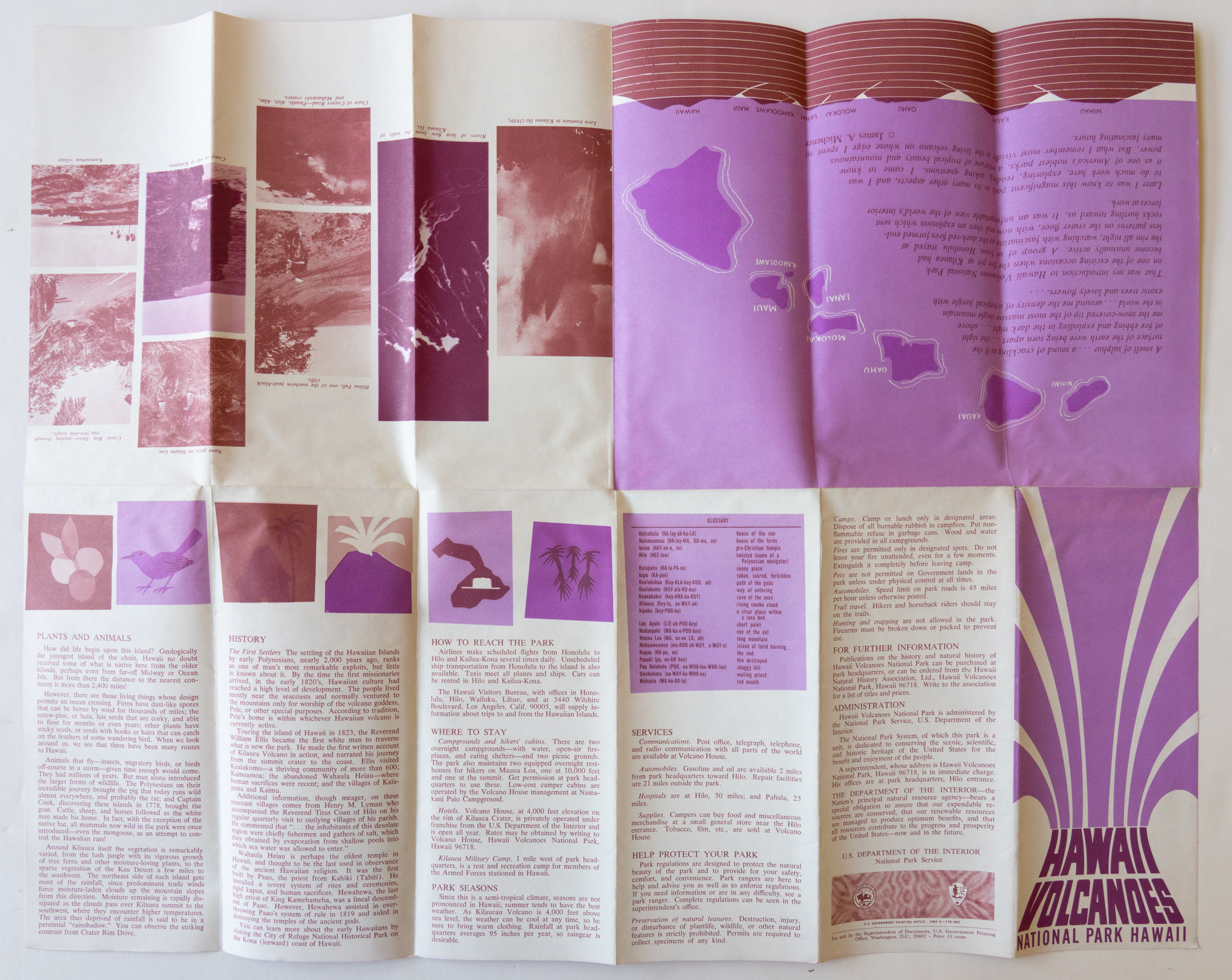
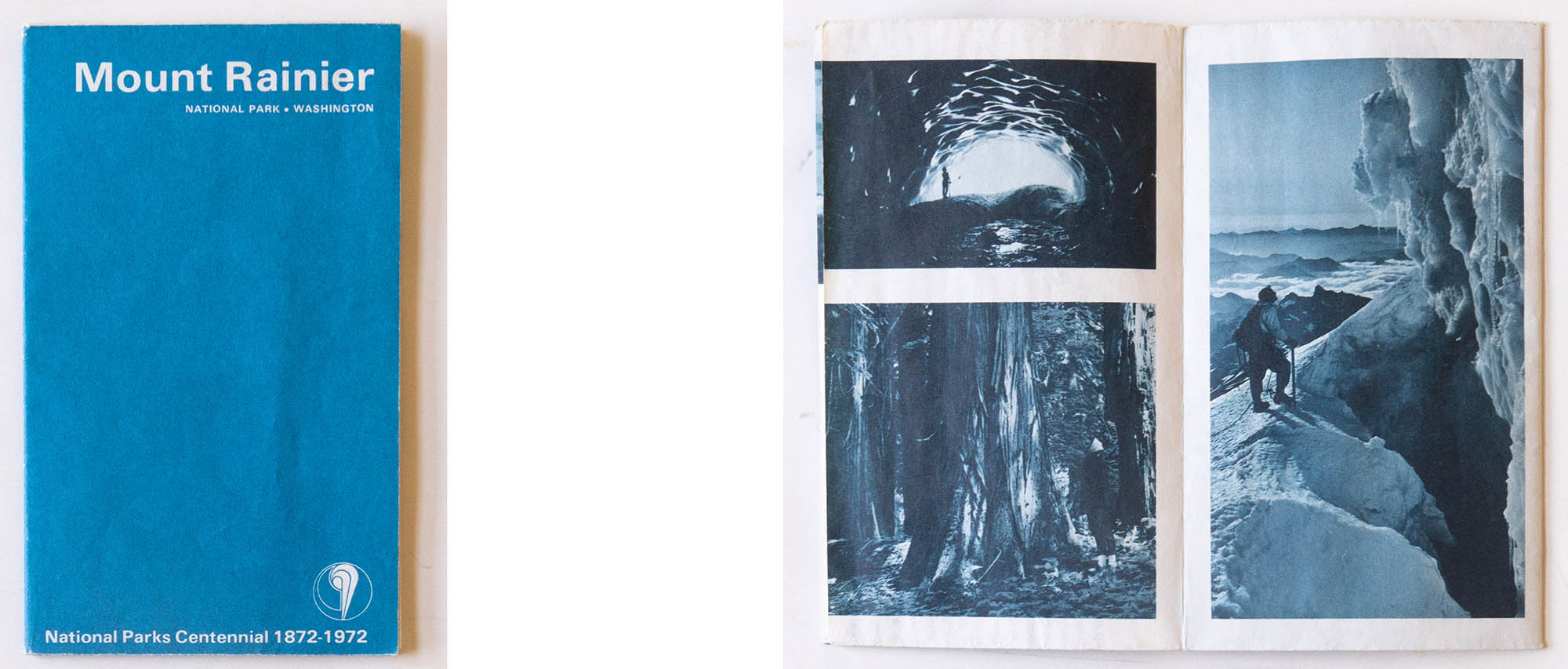
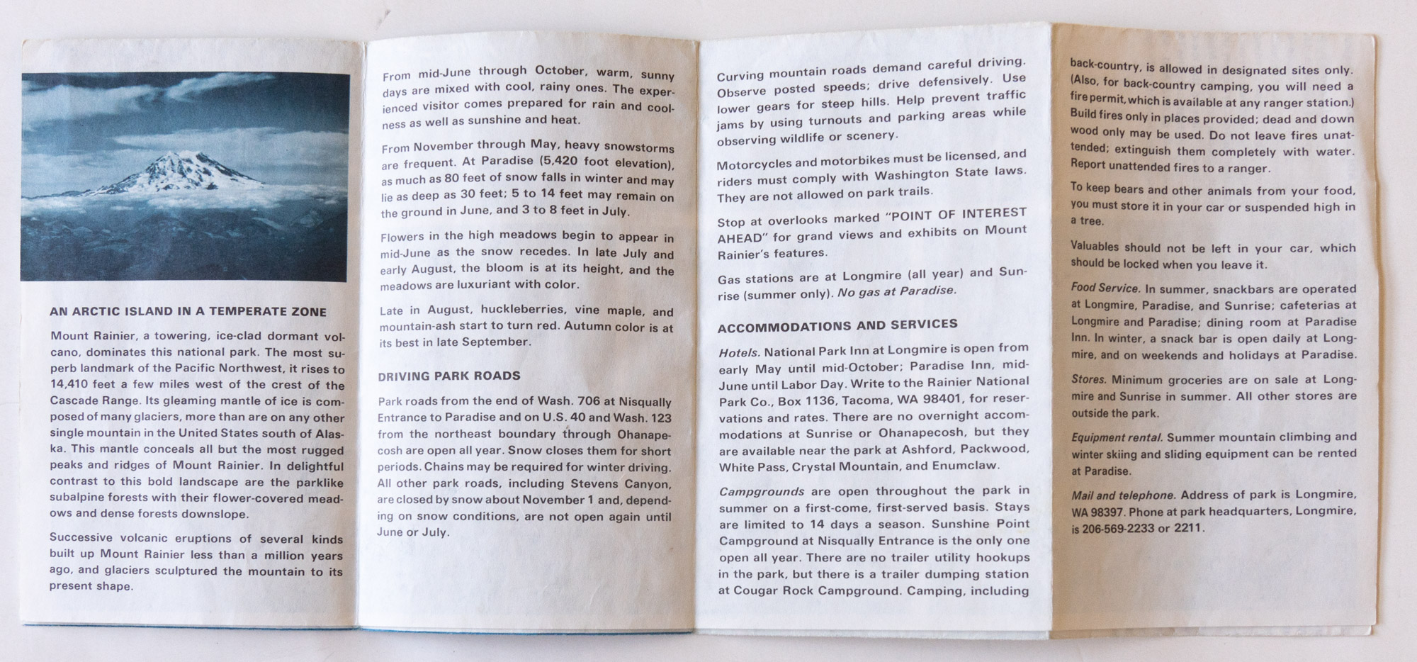
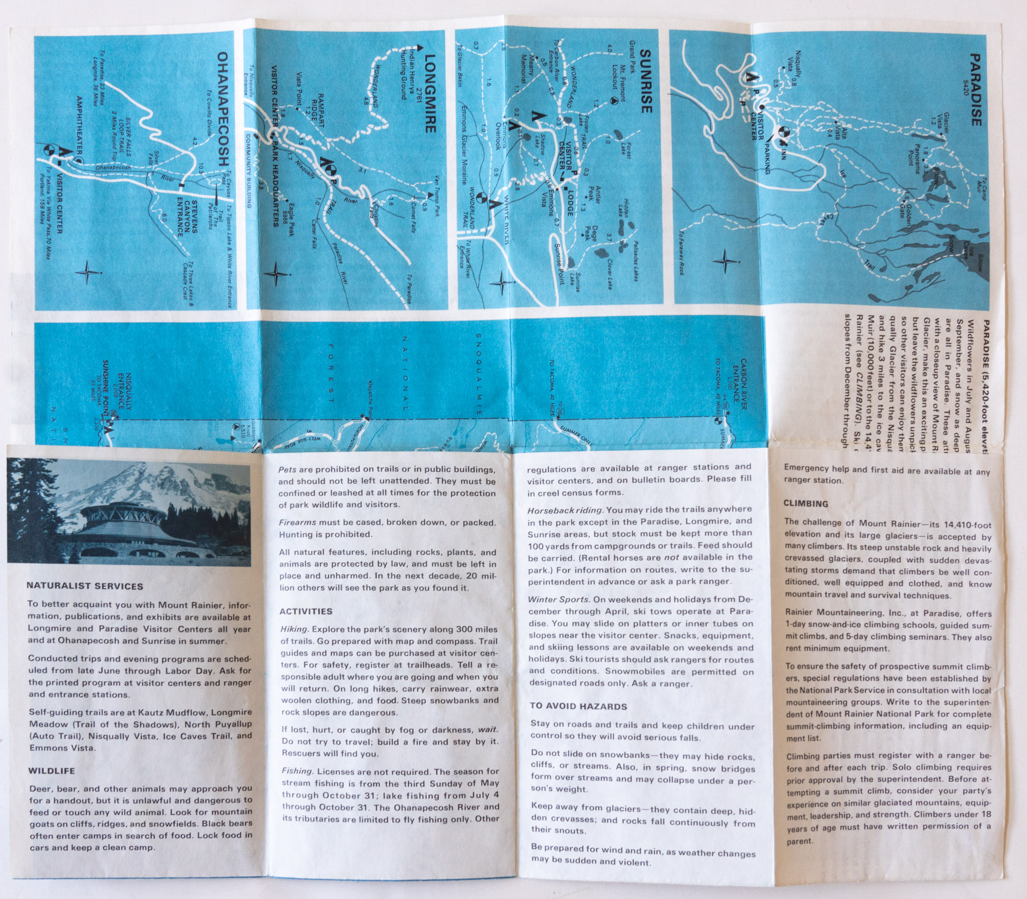
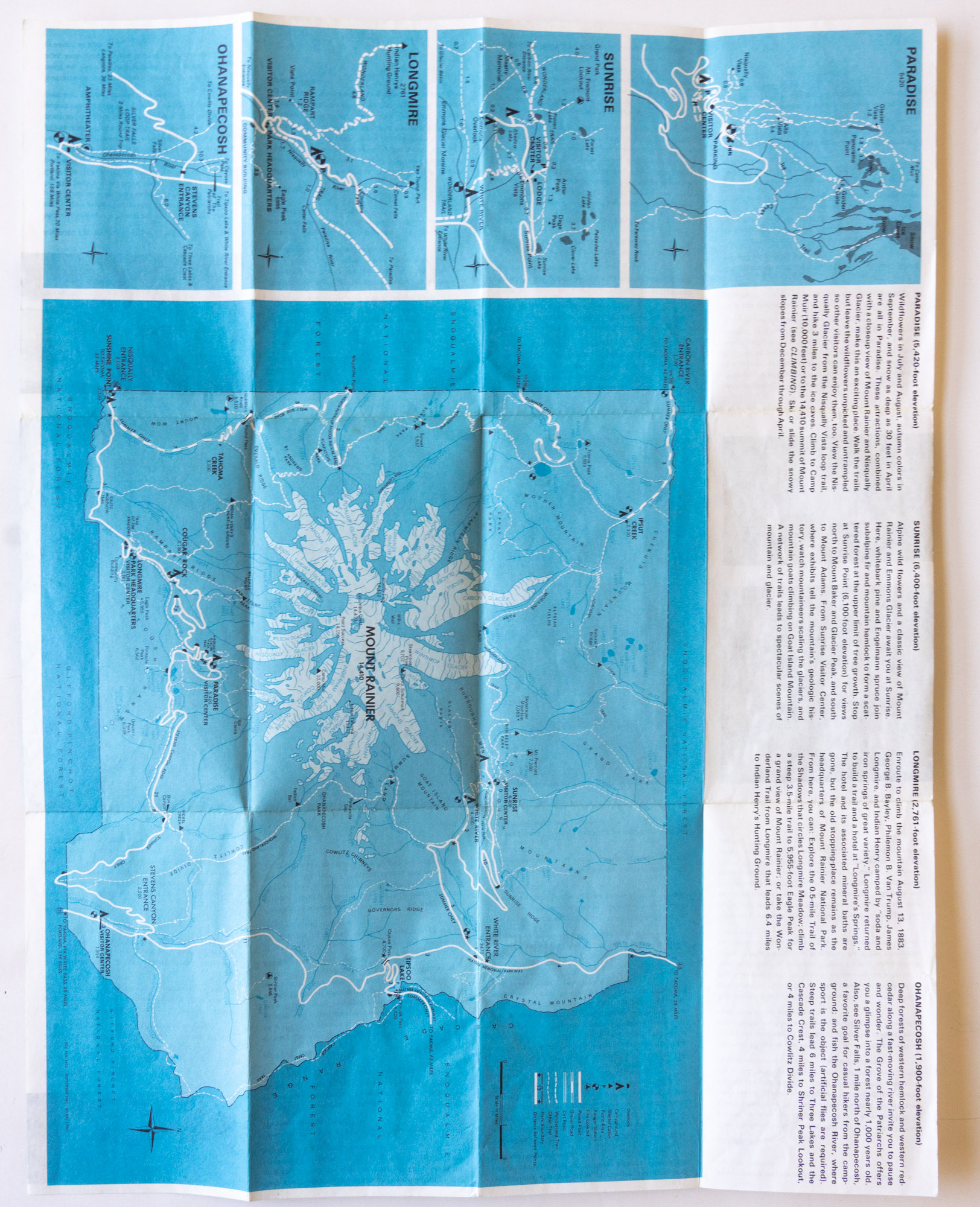
The trend to use color as accents culminated in the “pocket guides” of the 1970s. Each of them made use of a specific color, identical to the plain colored background of the cover. The pocket guides were the first attempt to re-impose a standard since the 1940s and resulted in the most radical designs in the history of the visitor guides. With each panel measuring only 3 1/4 x 5 5/8 “, given that the brochures included photographs (in monochrome) and often a large map, the amount of text had to be drastically reduced. The contents were again all rewritten for brevity. The pocket guide brochures aimed to give a quick overview of the park rather than detail what is available to visitors. Within the strict design standards, there still were variations. For example, while most of them unfolded vertically first, then horizontally, the Mount Rainier National Park brochure offers an elegant sequence: it first reveals photographs of the park, then with next unfolds, information, and eventually maps.
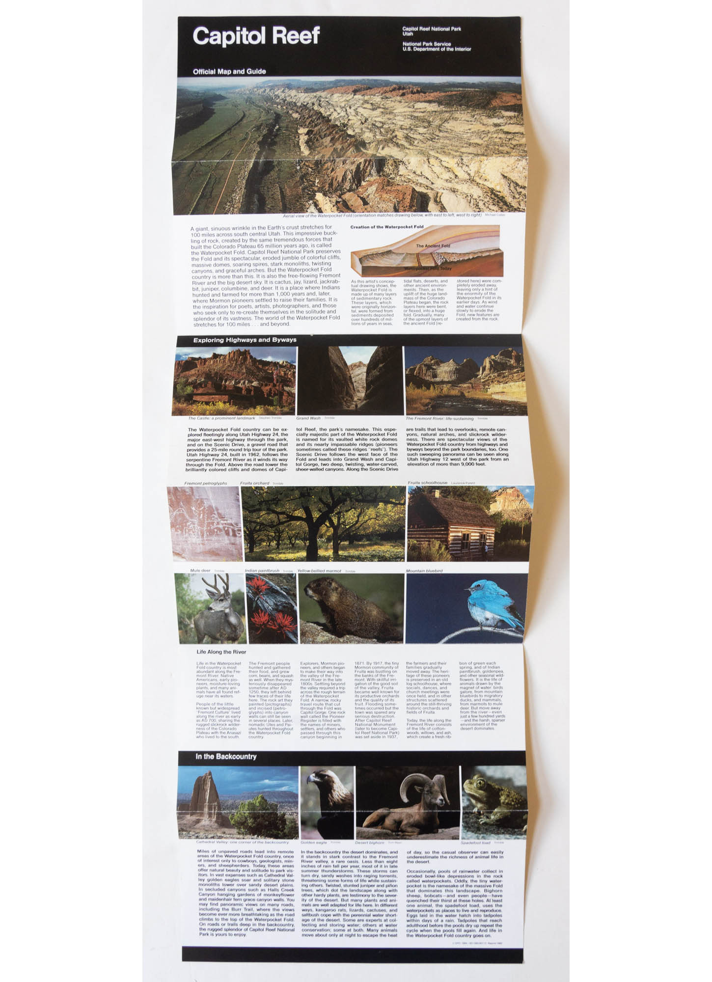
The two national parks in Hawaii (Hawaii Volcanoes and Haleakala National Parks) never adopted the “pocket guide” standard, and instead kept using a 4×9.25″ brochure. Those were the first brochures to at last make use of full color, even for the photographs. Most of the parks that reverted to a 4×9.25″ brochure did the same, and if not for the unigrid standard design elements and the large amounts of white space, could easily be mistaken for contemporary brochures. Over the years, the amount of information in the brochures ebbs and flows, dictated by new design standards, but also National Park Service priorities.
1980s to present day
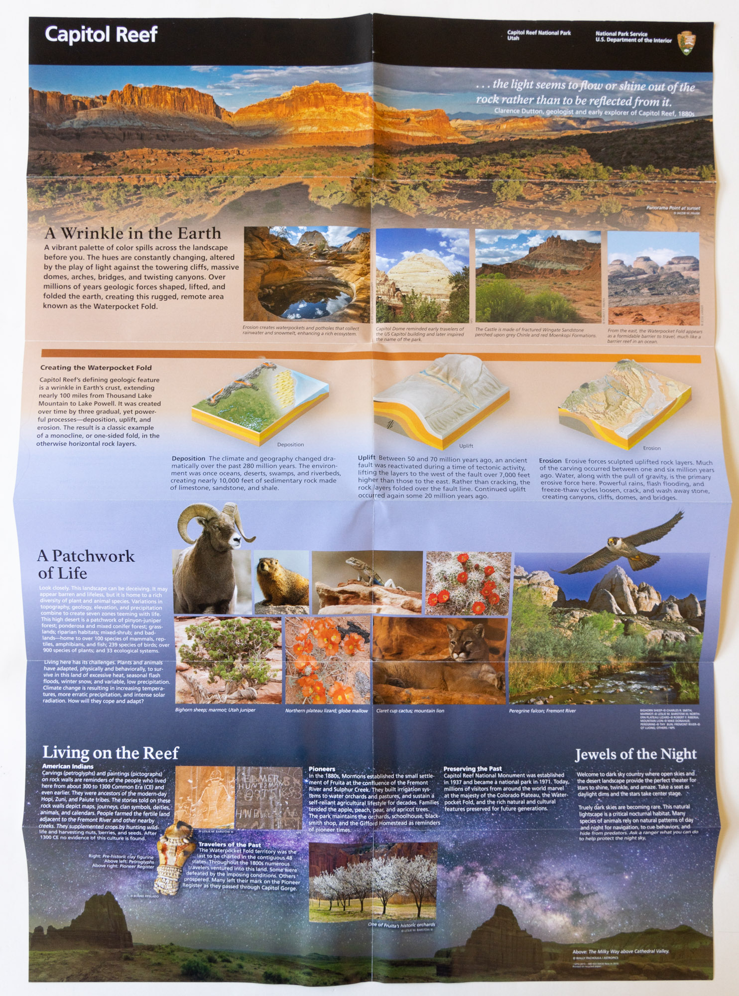
The “unigrid” brochures first introduced in 1978 are now familiar to all park visitors. Within the standards set by Massimo Vignelli, they have evolved and continue to be refined. For instance, even though current unigrids are all full-color, early examples sometimes shared some of the pocket guides design principles, with a single accent color and black and white photos.
Unigrids come in two basic types. Those that unfold only vertically, and those that unfold horizontally and then vertically. The smaller parks tend to use the former, while the larger parks use the latter as it provides twice the width and usable space. As brochures added more graphics and interpretive materials over the years, many parks have transitioned from single width to double width.
In general, the unigrid brochures opened in such a way that the iconic black band is at their top, but there were exceptions such as Grand Canyon National Park and Olympic National Park. Both parks are large and extend more in the east-west direction than the north-south direction. To give more space for their map, the cover photograph was replaced by a section of the map, and the brochure was turned sideways, so that the black band was at the left. In the interpretive section on the verso, design was structured along vertical 4 by 8¼” panels rather than horizontal panels, illustrating further the versatility of the format.

In recent years, several parks have transitioned their unigrids to that same structure, which works better when a large detail-laden illustration has displaced photographs as a better way to introduce visitors to the biological diversity found in the park. New materials have started acknowledging the ancestral use and ownership of park lands by Native Americans – the last Haleakala National Park brochure is even bi-lingual, with sections in the Hawaiian language. Looking at the way those people have been depicted through the history of the official visitor guides through the years is instructive. There is so much to learn about the history of the parks just by reading the vintage park brochures, from how attitudes over bears have evolved, to variations in park development. You witness the change of recreation practices, such as the retreat of winter sports and horseback riding in the parks. Stay tuned!
Part 2 of an on-going series: 1 | 2 | 3 | 4 | to be continued

This is a great write up. Thank you for taking the time do the analysis and share the results. I am curious if there are standard terms for the various styles used during different periods. For example, you refer to “pocket guides” of the 60-s/70s and we have the “Unigrids” of the current era. What are the technical/offical names of the other layouts? “Booklets” for some? “Bi-folds” for some? “Map folds”? “Fold-outs”?
If there is an official nomenclature, I am not aware of it. Even the terms “pocket guides” and “Unigrid” (as a way to refer to the brochures, rather than a design principle) are not official. From the mid-1980s to the early 2000s, most of the brochures were marked as “Official Map and Guide”, so I suppose that’s the last official names they had.