A Century of National Park Service Maps
6 Comments
On the 107th anniversary of the National Park Service (NPS) this article continues my examination of the official NPS visitor guides over the years, focussing this time on one particular element: the map. If you haven’t done so, reading the previous installments of this series will provide context.
Part 3 of an on-going series: 1 | 2 | 3 | 4 | 5 | to be continued
Maps are so central in today’s NPS visitor guides that many refer to them as “the park map”. Guiding visitors to points of interest, they are so intimately tied to the national park experience that it is easy to take them for granted. Yet, they are the product of a long evolution, with many improvements along the way. This article chronicles this history over a century.
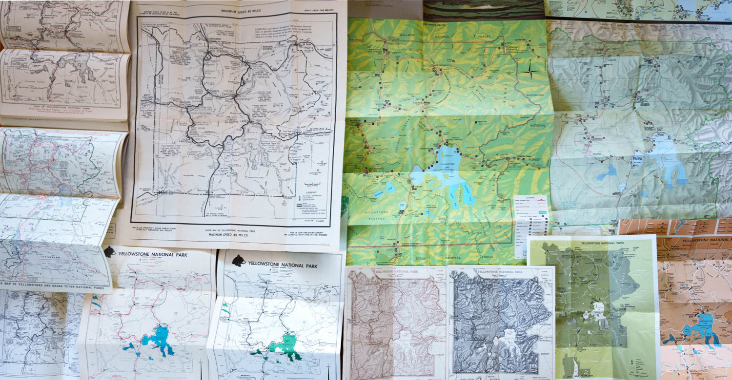
For specificity, I have illustrated it with maps of Yellowstone National Park. Given the importance of the park, Yellowstone maps have been subject to more revisions than any other park maps, which makes it possible to tell a more complete story. This also means that the history of maps from other parks is far from strictly paralleling the evolution of the Yellowstone maps. However, by examining my extensive collection of park maps, I can confirm that it follows the same general outline. As maps are detail-rich, it can be difficult to see those details in the in-line pictures, but you can enlarge any of them by clicking on them.
Linear maps
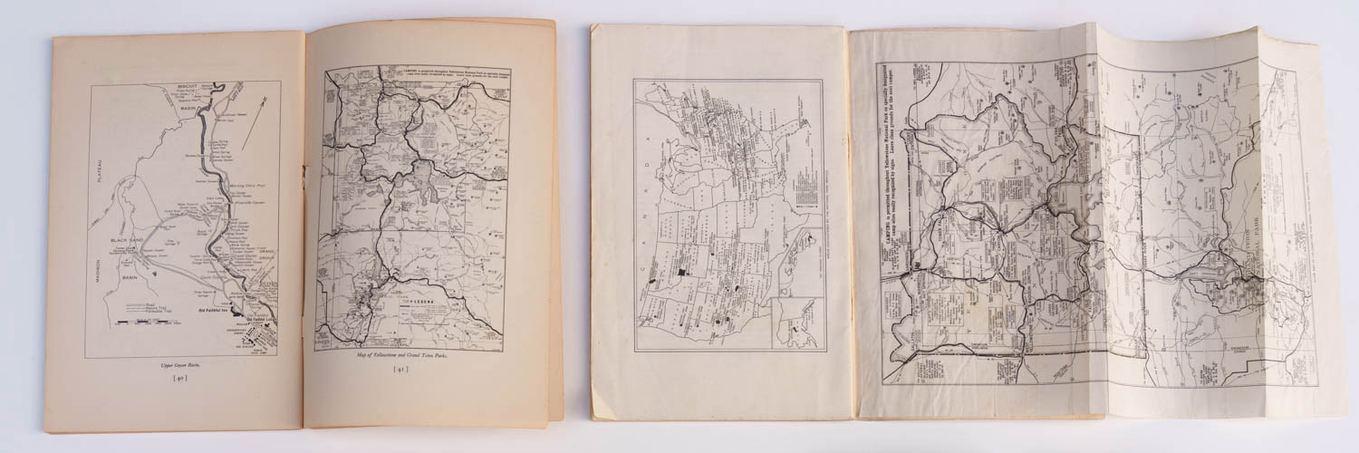
Although it underwent many changes in presentation, the map included in the first NPS booklet for the park (1917) remained in use for the next forty years with relatively few changes. Its main characteristic is the reliance on linear drawings with no fills or shading.1917-1933
In the 1917 booklet, whose trim was the standard 6×9″ octavo, the map was hand-drawn and printed by the U.S. Geological Survey on a separate double page and then stapled inside the booklet, which was necessary because it included a red color accent for road information, whereas the rest of the booklet used only black ink.
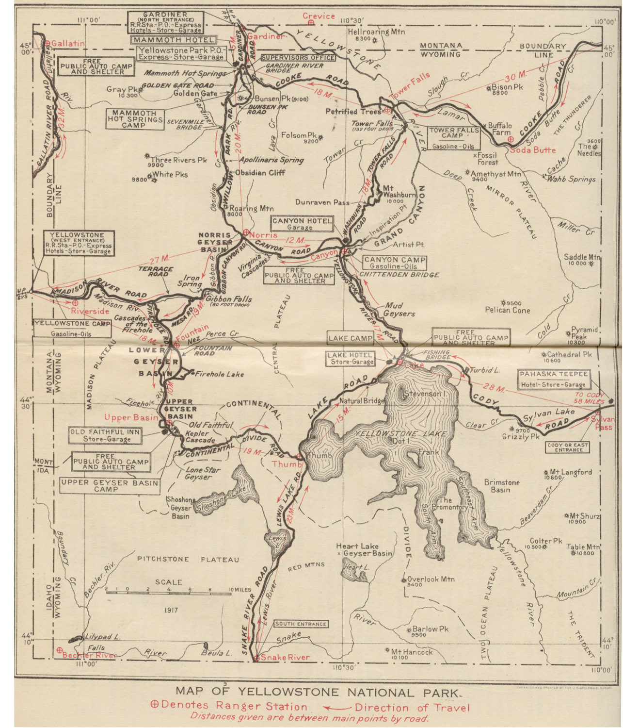
Being bound in the middle made it difficult to see the information in the map’s fold. This drawback was remedied in 1922 when the map became a fold-out page with identical dimensions. In 1923, blue was introduced as a second ink color and logically used for features such as rivers and lakes. Although the base map remained identical for years, information would gradually be added as new amenities were developed. The designers didn’t spare expenses to make sure the maps were done right, using special printing and binding. Yet the maps formed a tiny proportion of the booklets, since they occupied two pages whereas the 1922 and 1923 booklets comprised a total of 112 pages.
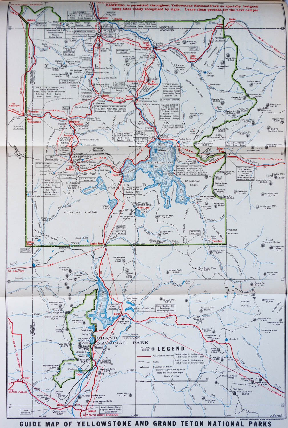
In 1931, substantial changes took place. The map was expended to include the new Grand Teton National Park, which had been designated in 1929. This made it possible to use the same map in the booklet for Grand Teton National Park. Since the start, the NPS had envisioned Grand Teton National Park as a complement, or even an extension of Yellowstone National Park. The 1920 Yellowstone booklet states:
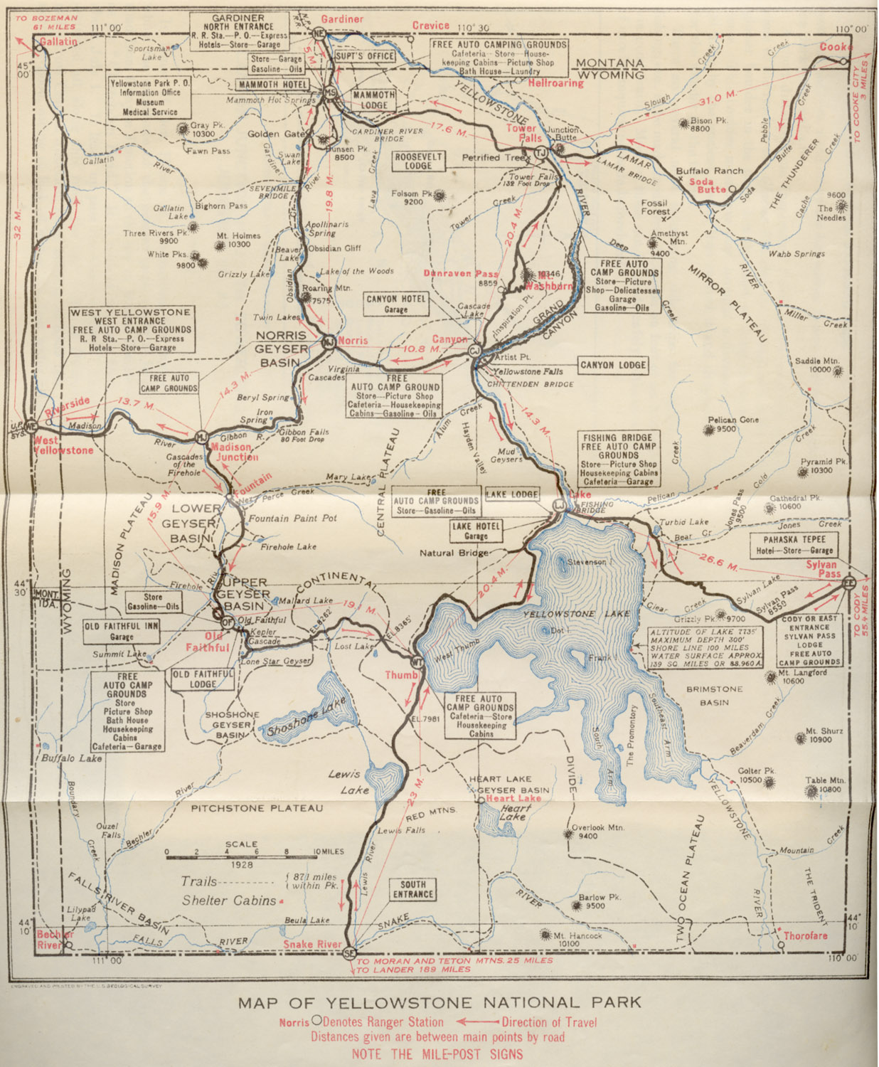
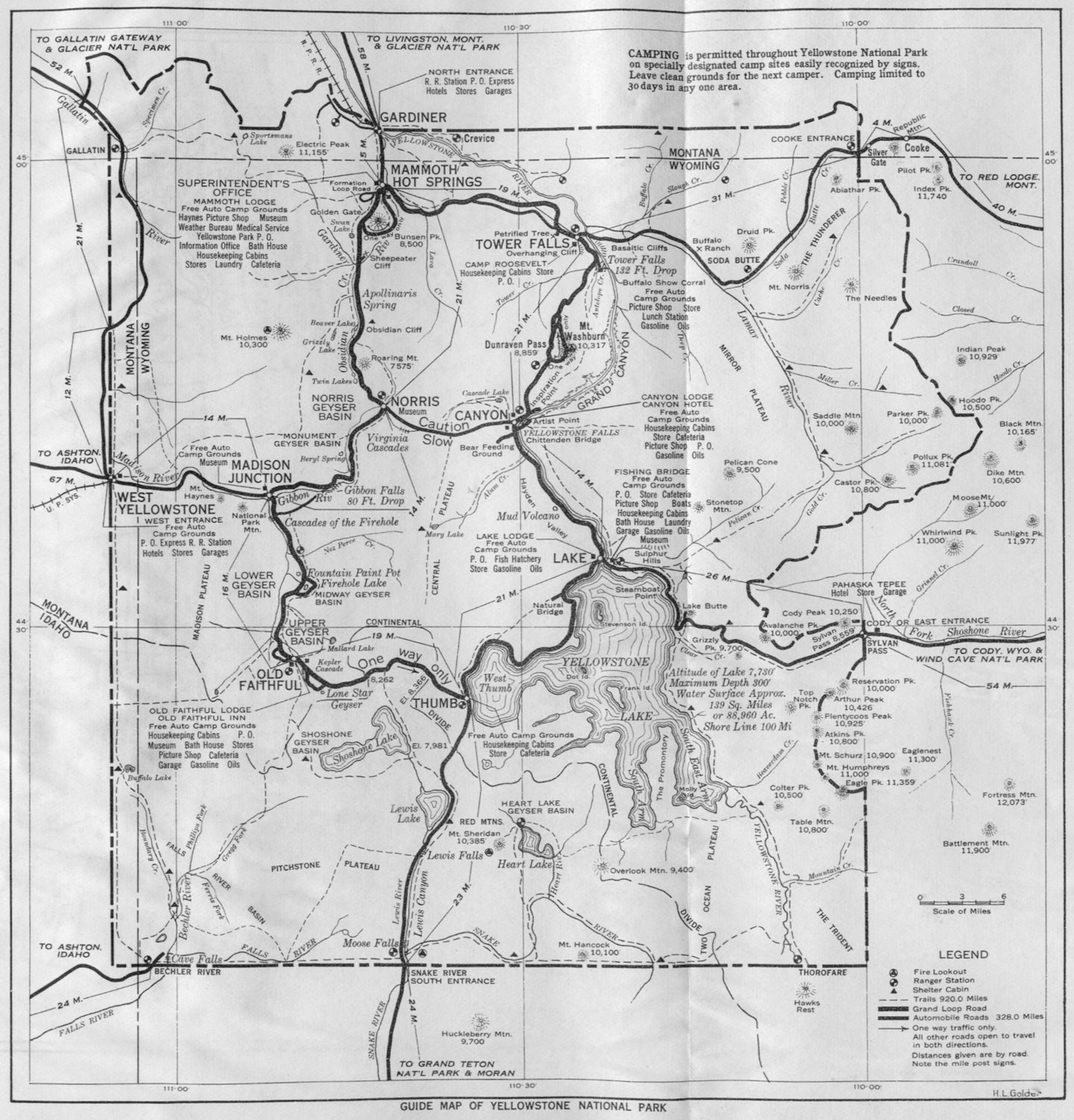
The criticism often made by persons who have visited granite countries that the Yellowstone Region lacks the supreme grandeur of some others of our national parks will cease to have weight when the magnificent Teton Mountains just south of the southern boundary are added to the park. Jackson Hole was the last refuge of the desperado of the picturesque era of the western life. Here, until comparatively recent years, the bank robber, the highwayman, the “bad man” of the frontier, the hostile Indian, and the hunted murderer found retreat. With their passing and the partial protection of the game, Jackson Hole entered upon its final destiny, that of contributing to the pleasure and inspiration of a great and peaceful people. These amazing mountains are, from their nature, a component part of Yellowstone National Park. In time, no doubt, part of it will be added formally to the park territory.Instead of using the color red for road information, the roads themselves were colored in red, a key element of the NPS maps visual identity that has persists to this day. Green was introduced as a third ink color to mark the national park boundaries with a green ribbon, another visual identity practice that continues to this day. Yellowstone National Park was originally rectangular with 3,348 square miles, but the act of March 1, 1929, gave it a more irregular area of 3,426 square miles. This map presentation continued through the year 1933 – the culmination of the pre-war national parks booklets in terms of production values.
1934-1940
1934 marked a change in brochure format which allowed a drastic simplification of the production. Colors and fold-outs were discontinued. The NPS must have recognized that the resulting shrinkage in half made the map extremely difficult to read, especially with the smaller scale necessary to include Grand Teton National Park. In 1935, they reverted to the previous fold-out design (although in black and white), which continued in 1936. For size reference, the fold-out on the right of the picture below is the same as the map above.
In 1937, the park map focussed again exclusively on Yellowstone National Park, omitting Grand Teton National Park. This reduced the fold-out size from 2 pages to 1.3 pages while maintaining similar legibility. For a more streamlined appearance, a different set of fonts were used and the call-out boxes were dropped. Another innovation was the use of symbolic pictograms for points of interest such as buildings (squares) and ranger stations (quadrant circles) that would continue until the 1970s.
By 1939, the brochures had become thiner, opening flatter, so there was no longer a need for a fold-out, and the map was printed across two regular pages at the same size as before.
1941 to mid-1950s
1941 brought to Yellowstone a radical change in visitor guide design that would come only after the war for most other parks, although the brand-new visitor guides for two newly established parks, Mammoth Cave and Great Smoky Mountains also followed the new design. In the new design, a one-sheet folding brochure (six horizontal panels and two vertical panels of 4×9.25″) replaced the prior 6×9″ booklets.
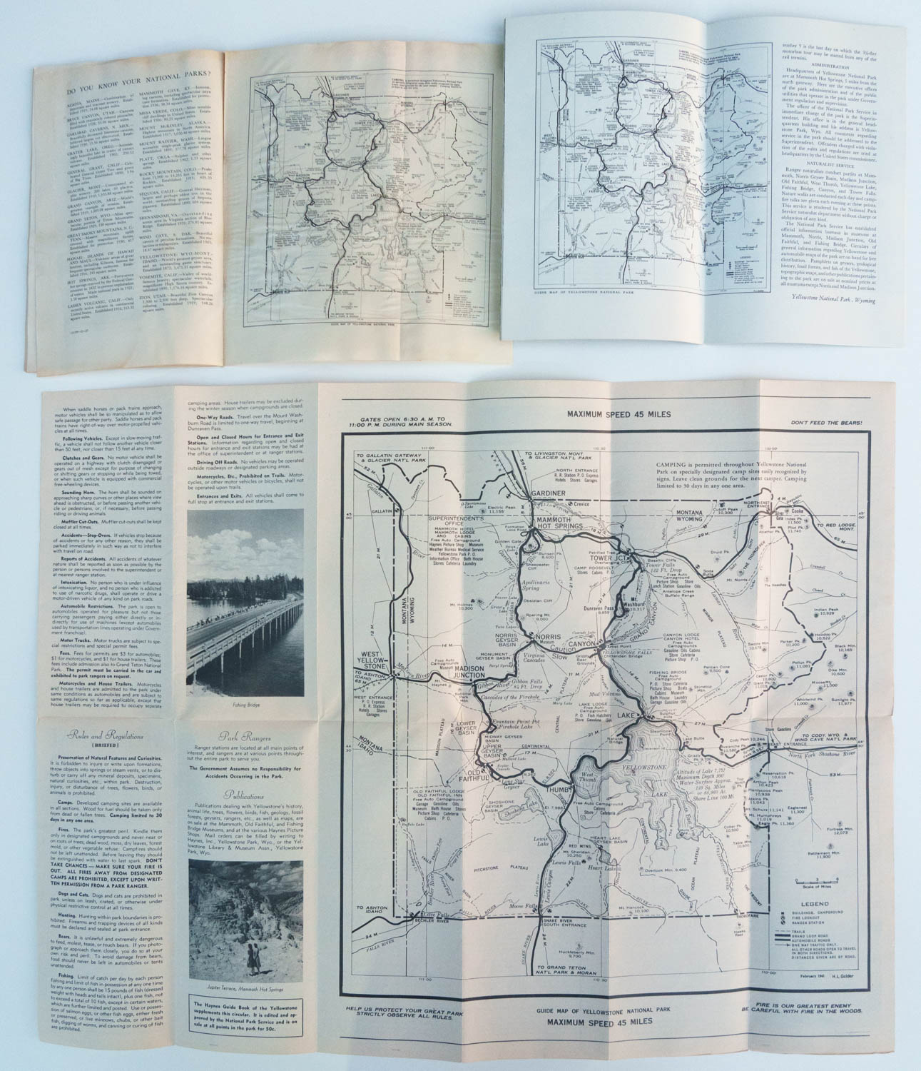
The main benefit of the new design was to make it possible to present much larger maps without the need for expensive fold-outs. Over the years, the relative amounts of space devoted to the map had steadily grown, but now that amount had jumped to 1/3. The map retained the same contents and design as before, down to the fonts. It was merely reproduced twice as large, over four horizontal panels and two vertical panels (16×18.5″). This alone provided a leap in usability, especially for the independent motorists that had become the park’s constituency.
Transition and experimentation
While the maps had slowly evolved in the 40 years from 1917 to 1956, the following decade and a half saw dramatic changes in the use of color, shading, and sizing. Those changes did not always follow linear progress, instead, they represented a sea-saw progression as if the NPS was continually experimenting to reach a new standard.Late 1950s to Early 1960s
With a new emphasis on interpretation, 1957 brought visitor guides with brand-new content. They also came with a new format: booklets of trim 8×9.25″ folded horizontally – resulting in the same panel size as before.
For the first time, the map went beyond linear features, displaying hand-drawn shaded relief to provide terrain information. Compared to the previous map, the typography also established a clearer hierarchy between points of interest and geographic features. This was also the first time a new pictogram representing a tent distinguished campgrounds from buildings. The result was the best monochrome map in the park’s history.

It is not clear why the NPS abandoned shaded relief from 1959 to 1965. Maybe they felt that on two panels (8×9.25″) the shaded relief maps were too cluttered for motorists. They reverted to a scheme reminiscent of the years 1923-1930, but with more hierarchy and with lakes marked with fills rather than contour lines. Besides being simpler, the maps were slightly larger, extending on three panels (9.25×12″) and requiring the user to turn the brochure sideways.
Mid 1960s
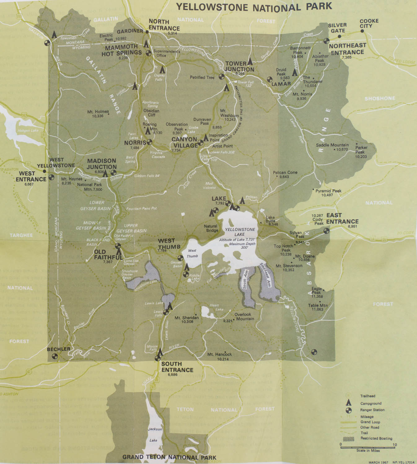
The year 1965 saw a return to the folded sheet format and with it the large map (4 horizontal panels and 2 vertical panels, 16×18″). More notably, it marked the first time full-color was used in visitor guides. However, the choice of colors was not particularly judicious in that first attempt, as a rather dark background didn’t allow the roads and points of interest to stand out. The lighter and less streamlined pictograms didn’t help legibility.
1970s
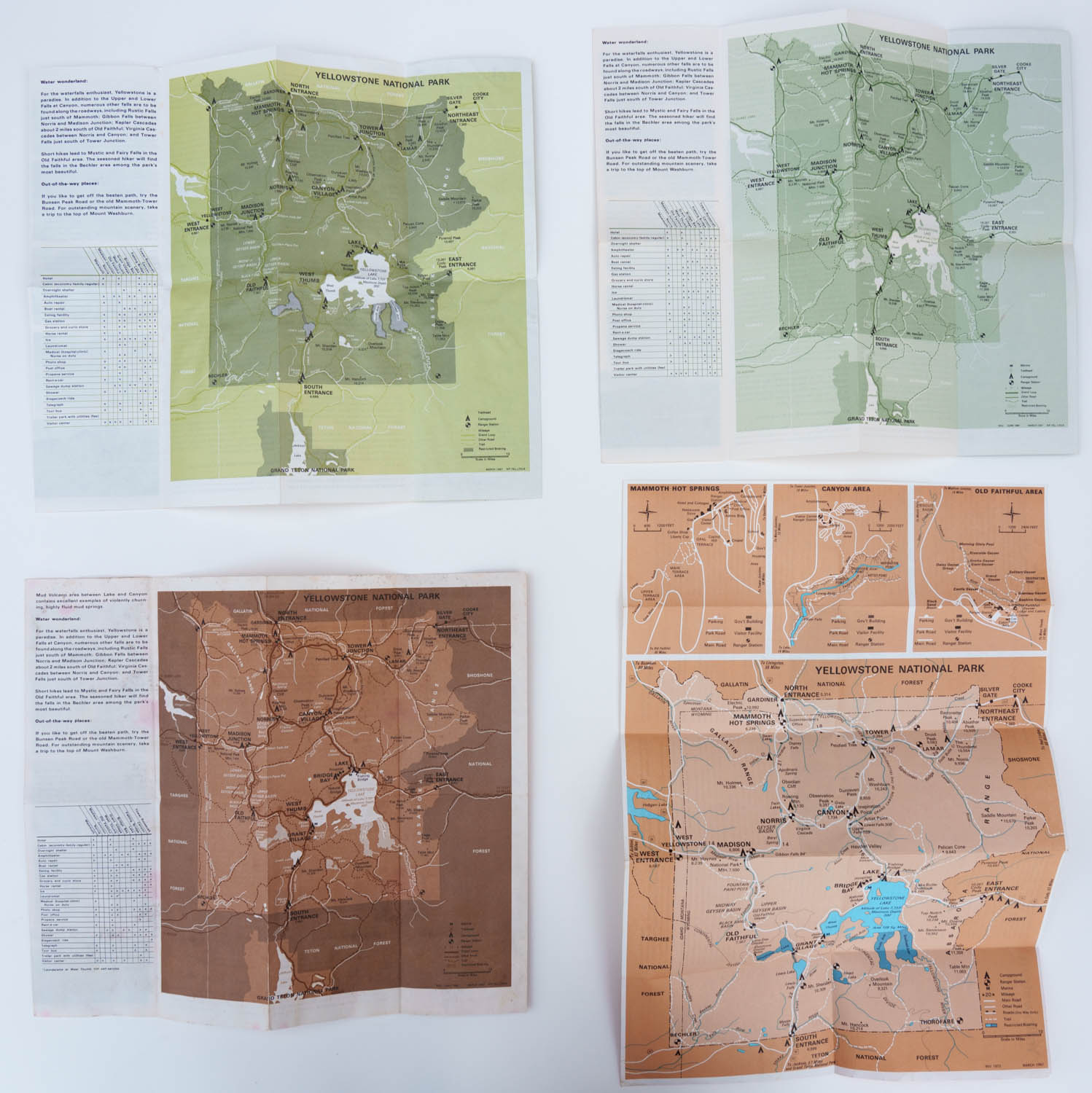
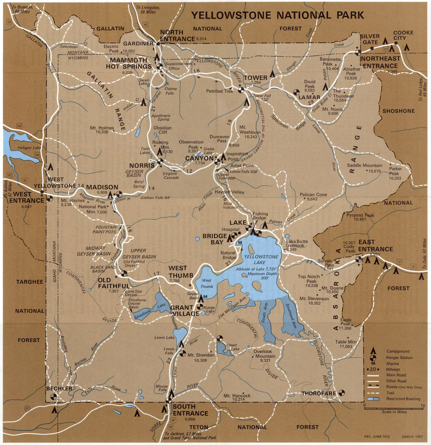
Those changes were short-lived, as by 1967, the brochures had adopted the design-centric “pocket guide” format. The minimalistic design combined with reduced size resulted in simpler maps which mostly relied on fills without shaded relief. Rather than a unified color scheme across parks, each park map had a specific color scheme that also varied from year to year – echoing the NPS experimentation with gratuitous color tints from the mid-1950s to the mid-1960s.
While at first glance, the maps appear to be in color, in fact they were initially essentially monochromatic. Each of the pocket guides was designed around a single color, which appears prominently as the plain background of the cover. The map used shades of that color for fills. Although the design was striking, the fills tended to overpower the map’s details.
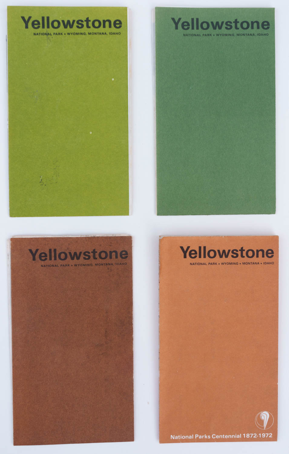
early 1967, late 1967, 1968, 1972 brochure covers
Initially, the roads used a darker shade of color which tended to merge with the fill, while white was used for hydrology. In the latest iterations of the pocket guide maps (1970-1973 for Yellowstone), the designers used white to make the roads stand out and brought back blue for hydrology. They sometimes made the maps larger, for instance by changing their orientation.
Modern maps
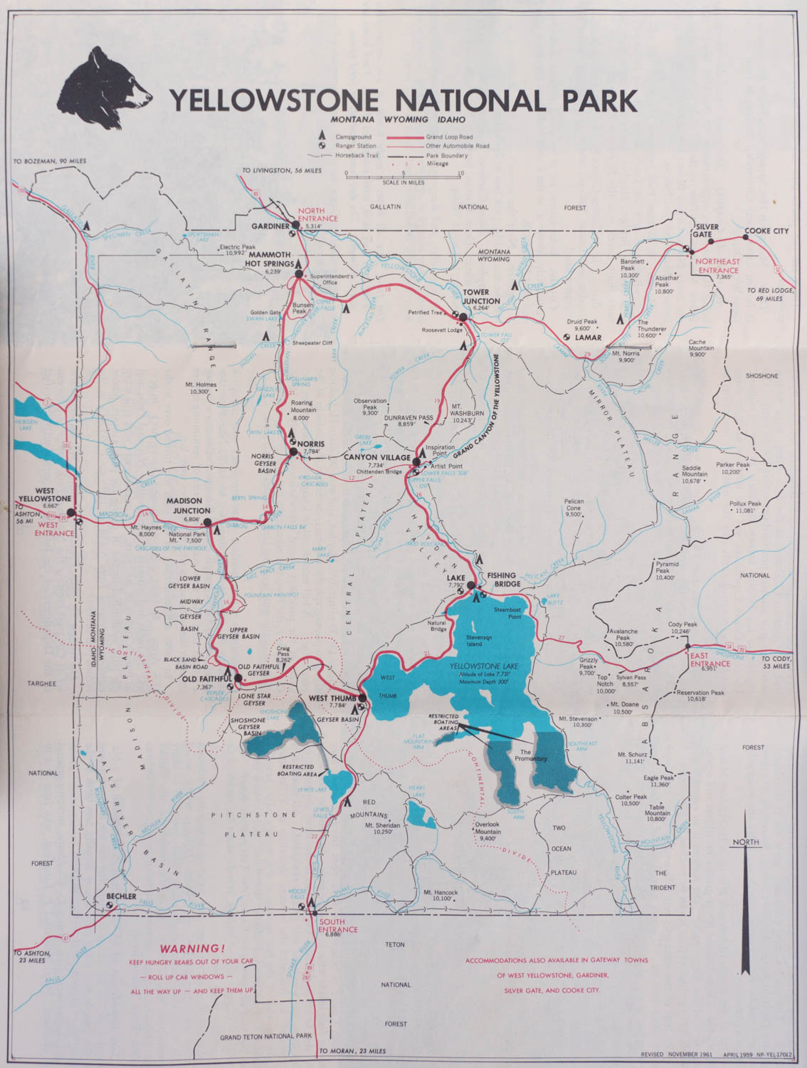
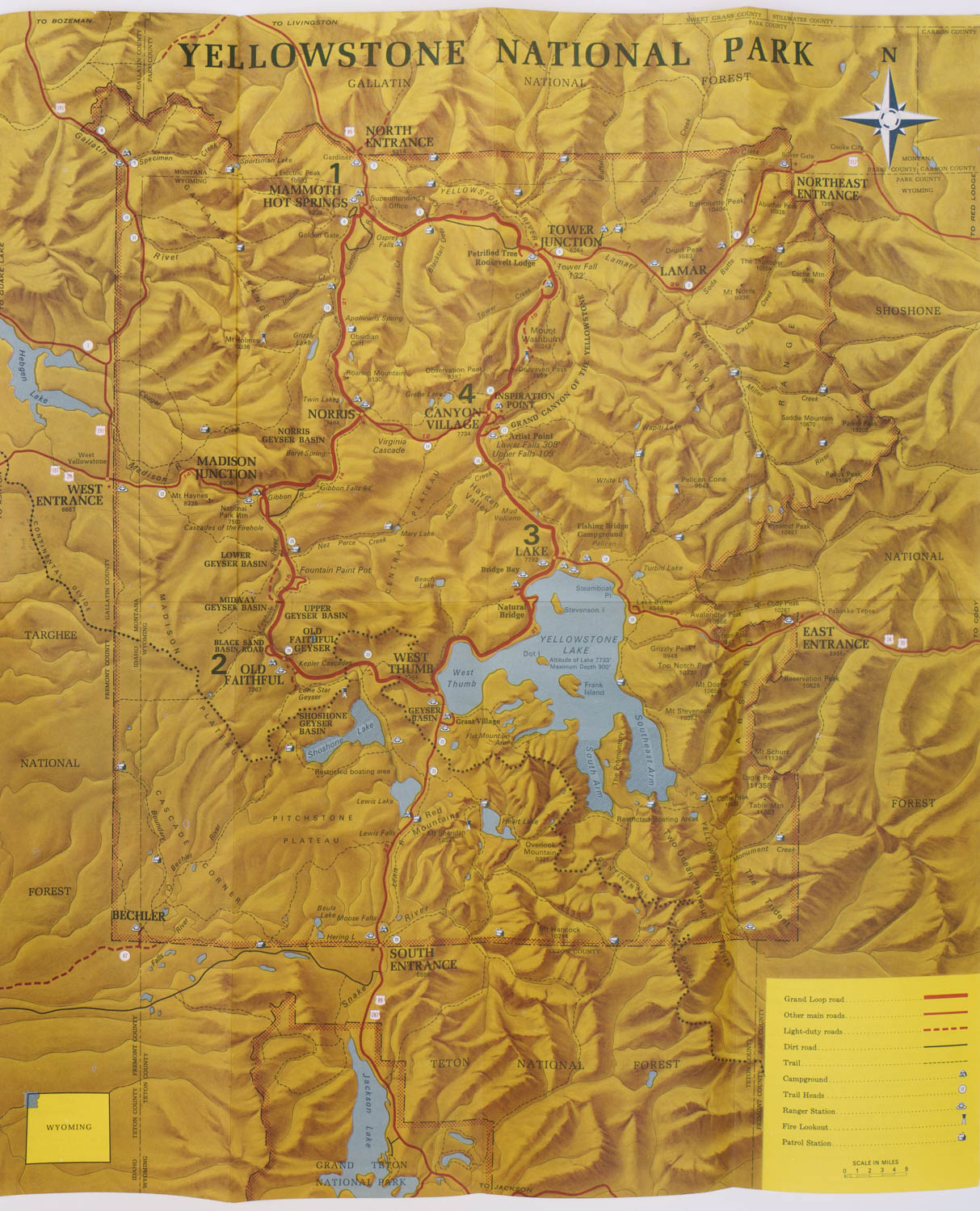
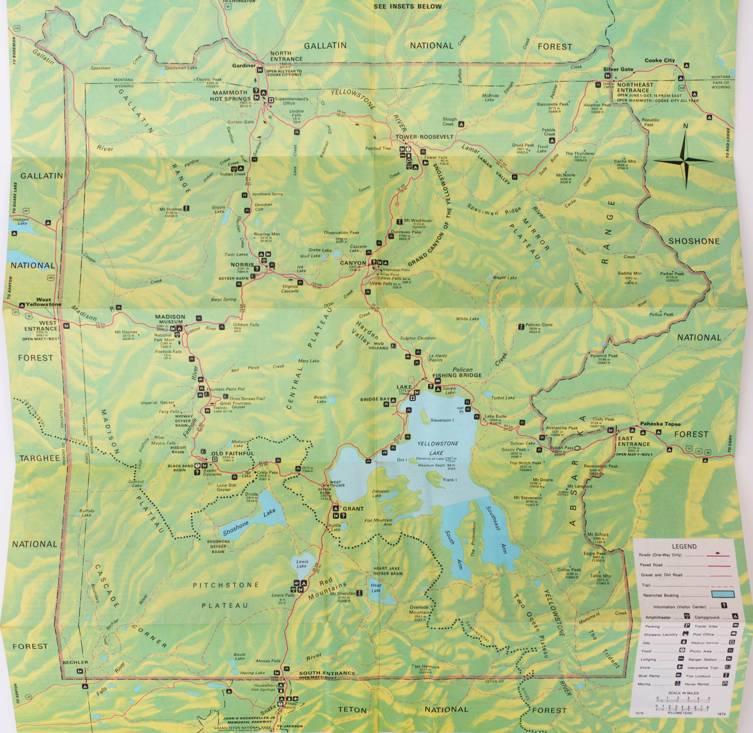
Yellowstone abandoned the pocket guides and reverted to the folding sheet in 1975. Like in 1965, this allowed the large shaded map to flourish. Going forward, the map would always occupy almost one entire side of the visitor guides. Roads went back to red, and hydrology to blue. Compared to a decade ago, the hierarchy of elements is improved. The shaded relief colors are lighter, making it possible for features and roads to stand out. Instead of relying on much darker tones to mark the shaded areas, the map uses a change of hue, with warm highlights and cooler shadows. Instead of a heavy fill like in the pocket maps, a ribbon marks the park’s boundary legibly and without obscuring interior features. However, maps for different parks still used different color schemes for shaded relief.The pocket guides had pared down pictograms to two: campgrounds and ranger stations, with better legibility than the 1965 versions. 1975 introduced many more pictograms that were easy to identify and unified by their appearance of a white icon against a block square. They would become another standard associated with the NPS maps visual identity.
1980s to present day
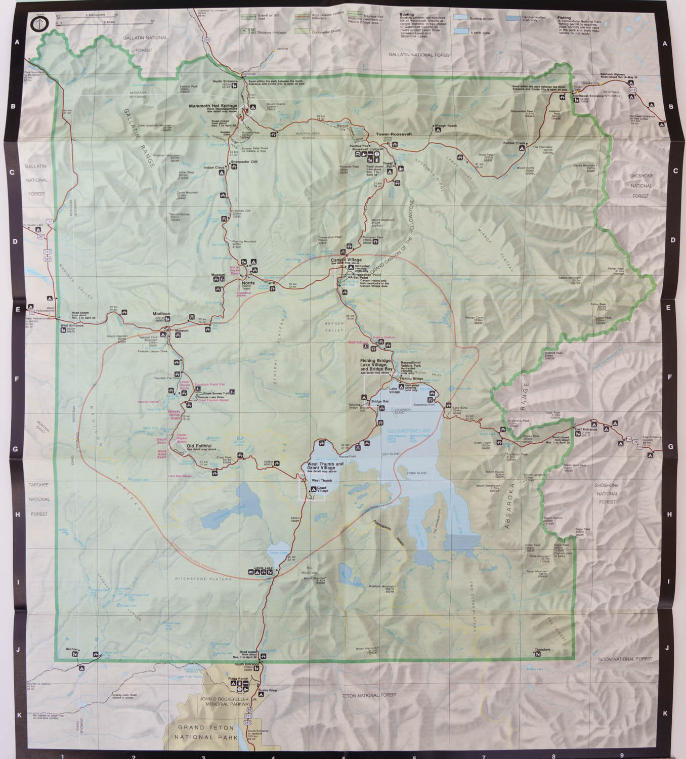
A few years after its adoption, the Unigrid standard finally brought uniformity to national park maps. The standard map formats in turn helped to establish a uniform identity for NPS brochures. Widths became either 8.25″ or 16.5″. With a few exceptions, the same pictograms and colors were adopted by all national parks. Besides the back border, one of the elements that brought a unifying look to the maps was the adoption of a light green fill and darker green ribbon to mark the park boundaries. In 1986, Yellowstone adopted the Unigrid standard. After the previous period of rapid changes, the map would stay essentially unchanged for thirty years.
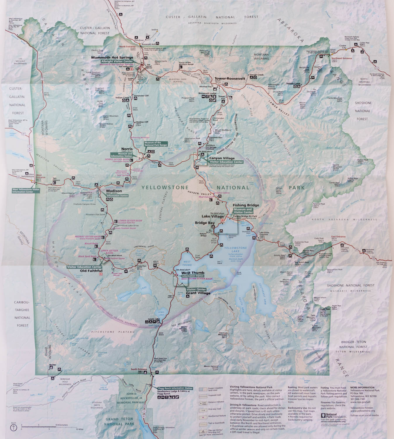
While the 2018 map may appear similar, it reflects state-of-the-art cartographic techniques. Instead of relying on hand-drawing like all the shaded relief maps before, its more precise shaded relief is directly derived from GIS data and uses subtle hue variations to suggest elevation differences, for instance, lighter colors for peaks and darker colors for valleys. Land cover information derived from digital sources has been added. This makes it possible to distinguish forests and meadows, which helps visitors find areas favorable for wildlife viewing.
National park maps continue to evolve while continuing a visual identity and useful features developed over a century. With a public domain status and high-quality design files published, they have been used in numerous projects, including my own Treasured Lands book. I am so grateful to the NPS Harpers Ferry Center for Media Services for making them available to everybody.
Part 3 of an on-going series: 1 | 2 | 3 | 4 | 5 | to be continued

Thank you, this is fascinating, and very well illustrated! I hadn’t realized that the National Park map icons for campgrounds and ranger stations, which have been a permanent part of vacations for my whole lifetime, in fact date from my childhood.
It’s interesting that they recently added the caldera boundary (it confusingly looks like a road to me in the first map where it appears) and de-emphasized the Continental Divide a bit, when it’s the divide that seems to really be a visible part of the landscape. I wonder if it’s due to increased public interest in volcanoes post-Saint-Helens – or due to rumors people see on social media that Yellowstone will erupt again and destroy us all?
Thanks, Brandon. I didn’t post the iterations of the Unigrid maps, but you would have seen that until the switch to a GIS-based map in 2018, the main changes were how the caldera was marked.
Very nice article, I love seeing the old maps and the changes that have occurred over the years. We hiked Specimen Creek last fall (and will again this October) and have always been interested in the campground and ranger station that used to be there. I seems to be removed sometime in the late 60s. There aren’t any traces of it that I noticed, presumably the current Specimen Creek trailhead parking lot is where the campground was.
I’m sure you’re aware of the recent book, “Mapping America’s National Parks,” it is an absolutely beautiful book.
Thanks, JB. That article focussed on design, but it’s also interesting to look at the changes that took place. There used to be a road to the top of Mt Washburn and a hotel on the rim of the Grand Canyon of the Yellowstone. Yes, I have the book, in some sense that article is an extension of a chapter in it.
I have found a collection of my dad’s old centennial NPS Park guides. For dozens of parks and some duplicates. He ran a park technology program training students at a small community college to work in parks all over the country. I think he kept them on hand to show his students. We visited the park during my childhood but most of these guides leftover we didn’t visit so it was a collection he kept on hand for his students to to do OJT training in the summers and maybe at the variety of parks they choose from. What would be the value of these guides today? Please email me. Thanks!
By old centennial NPS Park guides, I assume you mean guides dating from the year 1972, which was the centennial of the first national park, rather than the 2016 NPS centennial? Most park guides in 1972 were “pocket guides”, which were the most bare-bone productions in NPS history.
Because those are mostly folders rather than booklets, they are not of interest to antiquarian booksellers. Their value is determined mostly by what collectors such as me would be willing to buy them for. The main marketplace for those is eBay. If you go there, you will be able to research the price they sold for.