National Park Service Visitor Guides: A Brief History
4 Comments
A case could be made that the National Park Service (NPS), which celebrates today its 105th anniversary, would not have existed without the National Park Portfolio. In the early years, park rangers and guides were enough to provide guidance to the small number of visitors. However, as the visitation grew and visitors became more autonomous, another type of publication grew in importance: the visitor guide. The National Park Portfolio was the foundational publication of NPS, however, the map and visitor guides have become its most defining publications.
Part 1 of an on-going series: 1 | 2 | 3 | 4 | 5 | to be continued
The first thing handed at the entrance station, it explains how to use the park, as well as telling its story. Beyond its utility, mirroring the place, it served as a physical embodiment of the park, a memento of visits to many. There is much to be learned about the history of the parks in studying older visitor guides, as exemplified by the evolution of our attitudes towards bears. In this article, I will instead focus on the evolution of the cover designs. So that you have a baseline to compare them, this will be illustrated with visitor guides of two national parks, Yosemite and Grand Canyon.
1917-1942
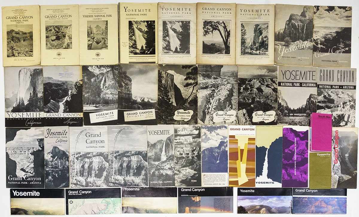
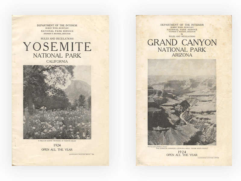
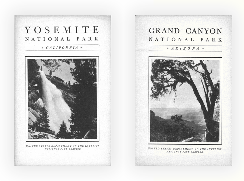
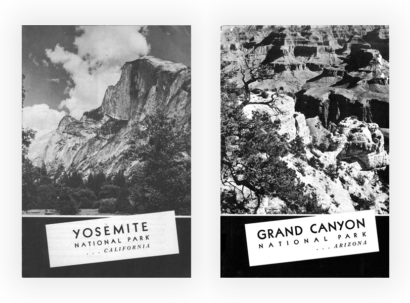
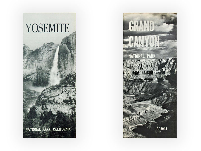
Like the National Park Portfolio fascicules, the first national park visitor guides issued by the NPS were stapled booklets of the size of the common book format of the era, 6×9 inches, sometimes referred to as “octavo”, hence I’ll call them octavo booklets. Initially, there was one for each of the 9 parks included in the Portfolio, plus Wind Cave National Park and Hot Springs Reservation. The covers were designed conservatively, with serifed type, centered and laid out symmetrically. The information on the cover, beyond the name of the park and its state, included “United States Department of the Interior” and the name of the U.S. Secretary of the Interior, “National Park Service” and the name of the NPS director, caption for the cover photo, and the opening season for the park. Other elements often found were the year of the booklet, a credit for the photo, “Government Printing Office”, and the Department of the Interior Seal. Besides those minor variations in the information included and in wording (“General Information” from 1917-1920, “Rules and Regulations” from 1921-1926, “Circular of General Information” from 1927-1932), the design remained basically the same for more than a decade. Maybe the most visible change was the switch from an off-white cover from 1917-1925, to a cream-colored cover in 1926. The booklet was often stapled in a curious way, with the staples placed 1/8″ from the spine from the first page to the last, and then a cover page of a glossy stock with photos glued over the spine.
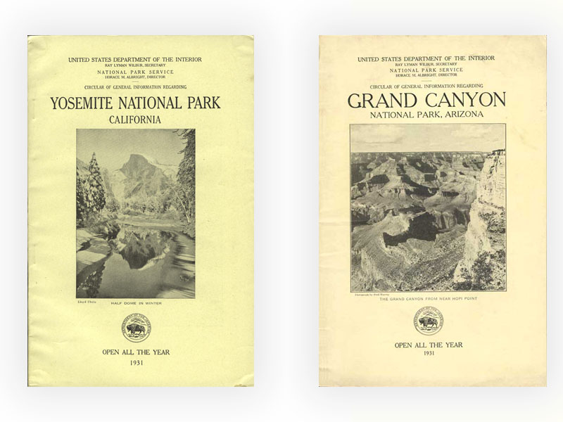
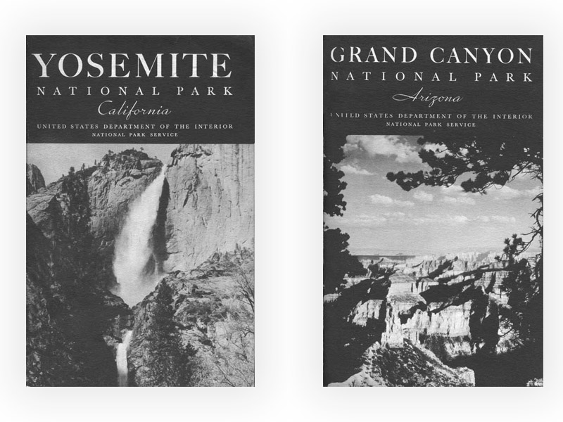
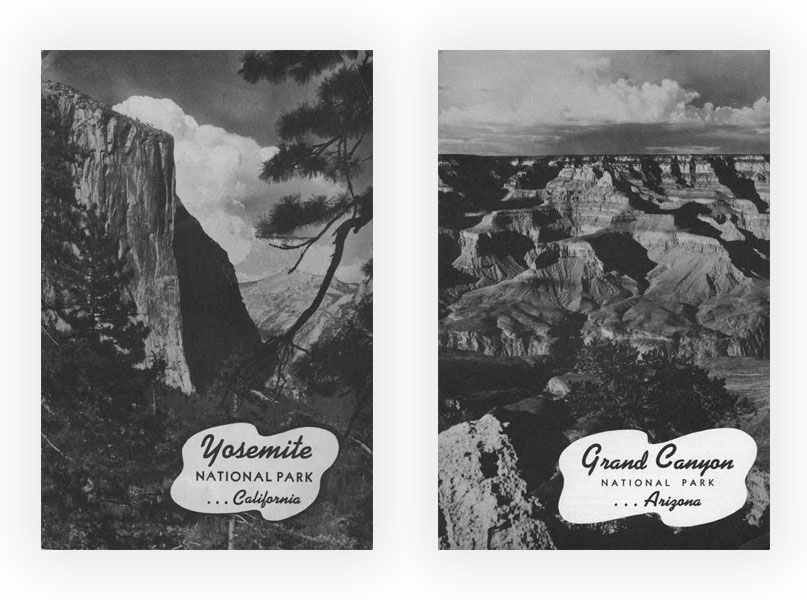
By the end of the 1920s, the number of national parks had grown to 21, and the number of visitor guides to 17. Starting from 1933, all subsequent booklets were stapled through the spine. That year 1933 saw the first cover with an asymmetrical design and a few graphic elements. From 1933 to 1942, the NPS reduced the amount of information on the booklet covers, eventually dropping all the additional details from the cover beyond the name of the park and the state. The number of pages decreased, with the most bureaucratic contents being dropped to make room for more practical visitor information. At the same time, the amount of design increased, with each year (except 1935 and 1936 that were based on the 1934 template) bringing a new cover design adopted uniformly through all the national parks. No other decade saw as many different cover designs. Some later years of that decade even saw more than one. The effort to improve the booklets in such a directed way reflected the new considerable means acquired by the NPS as the result of the New Deal and the 1933 reorganization. From 1934 to 1938, the booklet covers were made of a thicker, textured paper (almost cardboard). For the first time in 1939, the same paper stock was used for inside pages and cover pages.
Mid 1940s to early 1960s
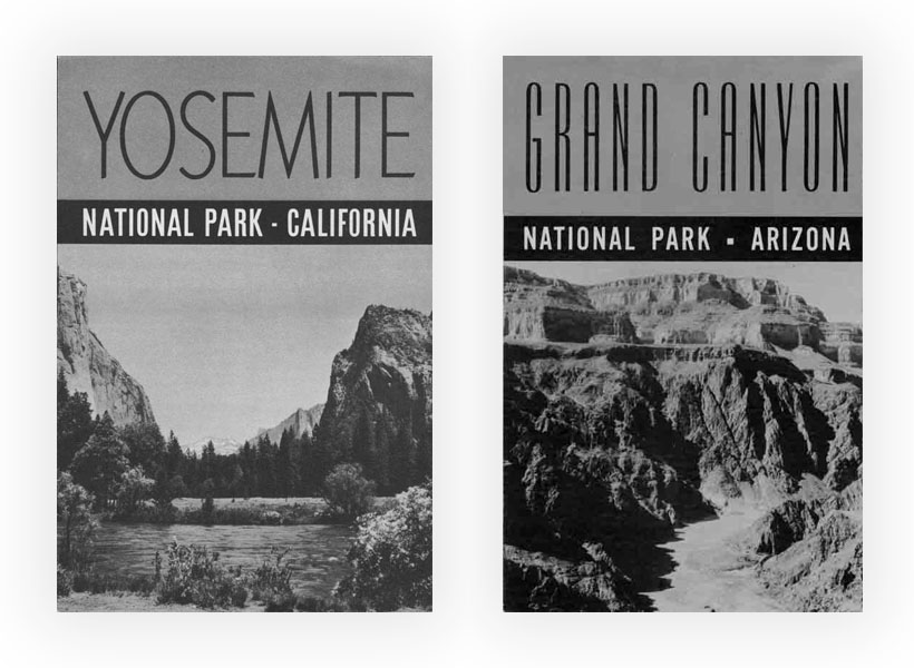
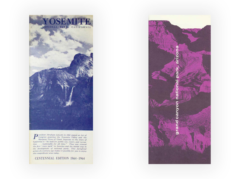
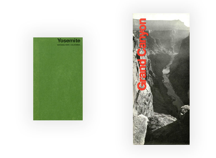
With a few exceptions, no new visitor guides were issued during the war, during which visitation dropped dramatically while some parks were turned into rest, recuperation, and recreation camps for soldiers. After it ended, in the free-wheeling post-war years, uniform design standards were relaxed – much more so than is apparent from our two examples. In 1946, out of the 26 national park visitor guides, 12 were 6×9 booklets or folders and 14 had a narrower 4×9 format, that I’ll refer to as envelope-sized brochures. By the mid-1960s, all had transitioned to a fold-out brochure with the narrower format. Not only it was more practical to carry, it could be mailed into a standard business envelope, but also, once unfolded, it allowed for a larger map. However, the way the brochures unfolded was far from uniform. Some opened vertically and horizontally onto a single sheet, others opened only horizontally. Among those, some were simply unfolded, but others were 8×9 stapled pages that were folded into 4×9 and then opened to 16×9 spreads.
Mid 1960s
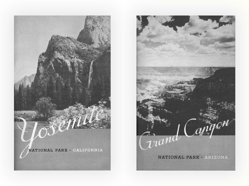
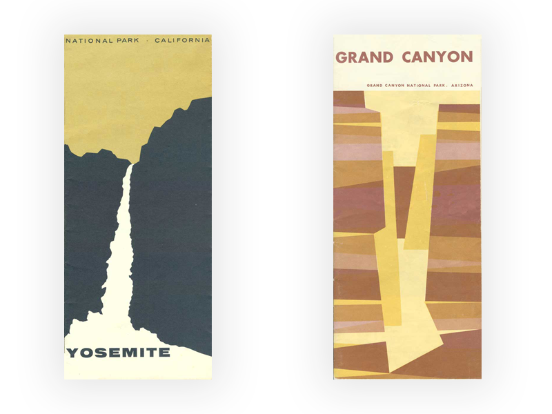
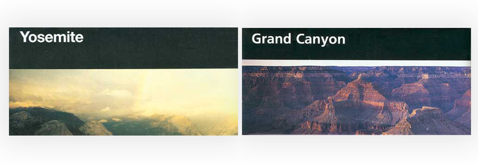
In the decade after the war, park visitation increased substantially, creating strain on staffing and infrastructure that was still geared to pre-war visitation levels. In 1955 a long term action plan designed to improve and develop facilities was inaugurated and dubbed “Mission 66.” The 50th anniversary of the National Park Service in 1966 marked the completion of those infrastructure projects – still the backbone of many parks – the only time besides the New Deal years when the NPS was fully funded. The mid-60s saw not only the introduction of color on the visitor guide covers but also, for some parks, they featured for the first time graphic design rather than photographs. Others continued to use photography, but often in a more abstract way, featuring a close-up rather than a wide landscape. This was the period with the most creative diversity in design among the covers.
1970s
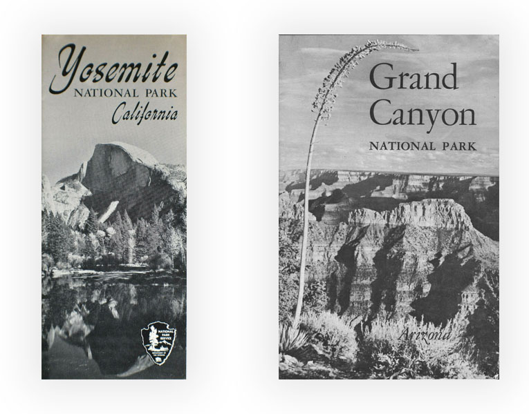
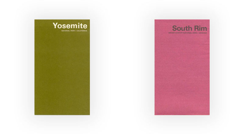
Maybe as a reaction to that kaleidoscopic approach, in the late 60s, a new design standard, nicknamed pocket guides or minifolders emerged for most parks (35 of them) – although not adopted by all of them. The cover consisted of a colored plain background, with the name of the park in either white or black type. Many different colors were used for the covers, so the collection of the visitor guides looked like a rainbow of colors.
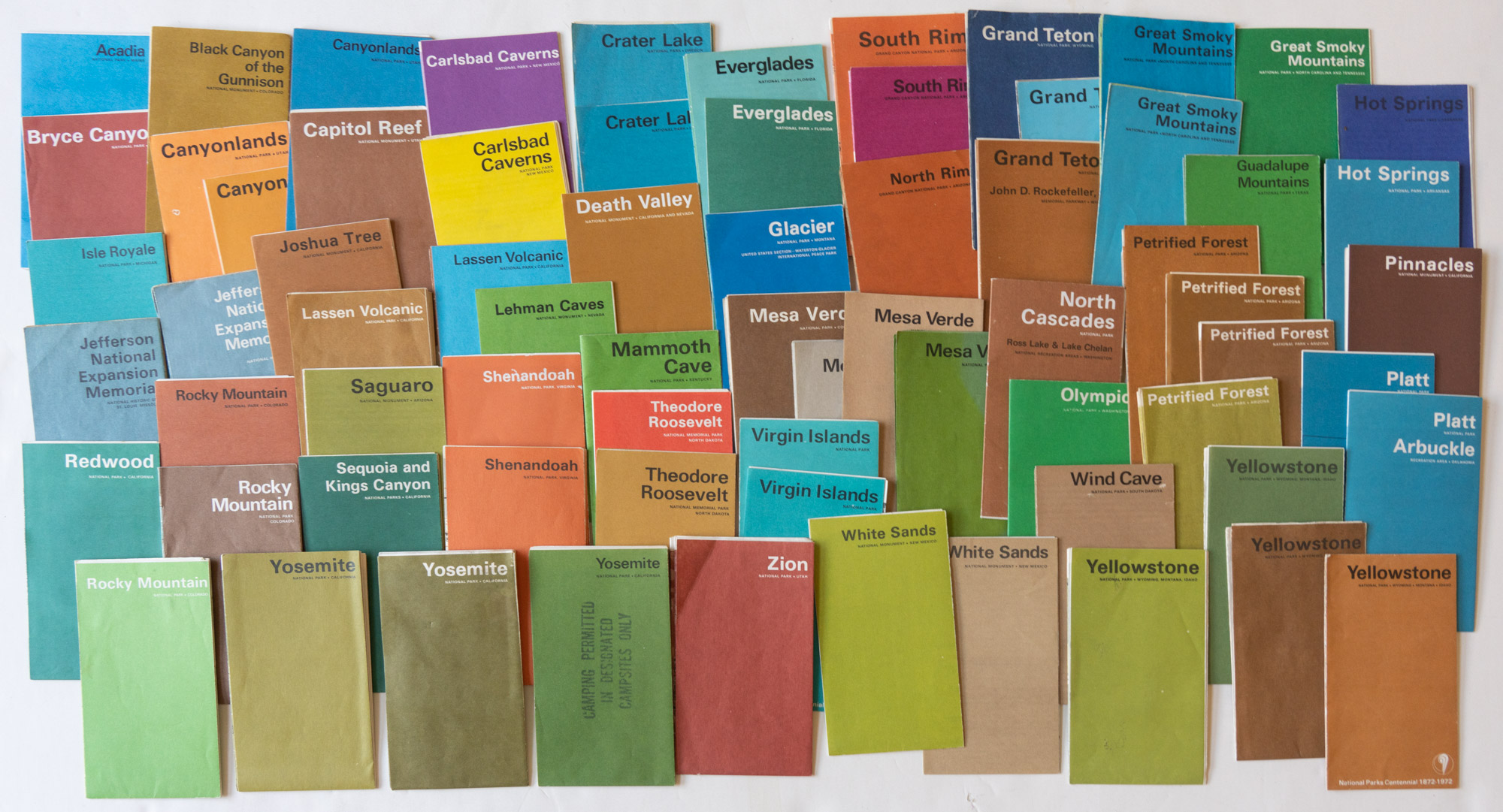
Reflecting the slowing rate of economic growth and the increase in park visitation, the brochures were more spare and economical. They folded both ways to an unprecedented small format of 3 1/4″ x 5 5/8″ and while the number of panels varied, many of them typically opened to a size 10 1/4″ x 16 1/4″ once unfolded, leaving relatively little room for information. For some parks such as Yosemite, the pocket guides design lasted until the 1980s, when all the visitor guides transitioned to the Unigrid standard described next. Some subsequently introduced extended pocket guides that share all characteristics of the standard pocket guides except for a larger height of 7″. Other parks such as the Grand Canyon experimented with a return to the larger enveloped-sized brochure format, now folded both ways, in order to accommodate more information. Thus visitor guides continued to reflect the spread-out nature of the park system.
1980s to present day
This started to change in 1977, when renowned designer Massimo Vignelli introduced the Unigrid standard (NPS’s Design specifications and A Brief History of the Unigrid). The most visible characteristic was the black band at the top with large white sans-serif type, initially Helvetica, for the park name that today remains one of the main “branding” elements of the NPS. But more important was the grid itself, based on the 8 1/4″ x 4″ panel corresponding to fold lines that could flexibly be used in single-width or double-width combinations and repeated up to six times in height. Standardized among all NPS units, the new system not only contributed to a unified visual identity but also allowed for a cost-effective way to mass-produce an array of brochures of different extents, making it possible to carry an amount of information as comprehensive as needed for a particular park. The first unigrids appeared in 1978, and by 1996, all the national parks had fully transitioned to the new system. Although Vignelli made many other contributions that affected our everyday life, he recognized that
… of all the projects I have worked on during my long career in design, this one has affected more people than any other …With its effectiveness, the Unigrid came to embody the mission of the NPS to make the parks accessible to the people. Its consistency at last reflected the General Authorities Act of August 18, 1970 that declared the various types of park units to be part of a single system.
I have been collecting NPS visitor guides with an eye towards compiling a combined history of the NPS and of graphic design. My 28 years of travel to the national parks has resulted in a voluminous collection, but since I started in 1993, I was missing the pre-unigrid visitor guides. Unlike books, they are ephemera that were given away, not cataloged, and overall quite elusive. If you have some for which you’d like to find a good home, especially from those NPS units that are currently designated national parks, I’d appreciate it if you let me know!
Part 1 of an on-going series: 1 | 2 | 3 | 4 | 5 | to be continued

Good article about the NPS brochures. I am also a collector. Am interested in trading with fellow collectors. I also have compiled a spreadsheet documenting all known unigrid brochures. If you are interested, I can send this to you. It also has a list of my extras. Let me know your email if you want it
Bruce
Bruce’s spreadsheets are a comprehensive resource that required a great amount of work. A great reference for anybody collecting unigrids, thanks for putting them together! This system hides users email for privacy, but if you want to contact Bruce, just email me.
I appreciate this very thorough review of the variations and their characteristics over the years. Thank you for taking the time to put it together and share it.
I am trying to learn more about the park brochures pre-1917. They were, of course, pre-National Park Service, but were still National Parks, and their “booklets” issued by the Dept of Interior are very official.
Are you aware of any official park brochures/booklets prior to 1912? If so which and what years? What formats?
Between 1912 and 1920 which years and which parks had official park booklets (Dept of Interior or NPS)? The NPS shows some on its website, but is missing many (most) parks that existed at the time—it isn’t clear if it just doesn’t have examples of these, or if they did not exist. Did all parks have them? Which parks in those years had them? Do you have any insights?
In 1916 and 1917, when the Portfolio was published, did the Dep. of Interior/NPS also publish brochures? All parks?
I have not seen anything prior to 1912. The site https://npshistory.com has some booklets for the years:
1912, 1913, 1914, 1915, 1916 (DOI)
1917, 1919, 1920 (NPS)
I don’t know which parks had booklets from 1912-1915, however starting from 1916, at the end of each booklet, there is a section entitled “Other National Parks”, which is, of course, authoritative. Here is Yellowstone 1916:
The list is unchanged in 1917. Casa Grande was removed in 1919. Grand Canyon was added in 1920.