Quick Processing Tip: White Application Background
2 Comments
There is no denying that photos look great on a computer screen, because of the transmissive nature of it, like a slide or transparency. However, in an all-digital workflow, it is all too easy to produce images whose tones are too dark. Often, photographers who do not often make prints realize that their images are too dark only after printing them, and in my experience, this is the main source of disappointment with prints. Overly dark images have less general appeal. This is not a matter of technical knowledge, but rather having a proper context to evaluate images. In this post, I’ll provide an easy-to-implement tip that has helped me much.
Rather than recording the actual light intensity like a camera, the human visual system relies on context and adaptation to make judgments of brightness. This results in a number of counter-intuitive phenomena, called optical illusions, that have been well-documented by perception psychologists. Here is one such example: which of the two areas of the central grey bar, marked A and B, is brighter?

The answer is that despite appearing to exhibit a gradient, the central grey bar is a uniform 50% grey, and therefore A and B have the same brightness. A appears brighter because it is surrounded by darker values. The lesson here is that if your surround your image with dark values, it will make it sound brighter than it really is.
Many photo editing applications provide as a default background a 50% grey. Lightroom has even the popular “Lights Out” function (shortcut key “L”) that blacks out the workspace. It is supposed to help you view your photo without distraction, but if you use it to judge its brightness, I can bet that you will end up processing your photo too dark. This is especially true if your ultimate goal is a print, but even on a screen, the photo will appear too dark when placed o a white page such as this one. Some websites allow the viewer to change the background color from white to black, and I’ve seen some nature landscape photographers recommend to their readers to use the later for a viewing experience that does justice to their photos!
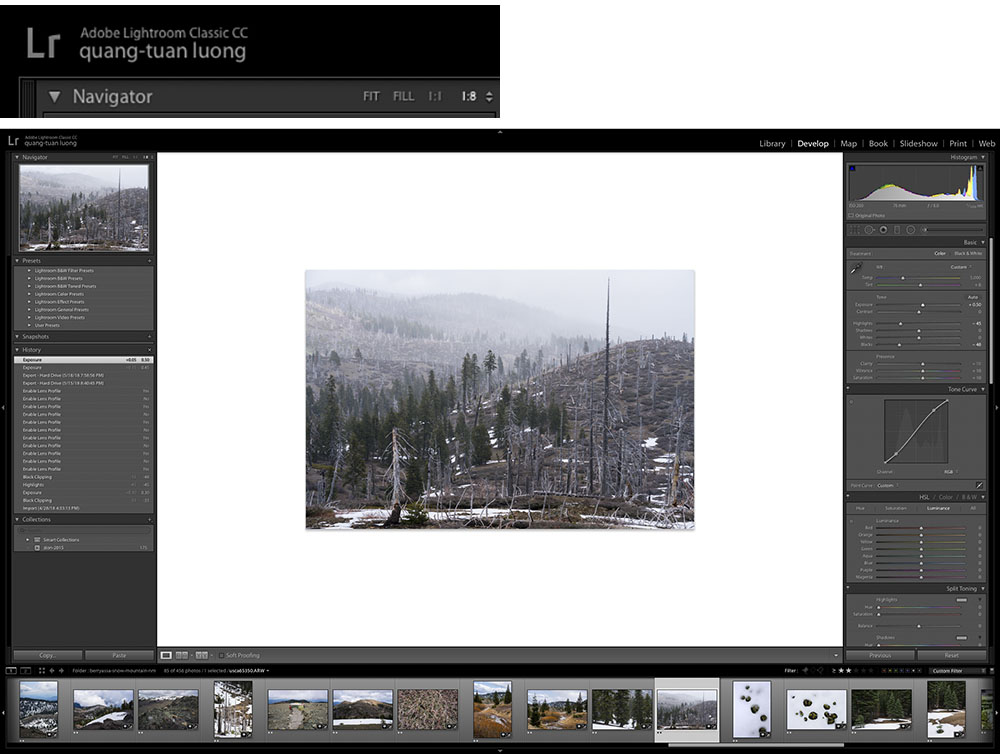
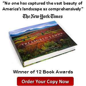
My recommendation is to process images with the background color set to white. This can be done in Photoshop in Photoshop > Preferences > Interface, and in Lightroom with Lightroom > Preferences > Interface. In Lightroom, to get a generous amount of white space around your photo, in the Navigator window at the top left of the screen, select 1:8.
Think about the fact that if your photo ends up displayed in a gallery or museum, there are great chances are that it will be surrounded by a white mat! And even in more modest settings, are your own walls light or dark colored? With that in mind, it does make sense to use a white application background, doesn’t it?

Hi QT,
Another way to change the background in LR is to right click anywhere on the border and a drop-down menu with the different background colors will appear. Just click on the color you want.
I’ve just changed mine to white!
Pearl
Hi QT, This is something I haven’t thought of and it’s a really good suggestion. I tend to have my PC and Laptop screen brightness lowered, which also helps. Look forward to more tips. Many thanks. Paul