Landscapes where I Live, Monochrome vs. Color
7 Comments
https://www.terragalleria.com/blog/landscapes-where-i-live-monochrome-vs-color
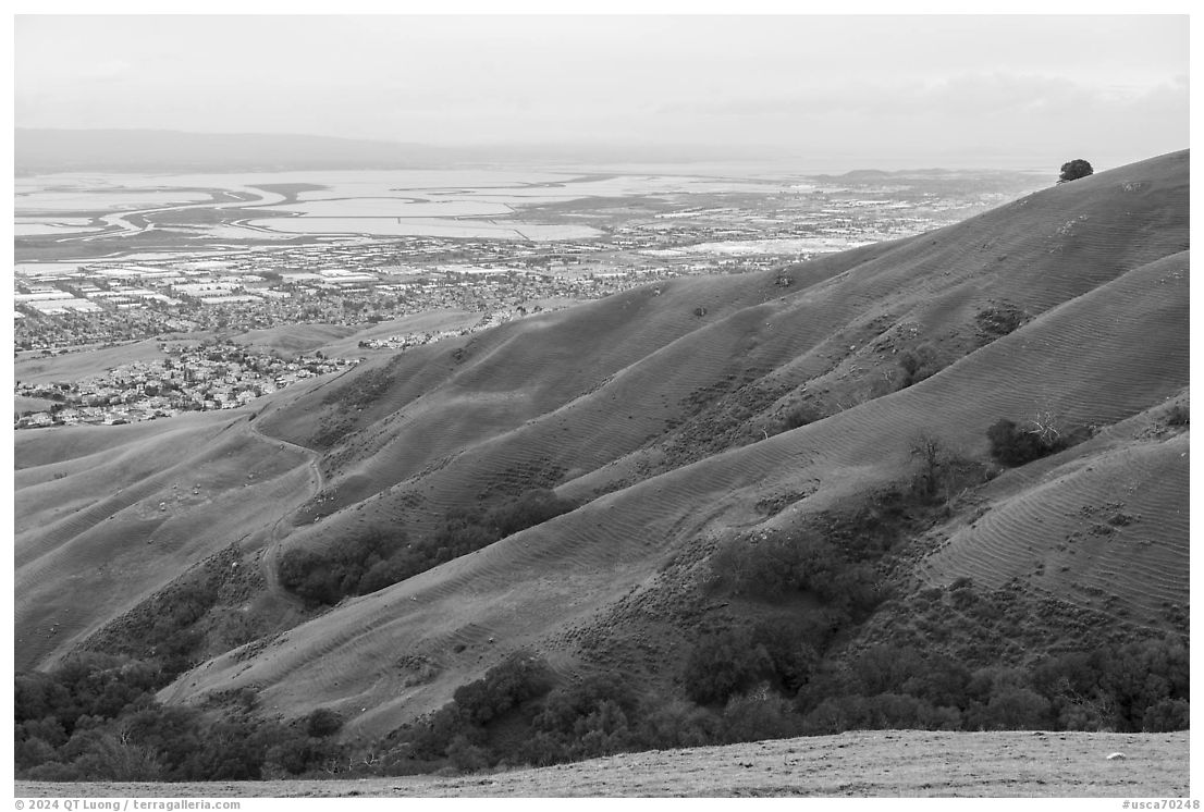
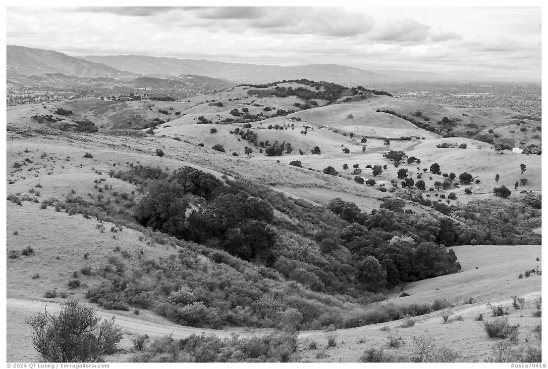
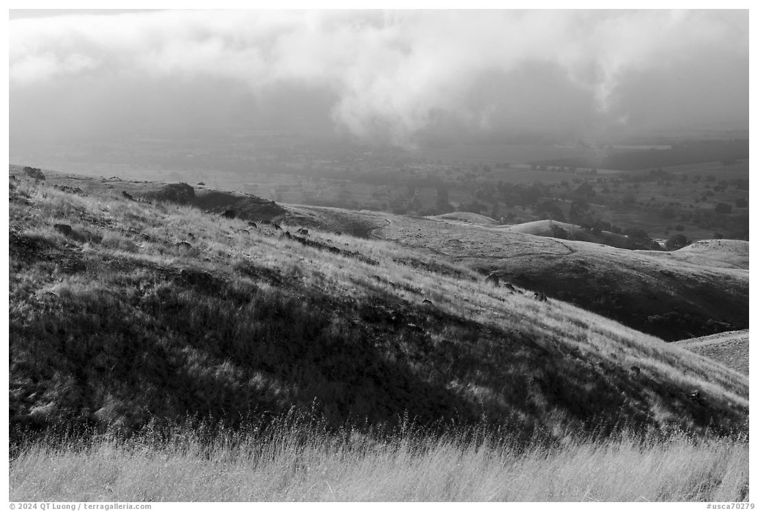
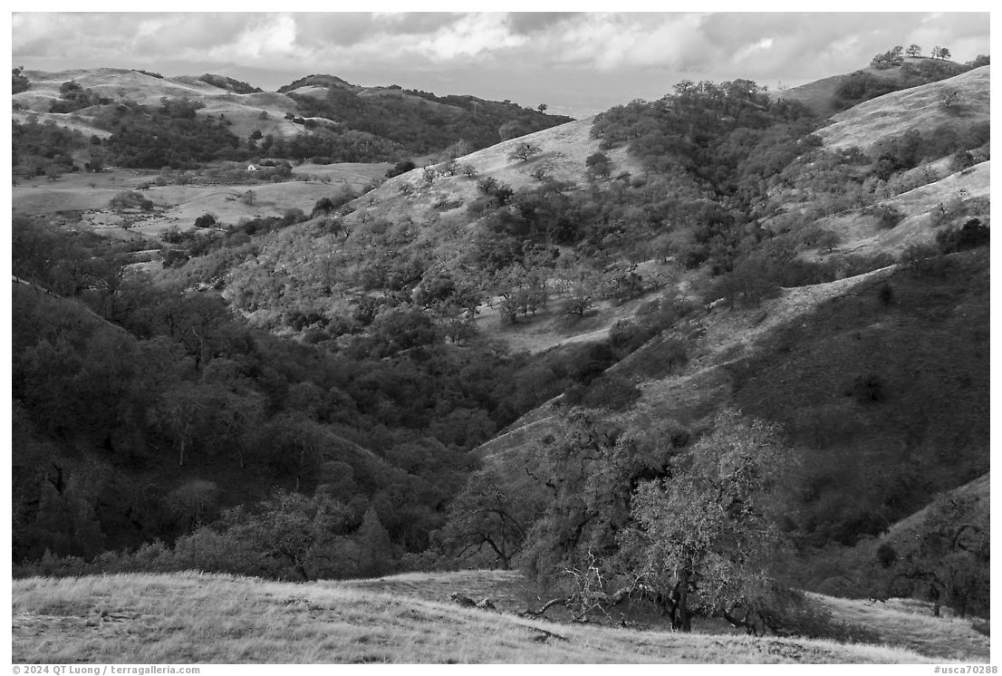
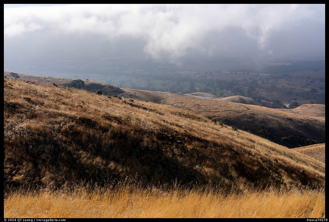
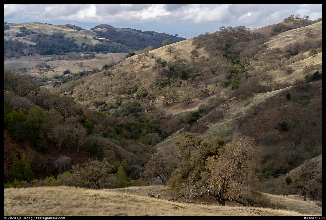
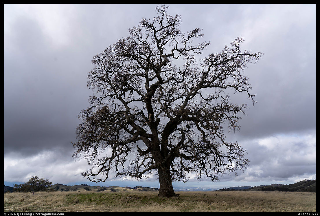
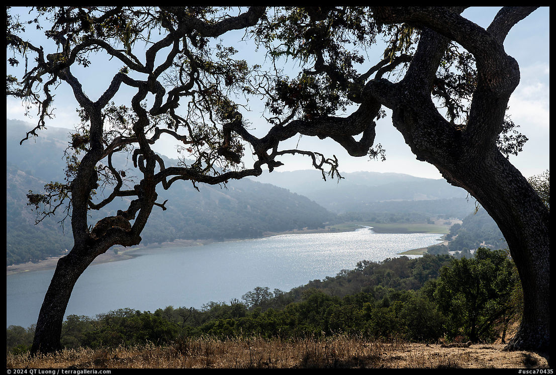
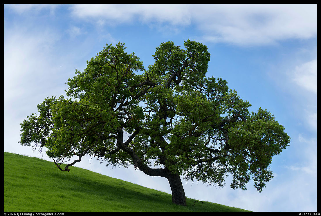
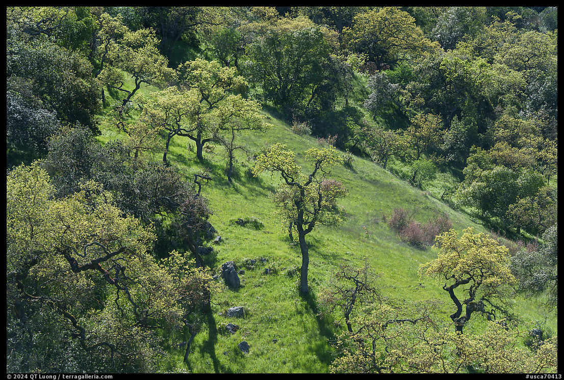
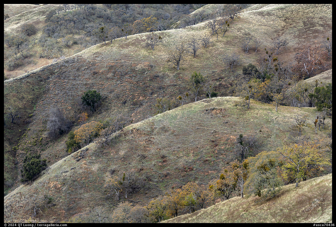
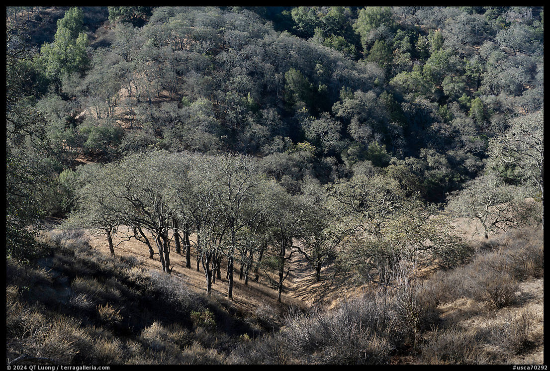
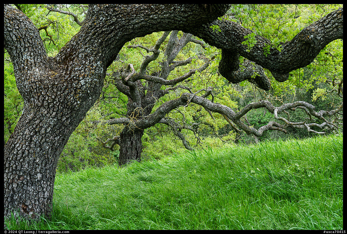
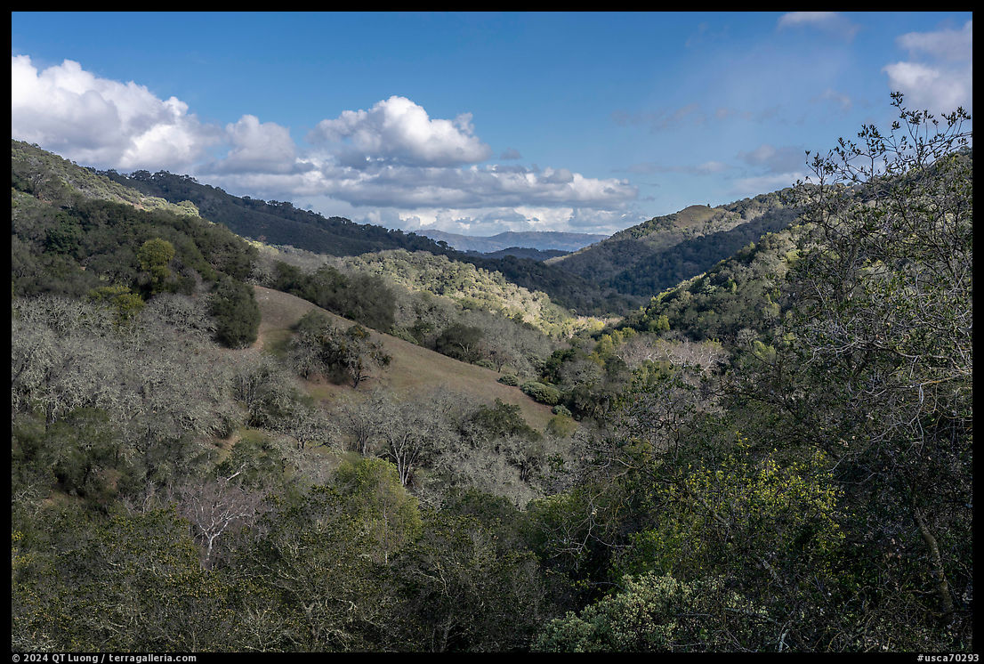
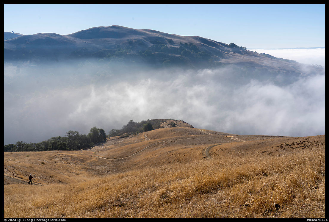
After chasing the light and seasons in national parks across the country, a few months ago I released the first installment of a new body of work: twenty-five landscape photographs made where I live, which means in public lands within half an hour from home. This follow-up presents twenty-five more monochrome images from that body of work. It is uncommon to juxtapose monochrome and color versions of the same images, but that is the main gist of this post, which also presents the color versions. Despite being rich in images and light on words, I hope it inspires thoughts and would love to hear from you.
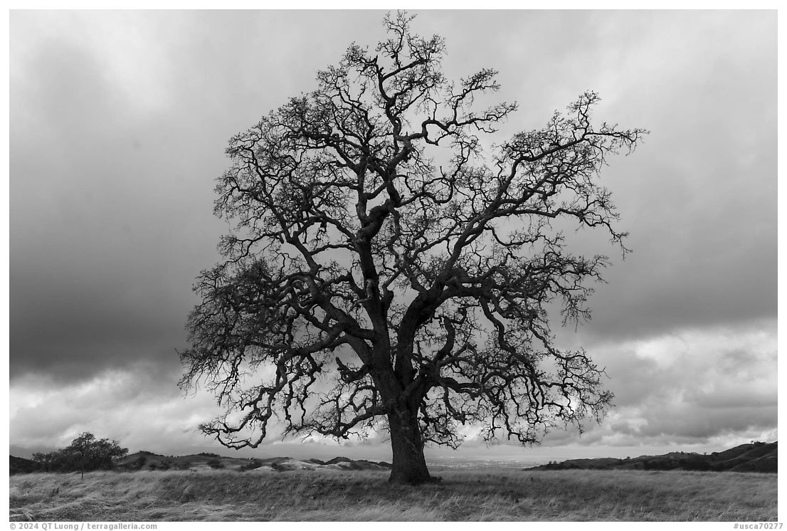
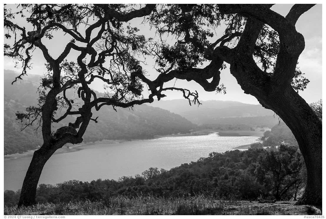
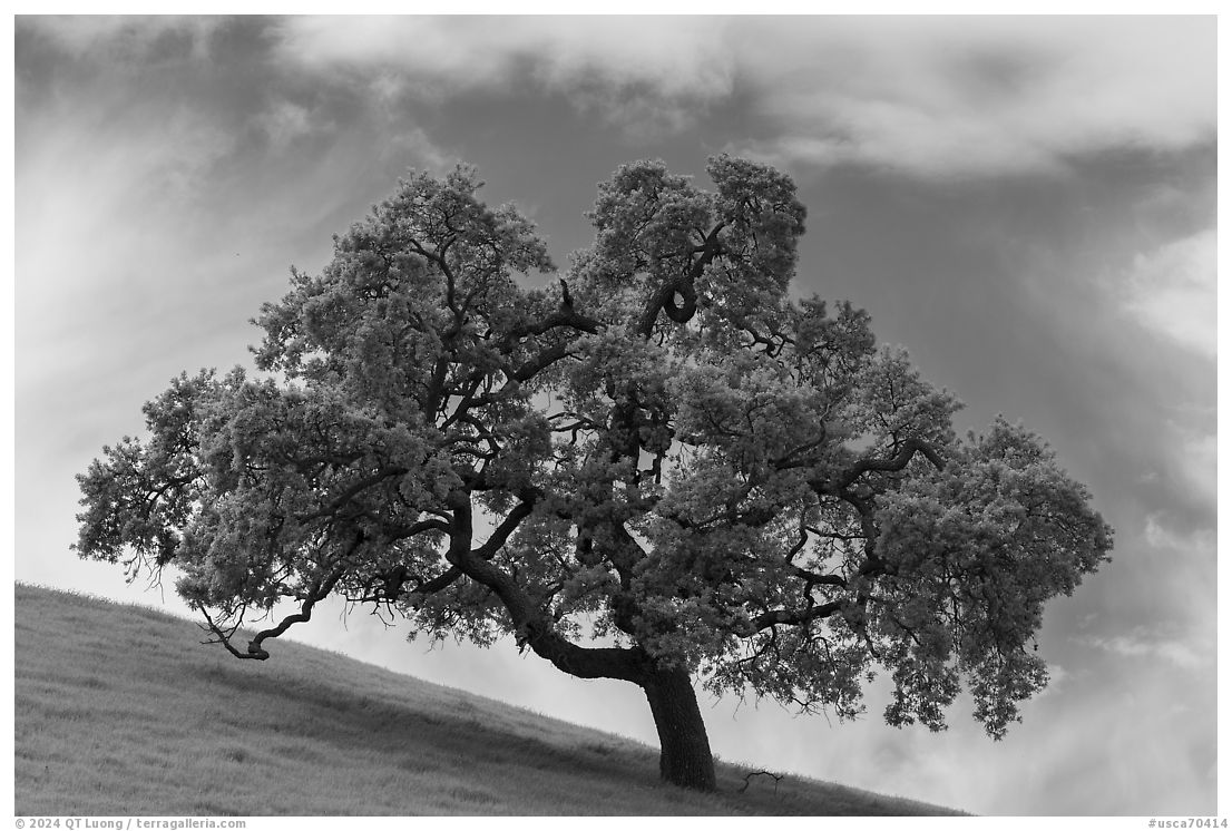
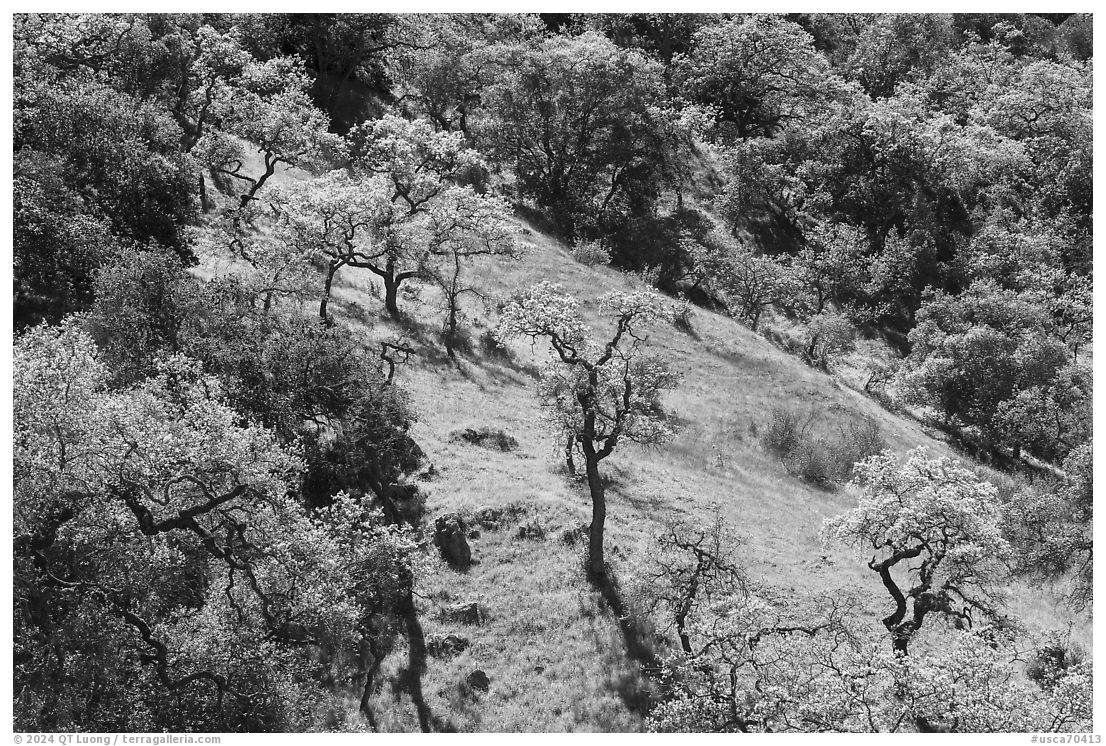
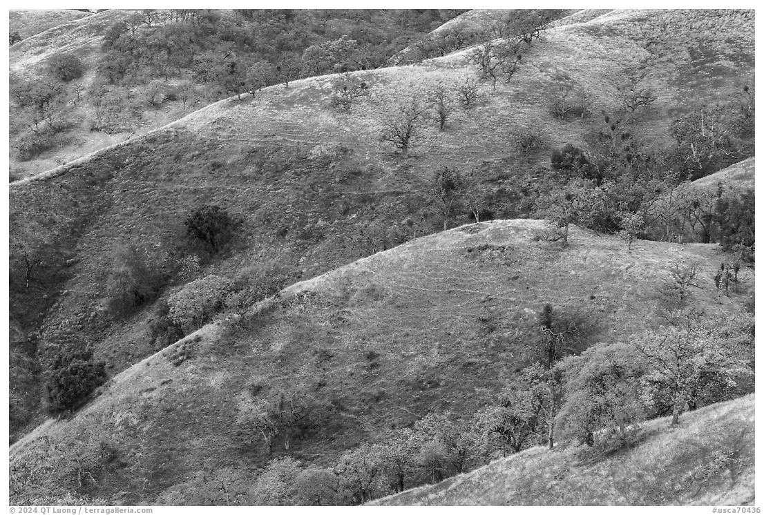
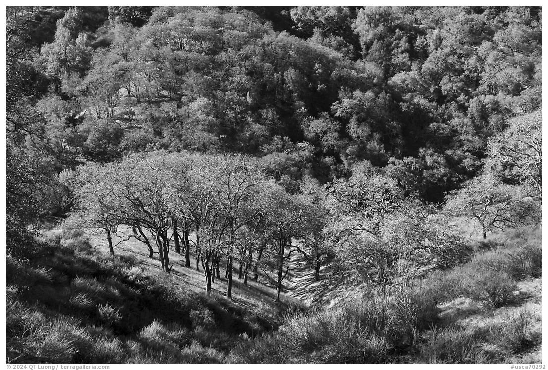
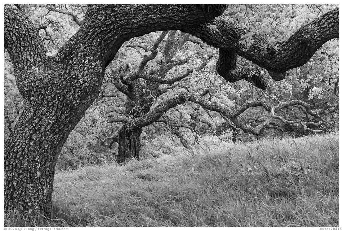
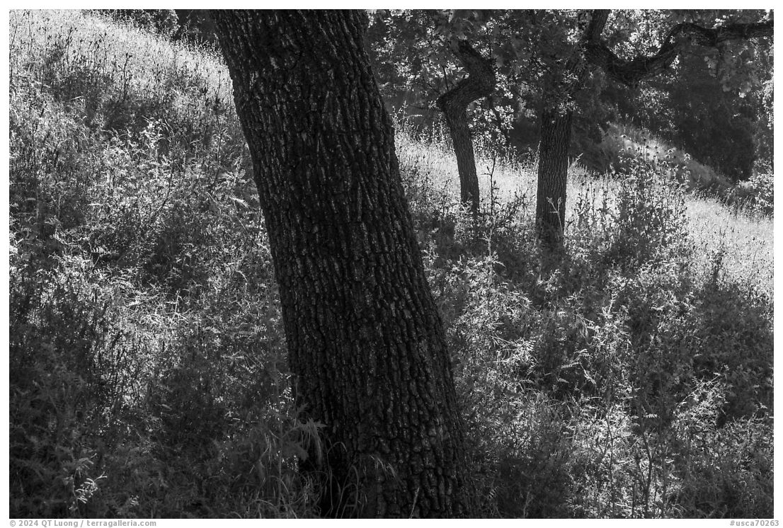
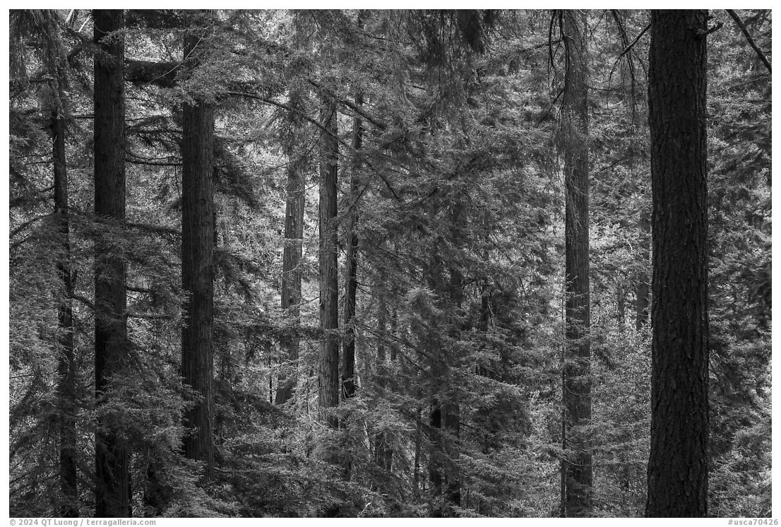
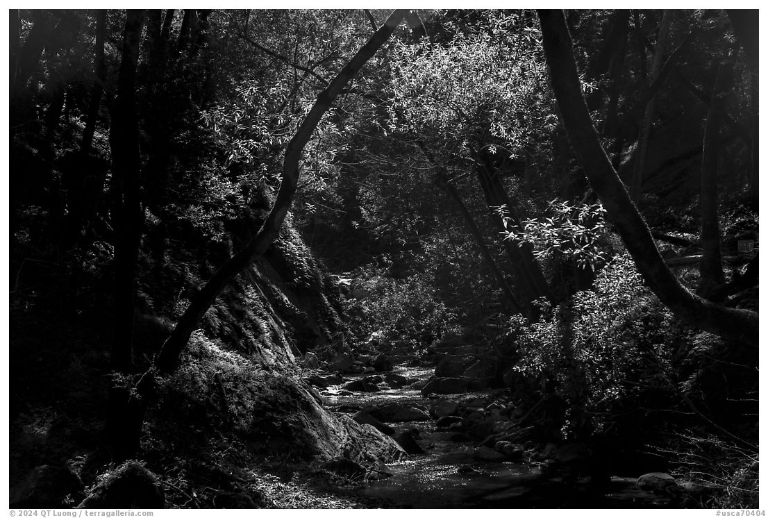
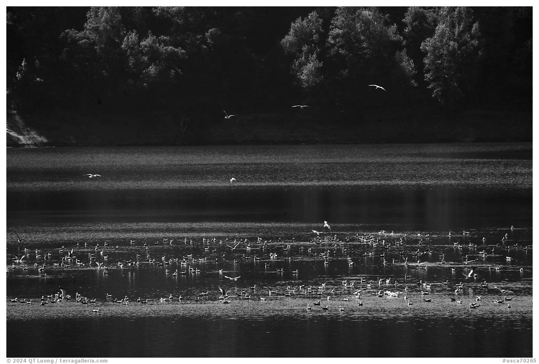
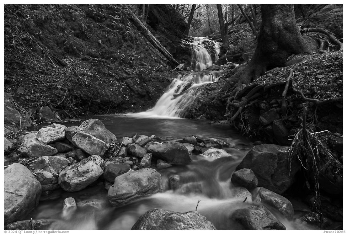
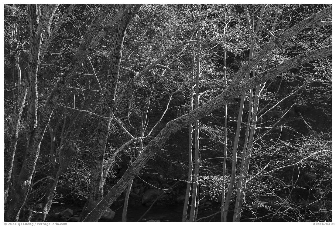
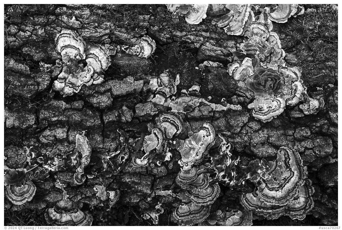
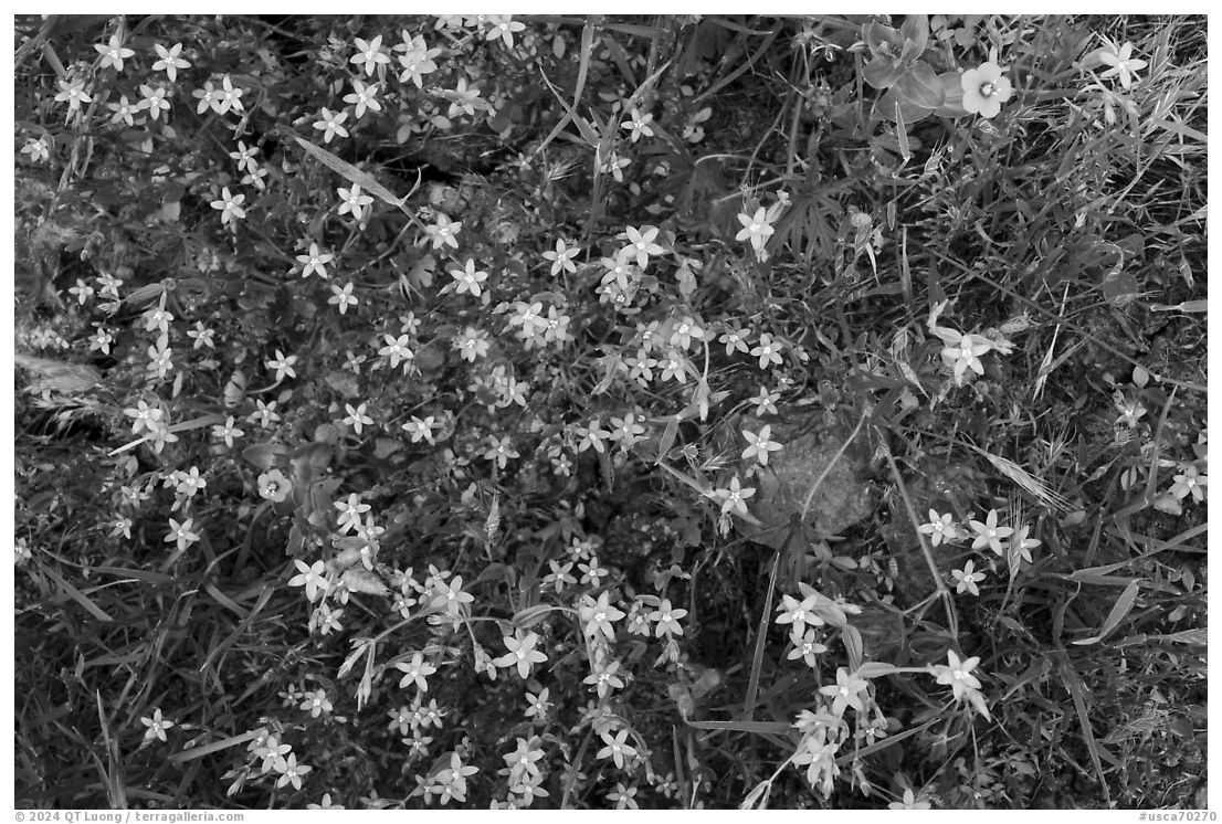
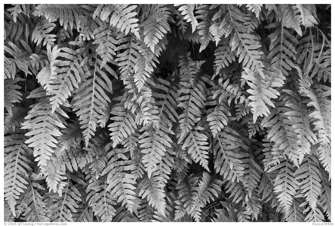
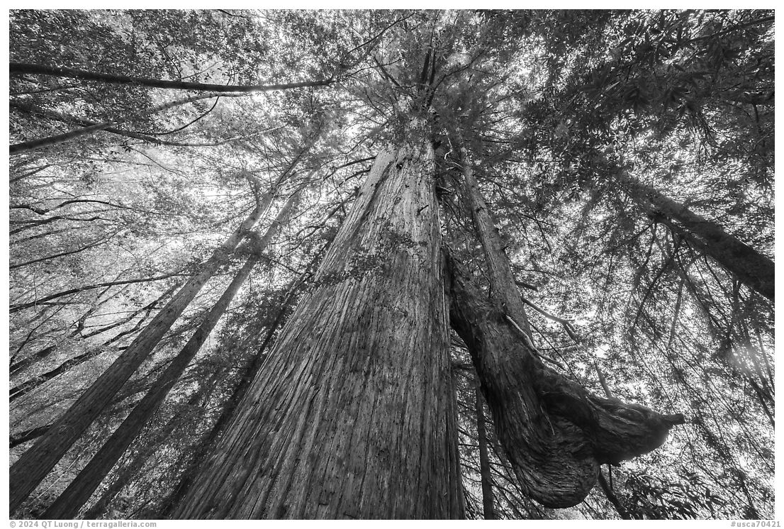
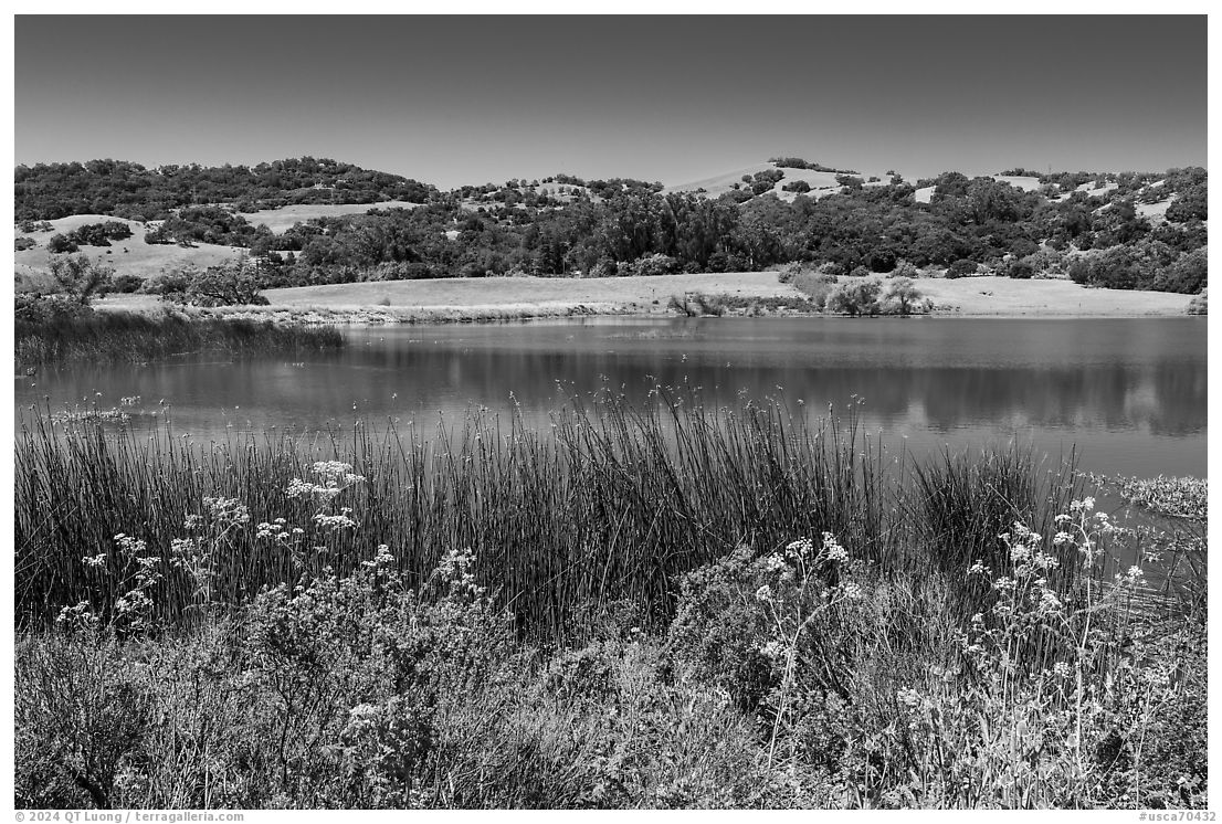
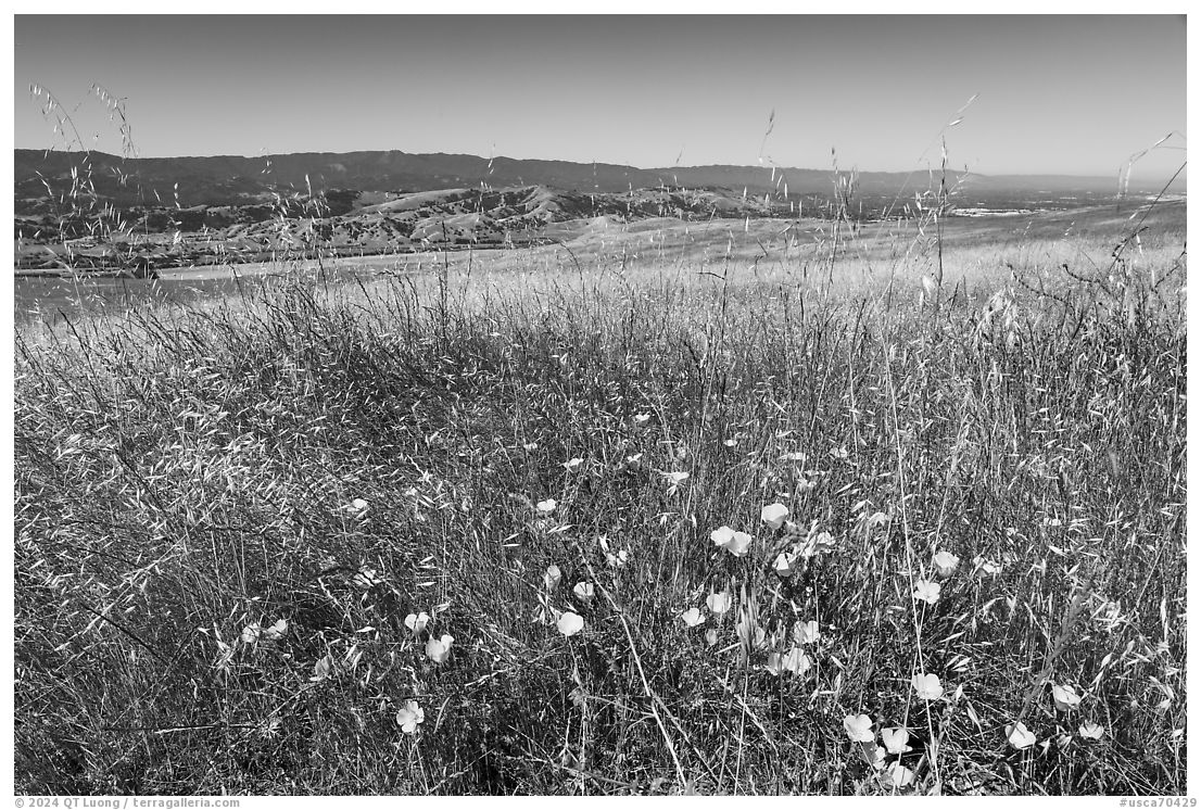
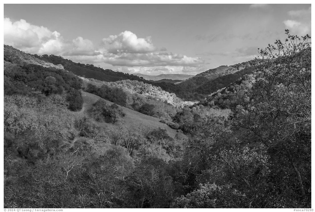
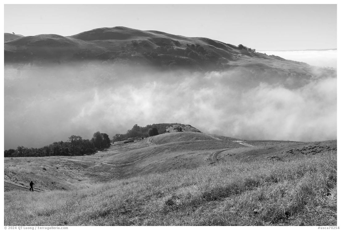
In the first installment of this series, I showed only the finished black and white photographs and asked whether you thought they missed “something” by being monochrome. That something was left to the imagination. It could have been many things beyond the presence of color itself. In black-and-white photographs, viewers use their imagination to infer not only what the colors might be, but also what facts they may convey, for example in this series the season of the year, and what emotions or moods they might evoke. The question mobilized the power of imagination in creating a complete and vivid experience from a seemingly incomplete visual representation, which is something that generally one does more when viewing black and white photography, although it is a task prompted by all photographs. That’s positive since imagination transforms the act of viewing photographs from a passive activity into an interactive and deeply personal experience. However, this made answering the question even more subjective.
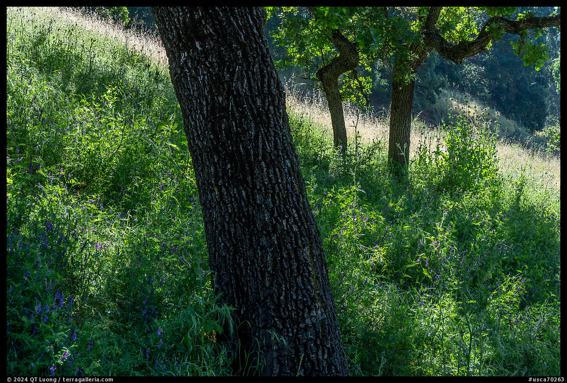
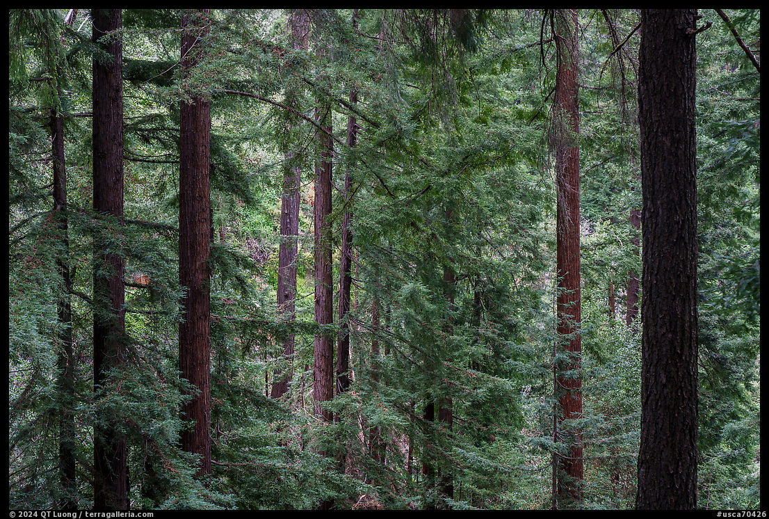
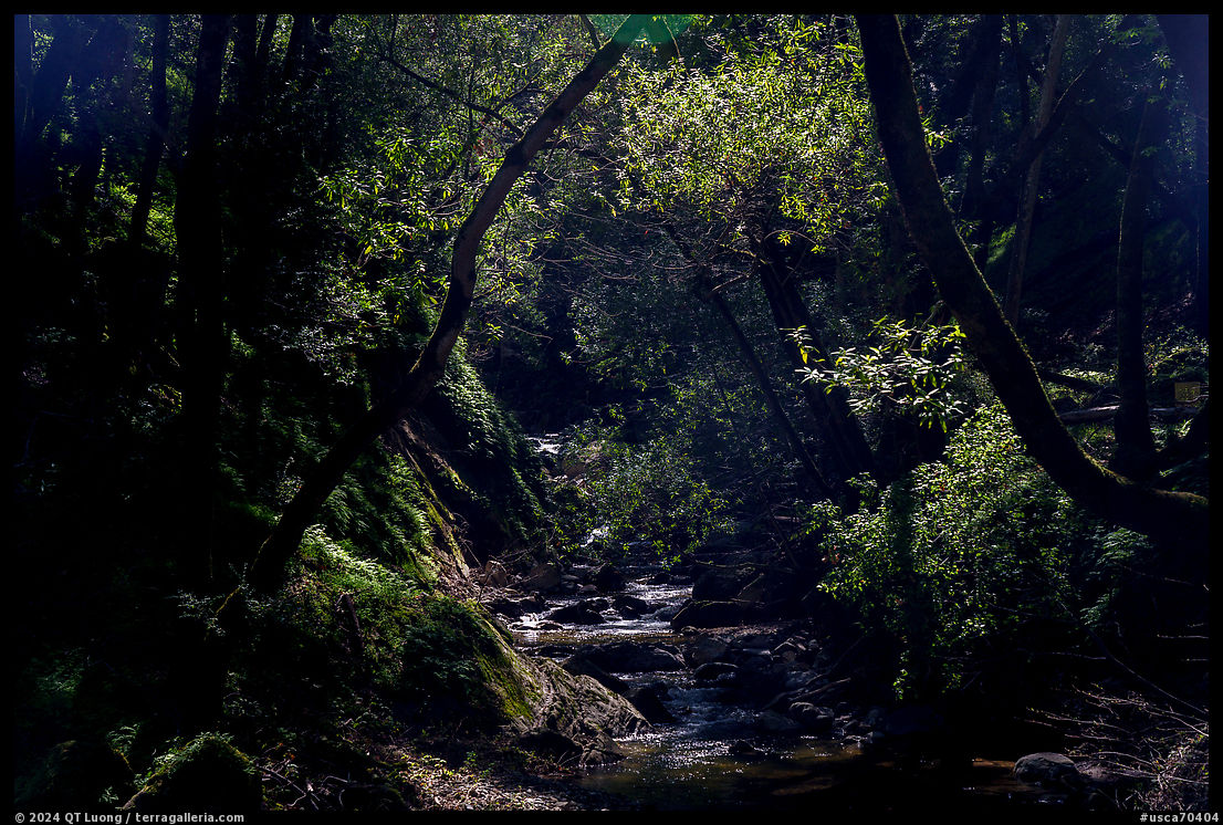
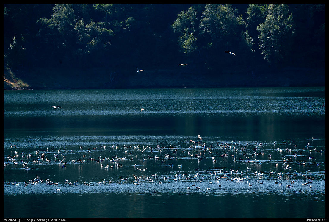
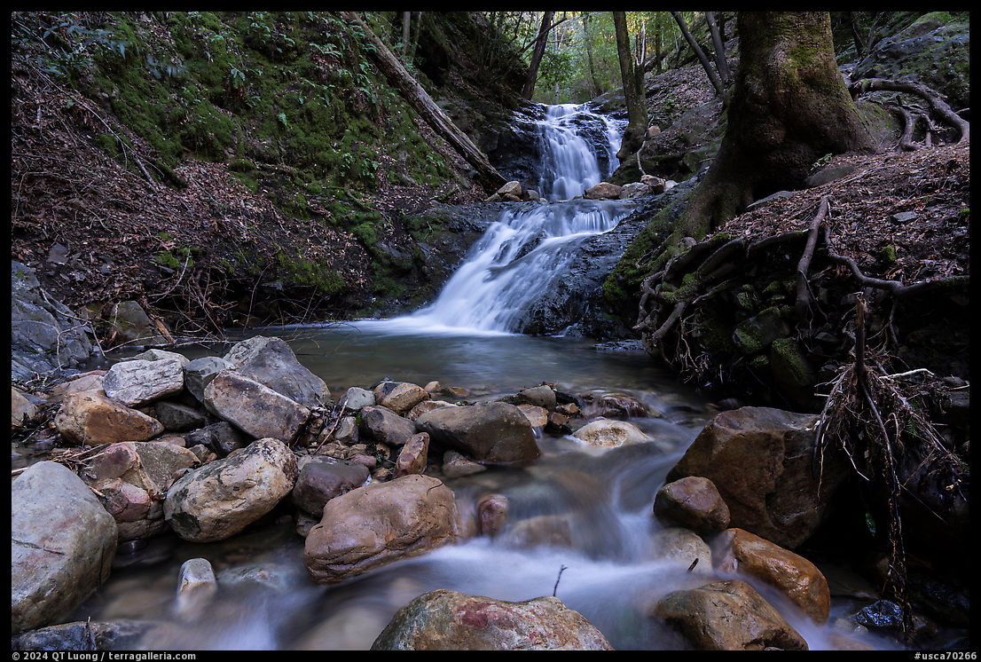
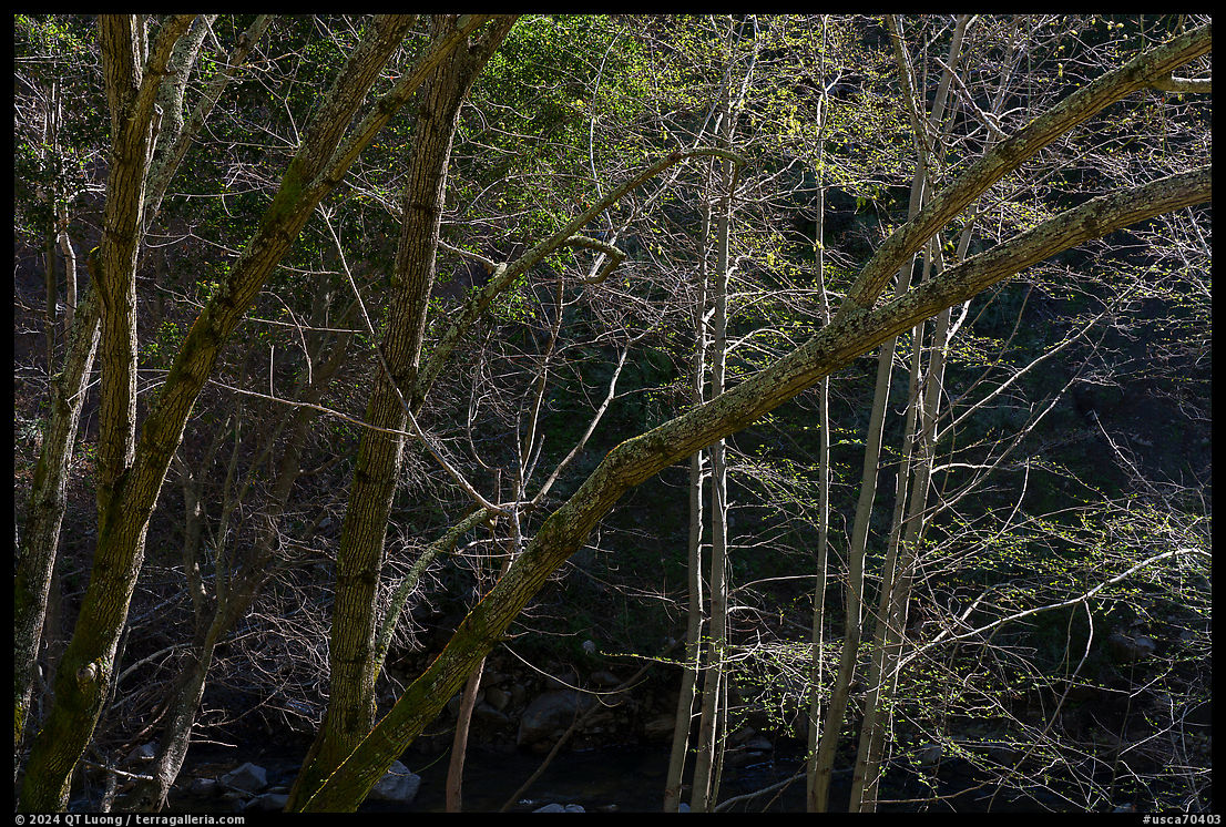
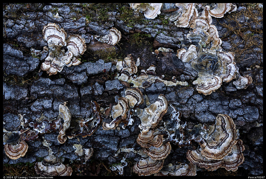
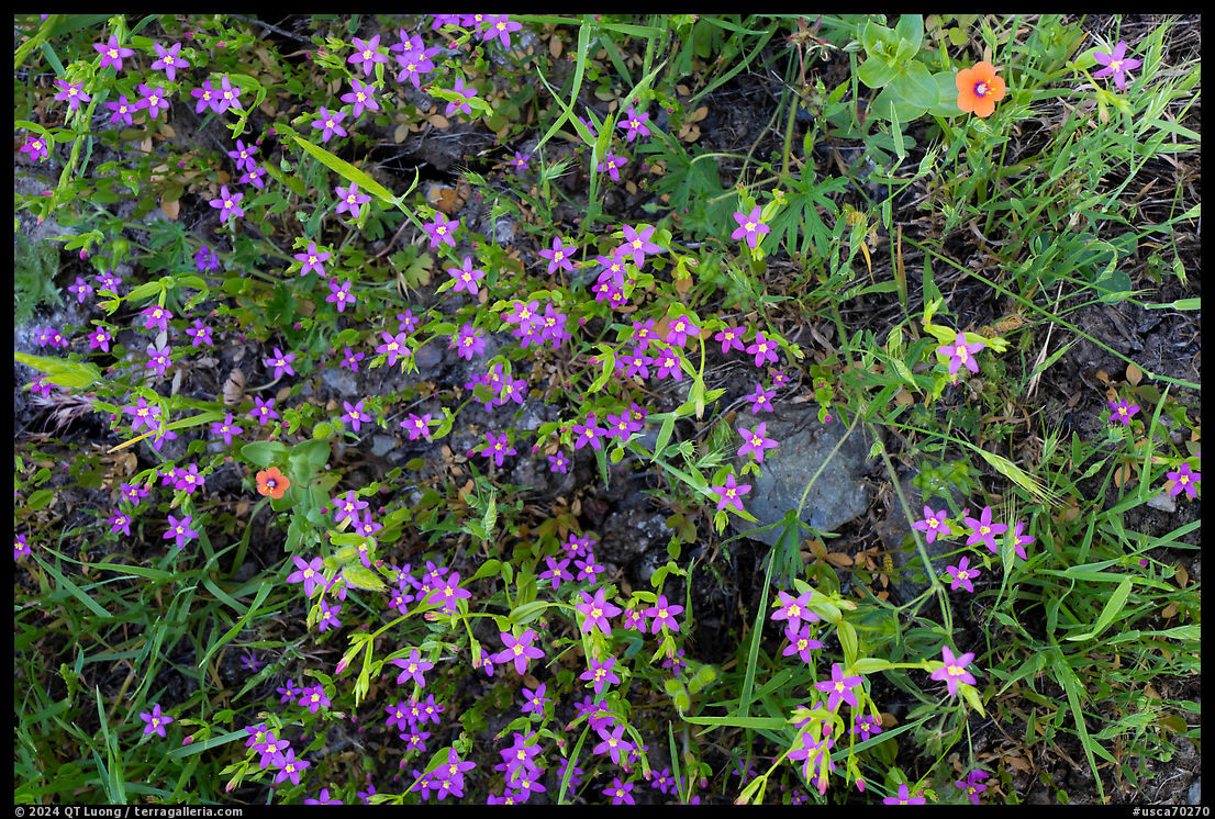
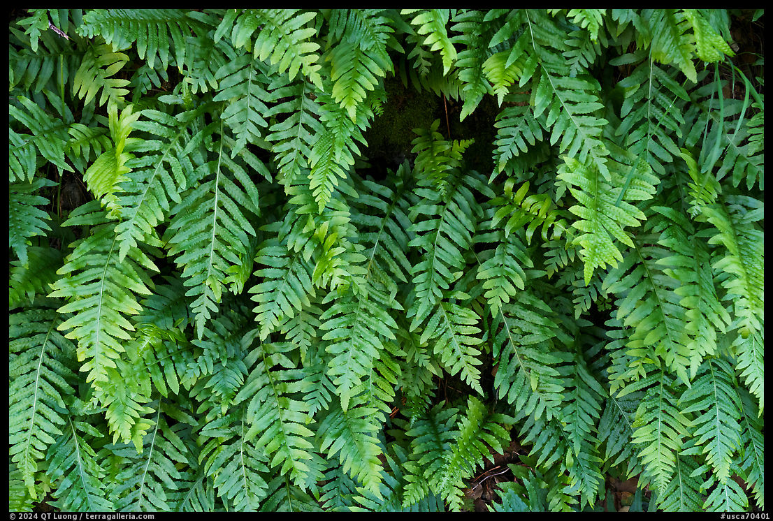
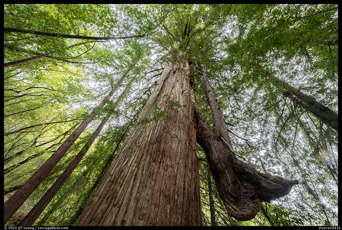
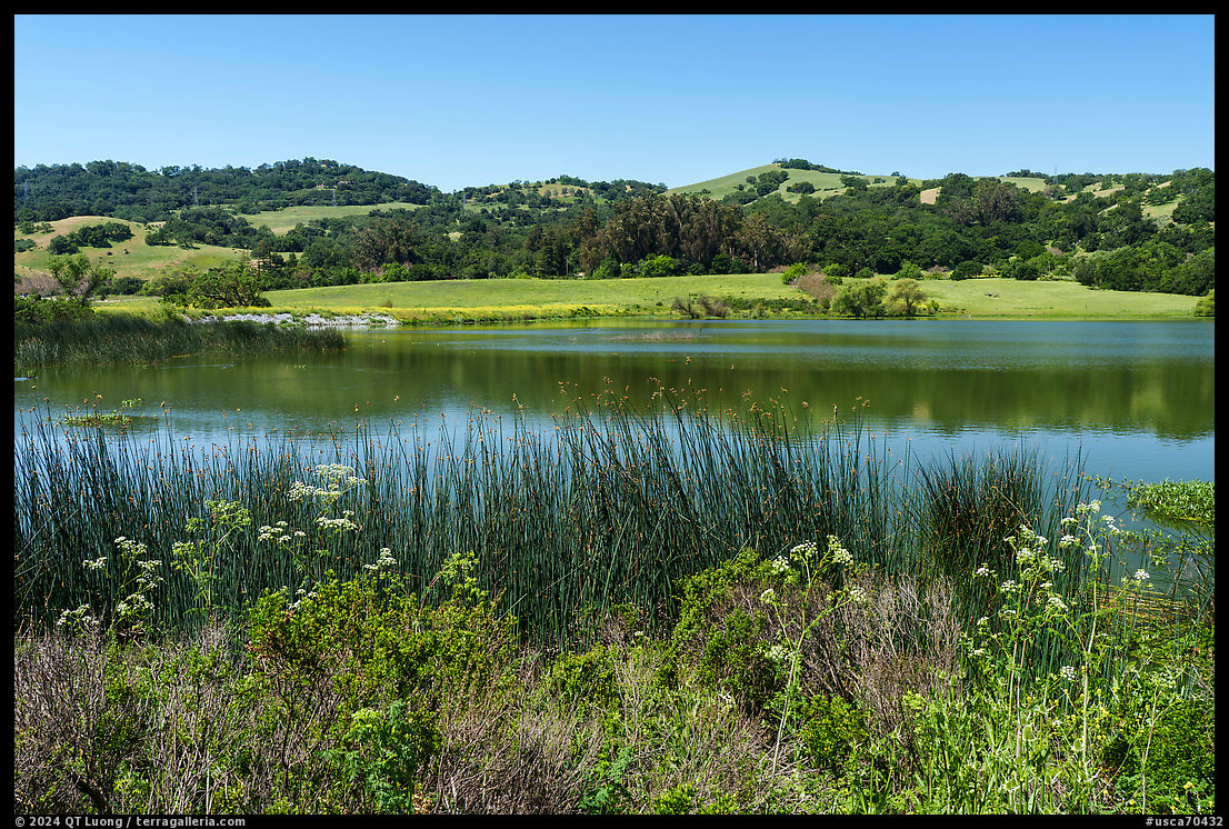
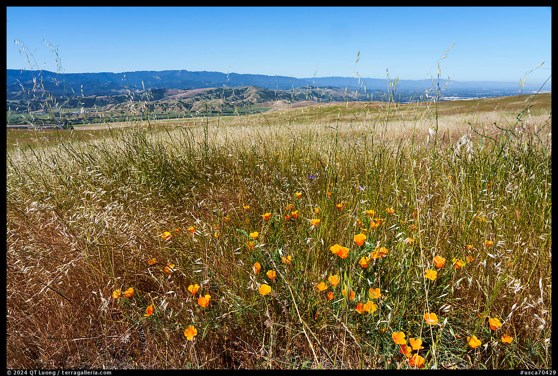
Back in the 1960s, black and white was considered the language of art photography, whereas color photography was the domain of commercial and casual photography. In the realm of nature, even by the mid-1970s, most of the visitor brochures issued by the National Park Service used monochrome photography, although they were printed in color! The photographer Joel Meyerowitz was one of the pioneers in ushering color photography acceptance into the art world. Meyerowitz initially worked as a street photographer, a genre that remains associated with black-and-white photography even nowadays. In the 1960s, he began to carry two different cameras to photograph the same scene in black and white and in color with different films. The personal experiment changed his practice, and he subsequently photographed exclusively in color, also switching to large-format photography. Despite its impact on the history of the medium, his juxtaposition of the monochrome and color images, whose compositions were not identical, was published only this year as A Question of Color (2024). Except for a few specialist cameras that produce a monochrome file, all digital cameras generate a color file. The creative potential of mixing color channels to generate a black-and-white image largely outweighs the slightly higher resolution of the monochrome cameras. Since I photographed with a standard digital camera, my black and white photographs originated in color without having to use two cameras like Meyerowitz. In this post, I am presenting both as a modest modern-day version of his experiment. Here are the color images from which the images above in this post originated:
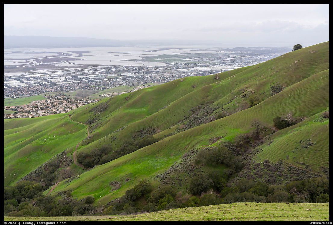
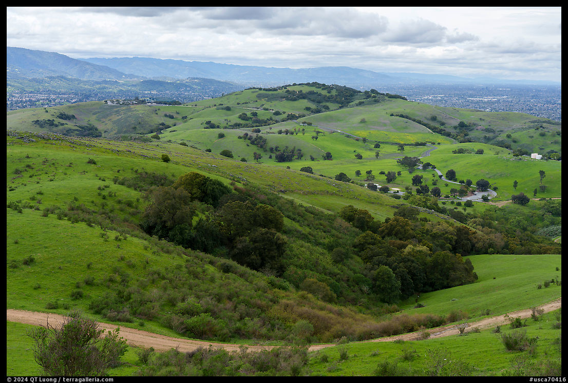
Now that you have seen the two versions, instead of imagining one of them, do you think that the monochrome photographs in this body of work are missing something that was in the color version? I understand that the most nuanced and precise answer is “it depends on the image”, but I am still going to ask you to evaluate the body of work as a whole. I would be grateful if you answer the two questions below, and even more so if you would say why you think so in the comment section. As with every time there is a poll I may not comment further to avoid influencing answers, but will follow-up in a third installment.
click here if you don’t see the questions below

To be fair looking at these on an iPad I am sure I am losing at the least some of the dynamic range of the images. I actually find the limited palette of most of the color images was more to my taste; landscapes in B&W need something in the subject, that grabs your attention, or perhaps as with Ansel Adams has a striking dynamic range. I did prefer the B&W trees in the 5th image, and the 5th from the end). Personal taste- but at least from someone who admires your body of work!
Thanks for sharing, your posts are always informative
Best regards
Chris
I do overall prefer the color. The dramatic effect of the light is lost in some of the B&W. However, the waterfall photo really grabbed me in the black and white. Thank you for sharing these!
Elizabeth
I get a greater sense of depth and detail in color versions. My main use of black and white is in portraits or images with a desire to isolate the subject.
Really appreciate your work and blog.
Dear Tuan,
When viewing the black and white images, I seem to interpret them with some background knowledge, which led me here often in the wrong direction. Knowing you live in California, I expected yellow dry grass in many of the images, that turned out to be vivid spring green. Wet or dry landscapes convey different feelings, so I think the color information is very important. Except for a few images of your series, the color versions show more, for example the 2 differently color flowers in the close up or the orange flowers in the foreground. Just a few images can convey the complete picture, such as the green fern one or the waterfall. Having said that, I still prefer the black and white version on occasion, I think for the tree silhouettes especially.
Thanks for your blog and work!
Thomas
To my mind, color is symphonic whereas black and white is chamber music.
If I went through picture-by-picture, I think in most cases I would prefer the color, especially those with the incredibly vivid greens. I think the B&W works better on less complex subjects, such as the lone tree and where contrast or texture play a predominant role, such as the ferns or the fungi.
Without diving into details, I think the B&W works better for a lot of these, especially the ones that are mostly about pattern and texture. Also, in my opinion monochrome tends to work better on images where the light is direct and relatively harsh. OTOH I think the redwood forest and creek scenes work better in color. I actually think the fog shot works better in color as well (shades of grey in color!). Full disclosure: I live in the same area (East Bay) and have wrestled with some of the same types of scenes.
Good work!
-eric