Are Composite Photographs Truthful?
5 Comments
Assembling parts of two or more images into a photograph is a long-established technique that I have occasionally used for technical purposes. This piece looks at the history of composite photographs and details my own approach to composites. Finding my own finished photographs composited into a new one in a USA Pavilion Expo exhibit was something different and led me to wonder about the truthfulness of the result.
Composites are nearly as old as photography
In popular culture, the practice of compositing images is associated with digital techniques (“she photoshopped him into the picture”), but many photographers are familiar with the work of Jerry Ueslmann which was created entirely in the traditional darkroom starting from the 1960s. Its surrealistic imagery is powerful, yet it is hardly technically pioneering. Composite photography had already reached a sophisticated stage of development in the 1850s, just a few decades after the invention of photography, so it is a practice rooted in the traditions of the medium.
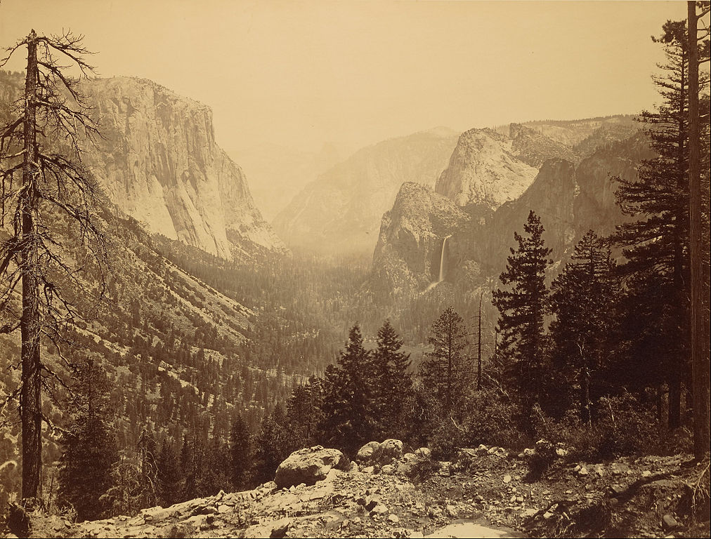
Carleton Watkins, Yosemite Valley from Inspiration Point, 1865
Most modern black-and-white films are panchromatic, meaning that they are sensitive to all wavelengths of visible light, reproducing a scene close to what it appears to the eye, obviously minus the color. The film’s primary sensitive components, silver halide crystals, are naturally sensitive to the blue portion of the spectrum. It wasn’t until the early 20th century that dyes were added to extend the silver halide crystal sensitivity into the green and red portions of the spectrum. Before, 19th-century emulsions were orthochromatic – overly sensitive to blue and less sensitive to colors like yellow and red. The extra sensitivity to blue resulted in skies being overexposed compared to the landscape. As a result, photographs made on the survey expeditions of the 1860s and 1870s had a recognizable esthetic. Gustave Le Gray is credited with making two different exposures on two different negatives and then printing them together on a single sheet in order to create a realistic rendering of the sky. Through the 19th century, most landscape photographers, including Eadweard Muybridge and Peter Henry Emerson, have resorted to compositing in order to expose properly both the land and sky.
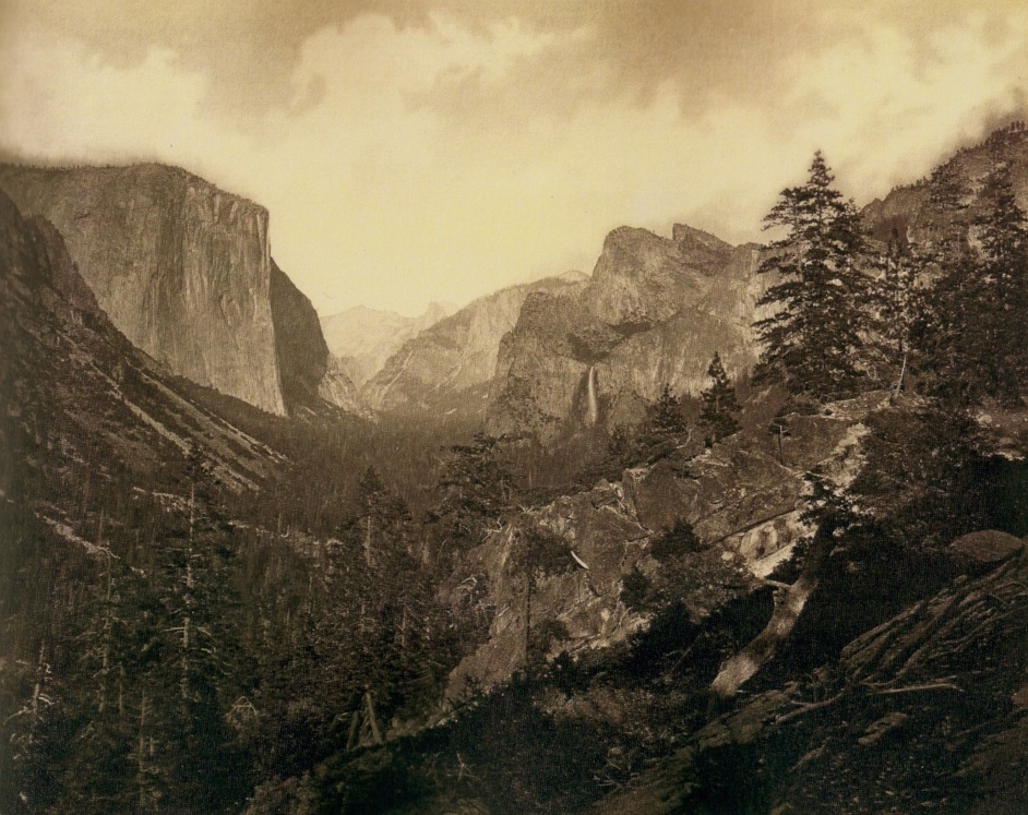
Eadweard Muybridge, Valley of the Yosemite from Mariposa Trail, 1873
From there, it was a short matter of time before photographers used a different sky. As Henry Peach Robinson writes in Pictorial Effect in Photography (1869):
It rarely happens that a sky quite suitable to the landscape occurs in the right place at the time it is taken […] These difficulties are got over by combination printing […] the result will depend, to a very great degree, upon the art knowledge of the photographer in selecting a suitable sky…In landscape photography, only two photographs needed to be joined in a fairly simple way, at the horizon, but composites in people photography are more complicated. Even today, when I make a group photograph, obtaining a consistent good pose and pleasant expression for each individual remains a challenge, when a single blink can marr the entire photograph. Imagine how hard it must have been in the days when slow film required sitters to remain still during the long exposure times, not to mention the depth of field issues associated with large format cameras. What started first as a way to alleviate those technical problems turned for photographers such as William Notman, Henry Peach Robinson, and Oscar Gustave Rejlander into a new creative endeavor, as exemplified by Rejlander’s Two Ways of Life, a photograph that combined over thirty captures to create a complex allegorical tableau. Naturally, at that time, heated debates rose about manipulation and truthfulness. This article on Artform offers a thorough discussion of composite imagery in the 19th century.

Oscar Gustave Rejlander, Two Ways of Life, 1857
In the early 20th century, Surrealists used photo montages to create disturbing images that clearly didn’t represent reality. Starting at the end of that century, digital technology enabled more complex compositing. In photomosaics, a great number of images are assembled by software to create a new pattern when viewed globally, while the component images remain identifiable in a close-up view. The technique is often used for commercial imagery, but Chris Jordan’s Running the Numbers is maybe the best-known art project using it. Another favorite innovative use of digital compositing is the Day to Night series of Stephen Wilkes, which seamlessly juxtaposes moments from 24 hours. In all those images, the compositing is obvious to the viewer. The rest of the article is about composite photographs crafted to make them appear as realistic images. Photographers such as Marc Adamus popularized the approach in nature landscape photography. For the past few years, mainstream photo-editing software such as Photoshop offer the option to replace the sky with a stock image by a single click, therefore automating a technique discovered more than a century and half ago.
Technical composites
A first category of composites aims to overcome the technical limitations of cameras in order to produce a higher-quality picture. While the resulting image shows more detail than a single shot, it could have been created as a single shot of technically lower quality. I consider them to be a part of the evolving photographic process. Yet, in the context of photojournalism, they are not considered acceptable, even though black and white photography, despite purposely erasing content by removing information, is. In this section, I am surveying each of the main techniques and my approach to it.Exposure composites capture a range of light that is too large for a single exposure by merging the best-exposed parts of a series of photographs where the only variation is exposure. High Dynamic Range (HDR) is one algorithmic way to do it by creating an HDR file with more bits than the standard eight representing colors on digital devices, then “tone mapping” it back to an eight-bit file. For some photographers, the effect resulting from tone mapping is part of the technique’s appeal, but their unrealistic appearance never resonated with me. Instead, I made frequent use of exposure blending, which instead relies on manual local selections to get the best-exposed parts, and when done carefully, achieves a more natural appearance. With the advent of high-dynamic-range sensors pioneered by Sony, a single exposure is sufficient to capture the entire range of light except maybe in some situations with the light source included in the image. However, brightening the shadows can introduce noise, so if the goal is the best possible tonal quality in a print, exposures composites are still a useful tool.
Focus stacks extend the depth of field beyond what is possible with a single exposure. Images otherwise identical but focused at different depths in the scene are merged by selecting the best-focused parts of each. Modern high-resolution sensors reveal imperfectly focussed areas more than earlier, lower-resolution sensors. The higher resolving power also means that the loss of resolution caused by diffraction when stopping down lenses occurs at larger apertures. In the 2000s, I rarely resorted to focus stacking, with the exception of my Sand Grains series, but nowadays I find it essential in order to take advantage of the full resolution modern sensors have to offer. However, this is not to say that the resulting photograph is not possible without focus stacking. You’d be able to make the same picture, but you couldn’t enlarge it as much before the viewer would notice that some parts are out of focus.
Panoramas merge images taken consecutively from the same viewpoint to create a wider view. As implied by the name, they are usually in an elongated, panoramic format, not only for esthetic reasons but also because it is technically easier to create panoramas made of a single row of images. Images with extreme angle of views (from 180 degrees up to 360 degrees) must be rendered with a non-planar projection such as a cylindrical or spherical projection, in which some lines in the scene will be rendered as curves in the image. Those could not be created with single-shot cameras and lenses. However, most of the panoramas have a smaller field of view and could be captured by photographing with a rectilinear wide-angle lens (angle of view up to 135 degrees for a 9mm lens) or fish-eye lens (angle of view up to 180 degrees) and then cropping to a panoramic format. For instance the foremost competition dedicated to panoramas, the Epson Pano Awards, accepts anything with an aspect ratio exceeding 2:1. Cropping an image doesn’t feel as satisfying as extending it, since panoramic images feel inherently more complex. The reason they are assembled by merging longer focal length images is to increase the resolution – up to so-called gigapixel images. Although tedious compared to large-format photography, the technique has the potential to produce even more detailed images. If mere resolution is what I am after, given the savings in costs, impact, and burden, I find it a workable alternative.
Sometimes, what appears to the user as single captures are in fact image composites because cameras implement compositing without user intervention. Many phone cameras (including Apple iPhone and Google Pixel) automatically create an exposure composite from a quick burst of images when they sense a high-contrast scene. They are also capable of creating a panorama in real-time by scanning the scene. Frame averaging is a lesser-known type of composite, in which almost-identical images are combined pixel by pixel in order to reduce high-ISO noise. The technique is most often deployed by astrophotographers in order to allow shutter speeds fast enough to capture point stars, with a bit of realignment to compensate for Earth’s motion between frames. However, the Google Pixel phones implement it automatically in a sophisticated way with their “Night Sight” technology. As computational photography’s capabilities grow, we can expect an increasing number of single captures to be in-camera composites.
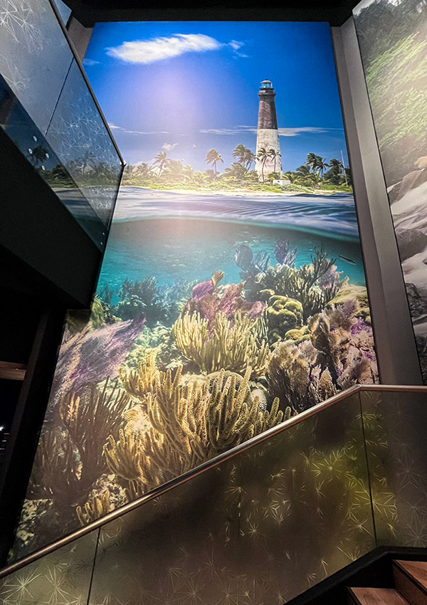
Compositing across places: the Dry Tortugas image
I find it useful to make a distinction between the composites discussed above, and the second category of composites where elements of images captured at different times or viewpoints are merged together. Such creations circumvent a fundamental attribute of photography: that an exposure captures a specific place at a specific point in time. The goal goes beyond creating a simply technically better picture. Let me illustrate the discussion with a particular example. The image of Dry Tortugas National Park that was displayed in the Expo USA Pavilion definitively belonged in that category. It was assembled out of three images made during a trip detailed here.
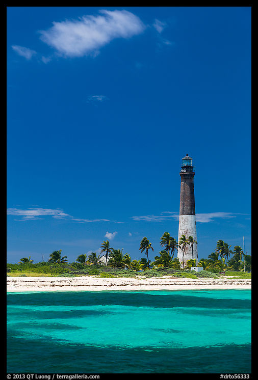
Upon arriving at Loggerhead Key at midday, we anchored the boat a few hundred yards from the pier on the south side of the islet, and I immediately photographed the Loggerhead Light, well lit with the sun in my back. I framed the striking lighthouse with the 24-105mm zoom set to a short telephoto focal length (75mm).
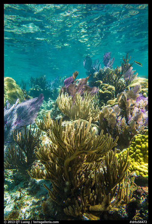
We landed at the pier with a dinghy, walked across the island to the north side, and snorkeled at the Little Africa Reef, which had the densest density of corals at a shallow depth I’ve seen so far. My underwater housing doesn’t let me adjust the focal length of the lens, and by default, I had set it at 24mm.
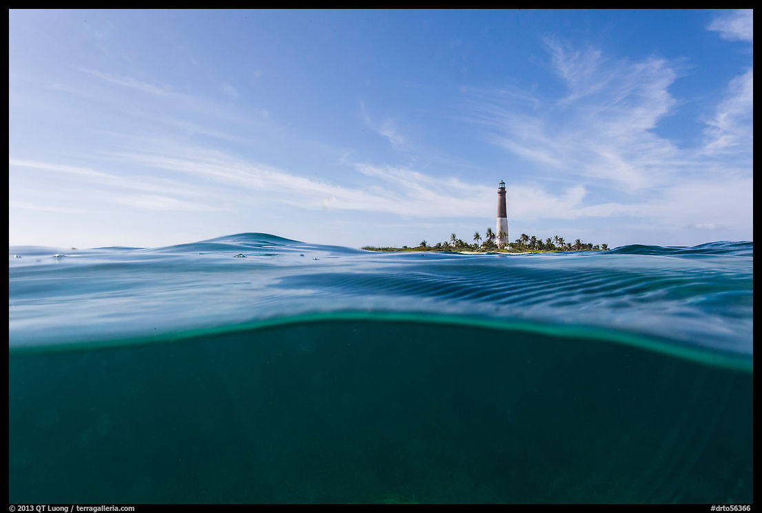
After returning to the boat, while the others relaxed, I got back in the water with my housing and lens still set to 24mm to experiment with under/over water images. By then, it was mid-afternoon. The sun was illuminating the lighthouse from the side – Note its size in the picture. It didn’t penetrate into the water as much as before, and at the spot where we had safely anchored, the water was deep, both factors resulting in no visible corals.
At the time I had licensed the images to the USA Pavilion designers, I was a bit puzzled that they had picked three views from Dry Tortugas National Park, as it is the third less-visited national park in the continental US. When I saw the exhibit panel, past the initial surprise, it made perfect sense from a design viewpoint. Combining two vertical frames and a transition section achieves a vertical resolution roughly equivalent to that of the highest megapixel medium format cameras. Moreover, the composite image holds visual interest from the very bottom to the top. This matters because it is the only image in the exhibit where visitors can have a close look at the bottom, from the base of the staircase, and at the top, from the second floor of the room.
Fiction or Truth?
While I have made many composites, they are almost all “technical” and very few are of the second category. One way their degree of manipulation could be characterized is by how much time has elapsed between the exposures, and how disparate their locations are. In my continued pursuit of truthfulness, I have limited myself to composites with a stationary camera and exposures separated by a short amount of time.The composite Dry Tortugas image used photographs that were taken at three separate points in time, over the course of three hours, at two distinct locations on each side of the island, and using two different focal lengths. There is no location on Loggerhead Key from which you could see exactly what it depicts, so it does not correspond to a real experience. It is therefore a fiction.
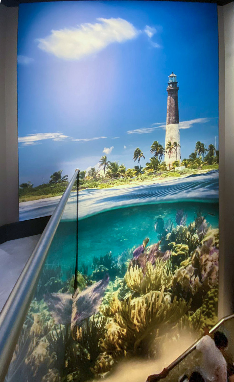
However, I thought that the composite image did a better job at representing what that national park is about than any of the single-capture images alone. Dry Tortugas National Park is an unusual national park, as it is 99% underwater (100 square miles). At the junction of the Atlantic Ocean, Caribbean Sea, and the Gulf of Mexico, its corals are particularly diverse and vibrant. The tiny islets (100 acres) called “keys” are home to remarkable structures. Most of Garden Key is occupied by Fort Jefferson, the largest brick structure in Western Hemisphere. Loggerhead Light is inactive, but was said to be “a greater distance from the mainland than any other light in the world” and once housed the brightest light in America. Although the park is biologically rich, the structures are the primary reason why the national park (initially Fort Jefferson National Monument) was established.
Human visual perception does not work like a simple camera, but is inherently computational, creating effortlessly “technical composites”. The brain can merge seamlessly and dynamically a vast dynamic range of light, far and near objects, minute details and broad field of view. Could it be the case that the same could be said of memories and places? We don’t take in everything in one glance. We absorb parts at a time and build the whole in our mind. Time and time again, great literature shows that fiction can get at the truth even when stories are all made up, that it can convey a greater sense of truth than the truth itself.
As a photographer, I can happily rely on multiple images in a sequence to tell a place’s story, but the exhibit – among other use scenarios – called for a single image per park, and a composite made ample sense. Yet unanswered questions arise. Should such composites be labeled so? Do viewers even expect the image not to be a composite? If they learned so, would they feel deceived? Would a visitor who, inspired by the composite image has made the arduous trip to Loggerhead Key, be disappointed not to be able to observe exactly the scene depicted even though they experience each of its components? Can composites be truthful?
I’d appreciate to hear your thoughts, but if you prefer, you can also answer a multiple-choice poll.
Thank you to Cecilia for the picture of the Dry Tortugas panel


Of course, the improvement in compositing tools has been rapid lately. Whatever your preferences, If you don’t use them, you will be left behind.
There has been a long lessening of technical knowledge requirements for making a properly exposed and now composited image. We may not like that, but just consider it a challenge to improve our subject matter, which should always be the point of the exercise anyway.
Nothing new in your article but you did a good job of condensing the issues into comprehensive content. Thanks
Thanks for the comment. There are quite a few photographers still working with film – disproportionately among those with institutional recognition. Are they left behind? I agree with you that eventually whatever technique is secondary.
Mr. Luong,
I Luv, Luv, Luv your photography‼️
Thank You for your photography from the “just completed” 2022 World Expo in Dubai‼️
You are an Incredible photographer and I Really Appreciate your work‼️
Thanks again & Best Regards,
Paul Lindberg
Thank you for taking the time to categorize and present the history behind different uses of compositing in photography before raising the questions about the specific use of your imagery at the USA Pavilion in this essay. I enjoyed thinking about these questions. I think they are difficult because answers depend on the intentions and expectations of the original creator of the images, the “exhibitor” (who selects where and how the images are arranged and viewed), and the viewer. In general, I would expect that when those are well-aligned everyone is happy. When there is misalignment someone will be unhappy.
In the specific case of your Dry Tortugas image, it seems that likely they were mostly aligned.
You, as the creator of the images seem to want to present the national parks accurately while conveying what a treasure they are.
The USA Pavilion team, as the “exhibitor” seems to want to use the national parks as an example of what makes the USA a great country and had specific constraints about a location in the pavilion they wanted to use effectively that seemed best-served by the composite. Because this area is viewed on two different levels two separate images (the top and bottom ones) could have been exhibited separately, one on each level, without the transition image, but that would have left empty space while transitioning between the levels on the staircase and likely lessened the impact, especially since I imagine it could almost feel like you are rising out of the water as you go up the staircase as presented. It seems like a very good solution that is aligned with your motivation as the image creator. The one thing I find a little troubling about it is that you do not appear to have been aware of the planned usage. This troubles me because there is ambiguity about who is responsible for the manipulation of the images you provided. Labeling, as you suggested, could help to resolve that but I suspect would be missed by most viewers. I think it is problematic when an exhibitor imposes an inconsistent intention on the work of a creator because unless extreme measures are taken to educate the viewer about those different intentions the viewer is likely to attribute the intention they perceive in the exhibition to the creator. In this case I think it would have been better if the exhibitor had confirmed with you their intended usage aligned with your intentions as well.
Finally, in the context of the exhibit location, it seems to me most viewers would expect they are effectively viewing one giant “advertisement” for the sponsor country. I think most everyone is used to and expects image manipulation in advertising in a way that they do not in a more journalistic setting such as a news photo. I think in an advertising use such as this the expectation of the viewer is to understand an experience more than the truth about a specific instant in time, and experiences, as you also described, are built over time and in effect essentially composited by the brain as well. While the viewer might not be able to have the exact experience implied by the composite if they visit the park (which they never could anyway because weather conditions vary, etc.), I expect they could have one very similar to it. As such, I don’t think the viewers expectations about the image are misaligned either.
I hope these thoughts are helpful and thank you for your wonderful images. They truly enrich all of us.
Thank you Keith for the thoughtful comment. I understand that some artists prefer a stricter control over how their work is presented and would consider licensed pieces as finished artworks not to be altered. As an image licensor, I accept that images may be used as source material, and by default, I grant licensees permission to alter images. Maybe because such language is present in my licensing contract, the exhibitor didn’t feel they had to ask me about the manipulation. The credit (pictured in the previous post) is succinct: “for the use of his photography” leaves more indetermination than “for his photography”, but you are right about the viewers likely attribution.
Except in the case where photographs are meant to be evidence, I think viewers understand that part of the role of photography is to exaggerate everything. A lot of photography is propaganda. Obviously, fashion, and food photography fall in this category, but also travel photography where places are always depicted at their best.