How to Convert Digital Files for Printing: Step by Step Example of RGB/CYMK Conversion
No Comments
A main technical obstacle in making great prints from digital files is that you are translating an image viewed through the transmissive vehicle of the computer screen to a physical medium which is reflective. In this article, I explain with examples how to compensate for that difference, using as a step by step an improved page in the just released second edition of Treasured Lands.
Fundamental media differences
Modern digital cameras, like film, capture a very wide range of colors. That range is called the gamut. Monitors emit red, green, and blue (RGB) light to create colors, which are added together to generate the pixel color. On the other hand, on paper colors are created by absorbing light with pigments, and the process is subtractive, since adding more pigments results in less light being reflected. Because the process is opposite, opposite colors are used: cyan, magenta, and yellow, with blacK used to enable darker colors (CMYK).The pigments are subject to physical limitations, so they always reproduce a narrower range of color (a smaller gamut) than available on the screen. This is particularly true of the offset printing presses used for books. For instance, Adobe RGB has a gamut volume of 1,207,500 whereas Fogra39, which characterizes the offset printer used for Treasured Lands, has a volume of 402,100. This means that two-thirds of the colors available in Adobe RGB simply cannot be reproduced in Fogra39. The same limitations apply to a lesser extent to photographic prints, including laser prints and inkjet prints. So even if you are not preparing a book, you can use directly the tips in this article when crafting a fine print. Just replace “convert to CYMK” by “convert to printing profile” in the descriptions and you are set.
Out of Gammut Color: Rododendrons and Redwoods example
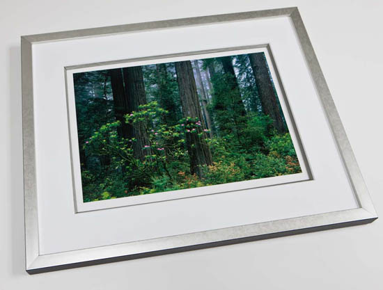
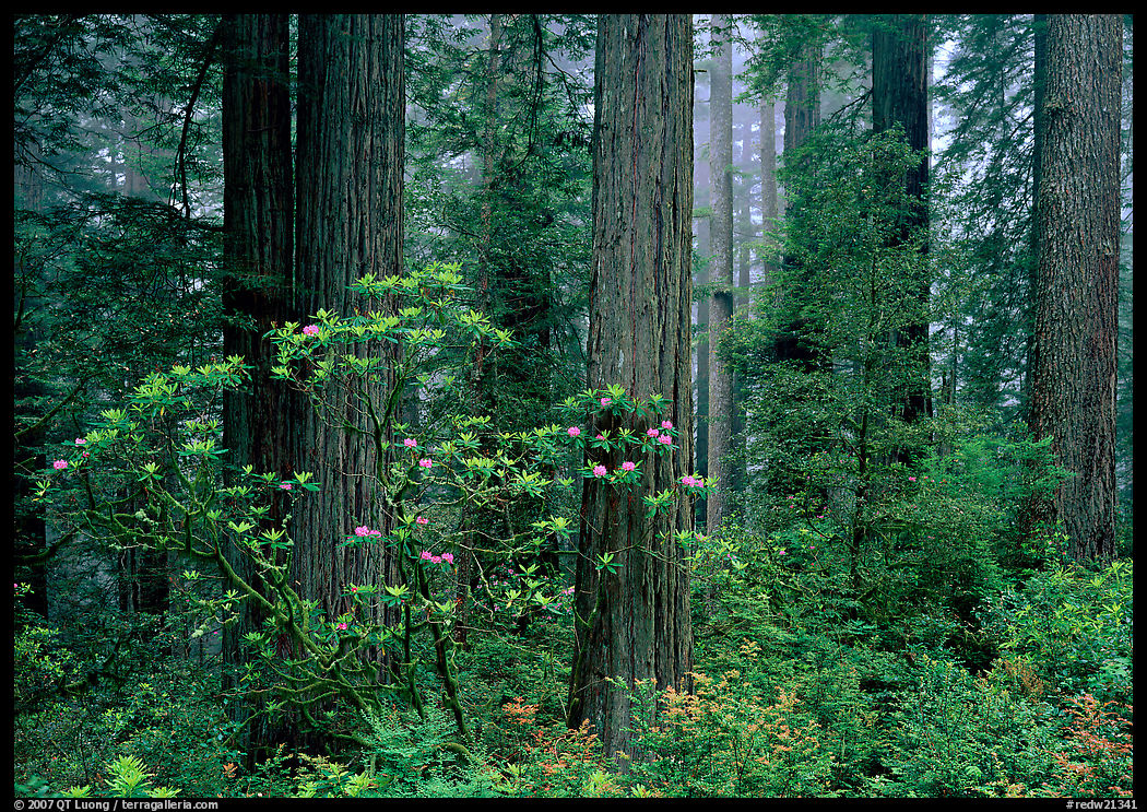
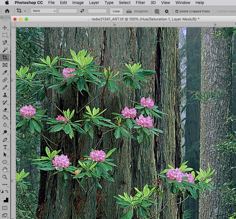
Page 49 of Treasured Lands is an image from Redwood National Park in California. If you come between late May and mid-June rhododendrons are in bloom. From an esthetic point of view, although they are very small in the image, the color accent they add is important because their pink create such a contrast with the dark green woods.By the way, one of the things that attracted me to large format photography 25 years ago is that with the high resolution of large format film, I didn’t have to frame the flowers tight for the detail to be there. The image on this blog may lack detail, but on the printed page, it is readily seen. That is because the image in this post has only 600 pixels across (a level of details equivalent to the thumbnails in the book) but the image on the printed page has the equivalent of 4287 pixels across (12.25 inch at 350dpi).
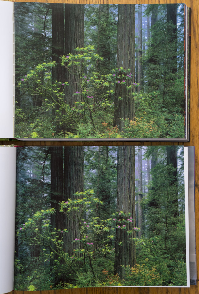
In my original transparency, as well as in the scan, the blooms are bright. However, if you look at the first edition of Treasured Lands, those blooms look a bit dark. What happened?
Because it had taken so much time to find a publisher (a story for another article), we had to rush the first edition of Treasured Lands in order to release in time for the NPS Centennial. Under this intense time pressure, when the publisher assured me that I could provide them the files in RGB and they would take care of the conversion to CYMK, I acquiesced.
For that image, it turns out that the blooms were out of gamut, meaning that the inks could not reproduce the colors of the blooms, a saturated and bright pink. In that case, to simplify things a bit, the automated RGB to CYMK conversion maps the unprintable color to the nearest printable color, which was a darker pink.
With more time and care, that outcome was entirely predictable. Having taken charge of the entire pre-press process, I fixed it in the second edition of Treasured Lands, whose reproductions are overall more accurate. How?
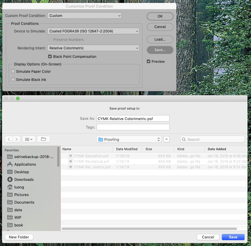
Setting up soft-proofing
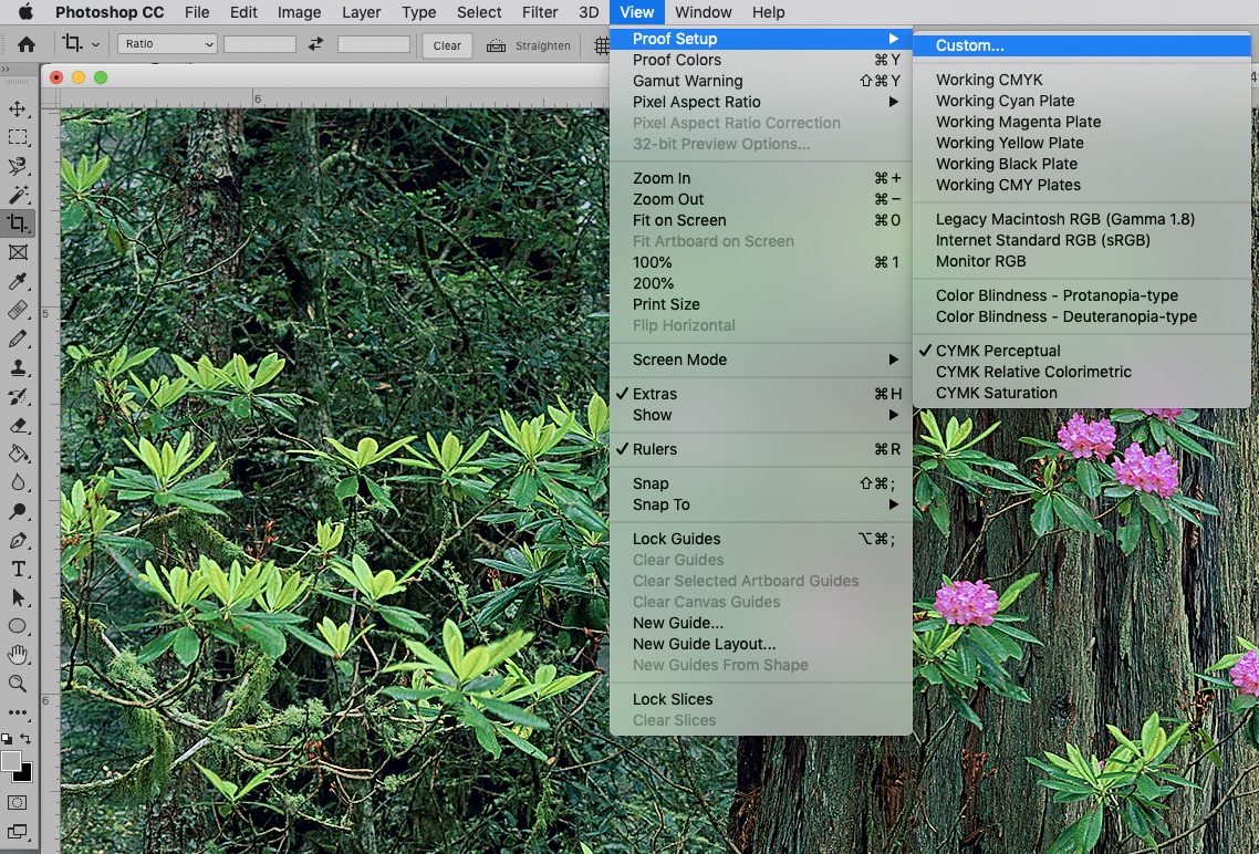
When you work in a color-managed workflow, you use a digital file called an ICC profile to characterize each of your devices. Monitor calibration creates an ICC profile for your monitor. ICC profiles for prints depend on the printer used, and on the printing medium. Sophisticated vendors provide you with an ICC profile for the precise type of print you are making. Once you have downloaded and saved the profile in the appropriate folder on your computer, you can use Photoshop to preview your print by applying the profile, which is called “soft proofing”, as opposed to “hard proofing” with an actual print.First, save a soft-proof setup (View > Proofup > Custom) with the relevant profile (in my case, Coated Fogra39). The “Rendering intent” specifies how out-of-gamut colors are reproduced. I recommend creating two setups, one with “Perceptual” and the other with “Relative Colorimetric”, Black Point Compensation should be enabled for the later. When you preview the image, you can visualize which one produces the best results. In general, Relative Colorimetric works best. You should use Perceptual only if an important color changes too much using Relative Colorimetric because that Perceptual akes more of the whole picture shift, whereas Relative Colorimetric will shift only a few colors.
Using soft-proofing
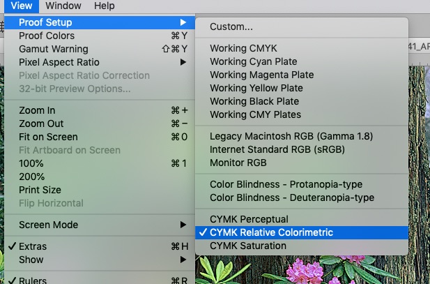
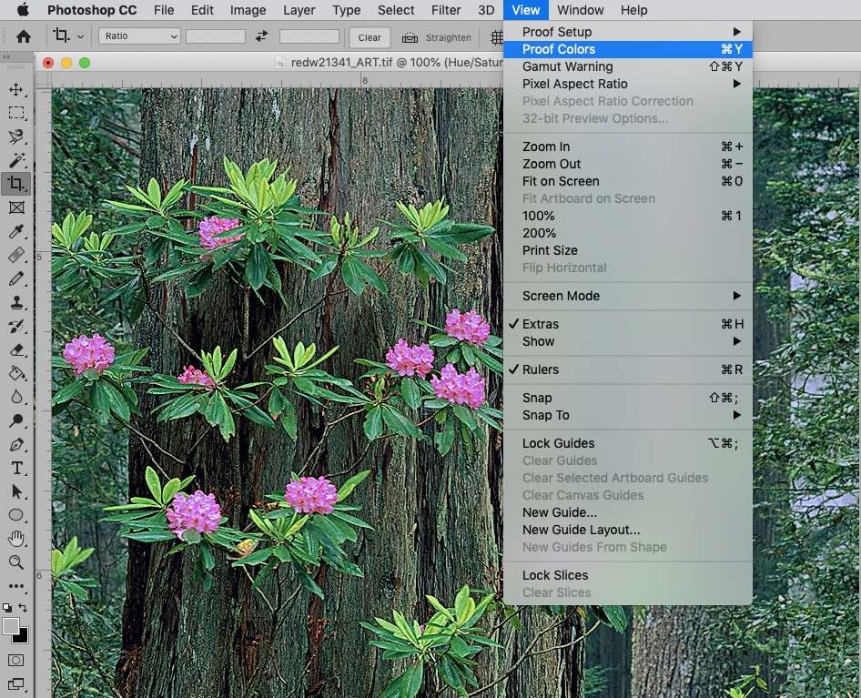
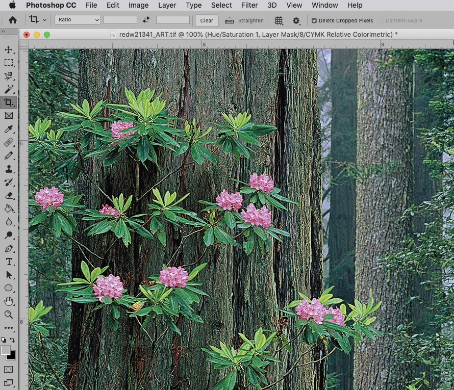
Once your soft-proof is set up, you activate it by selecting it (View > Proof Set up > Your_Proof_Name), and then toggling “View > Proof Colors”. As you see below, once activated (checkmark next to “Proof Colors”) the preview shows correctly that the blooms get darker compared to the original file before soft-proofing.
Sometimes, when you soft-proof, you get the impression that the image is dying in front of your eyes. It is because you have a side-by-side comparison, but eventually the relative balance within an image matters more that absolute color. Here is my recommended workflow to optimize the conversion:
- Bring image in RGB and duplicate it
- Apply CYMK soft-proof to the duplicate
- Tweak soft-proofed image (duplicate) so that it “feels” as close to the RGB (original) as possible, using adjustment layers so that the effect can be easily turned on and off for comparison
- Save the tweaked image separately
- For production, flatten layers, convert it to CYMK, apply appropriate sharpening
Fixing the rododendrons
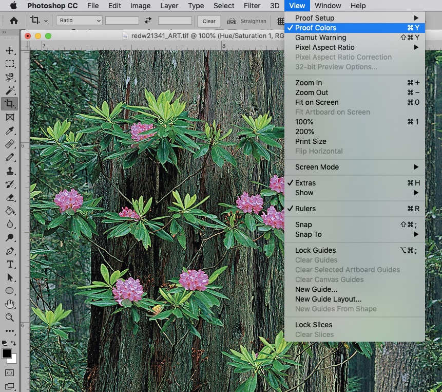
For our image, after playing around with hue, saturation and brightness, I determine that in CYMK, although I cannot have saturated light pinks, I can have either saturated dark pinks, or less saturated light pinks. Since color cannot, nor should not exactly be matched between different mediums, what you try to preserve is how the image feels, so that is a subjective decision. Since the feeling that I want to preserve is the brightness of the blooms in the dark forest, I opt for the later. I select the pinks in the image and then selectively desaturate them with a Hue/Saturation adjustment layer (see “Hue/Saturation 1, Layer Mask” on title bar). Here is the image with the tweak, and without proof.
When I apply the proof (note “CYMK Relative Colorimetric” in title bar) the blooms do not become significantly darker compared to the image without soft-proof. Although I have lost a bit of the color of the original, I have gotten around the limitations of the medium to make a print that now conveys the brightness that struck me when I was in the forest.
Two more examples
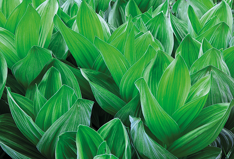
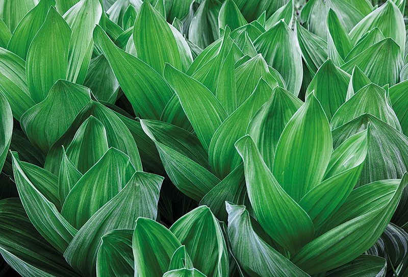
Intense greens were famously captured by Fuji Velvia, and well captured by digital cameras, but they are challenging in CMYK. In the first example (page 91 of Treasured Lands), you can see that with the default CMYK conversion, the structural texture of the corn lily leaves in Sequoia National Park is barely visible, whereas it has been restored in the custom conversion with lowered saturation. The cave image on the same spread also illustrates the exact same issue.
In the second example (page 208 of Treasured Lands), the default CMYK conversion renders the right part of the colorful cloud above El Capitan in Guadalupe Mountains National Park as a uniform blob. Reducing the saturation and shifting slightly the hue in the custom conversion for the second edition brought back the subtle detail from that superb sunset. See also the other sunset image on the same spread.
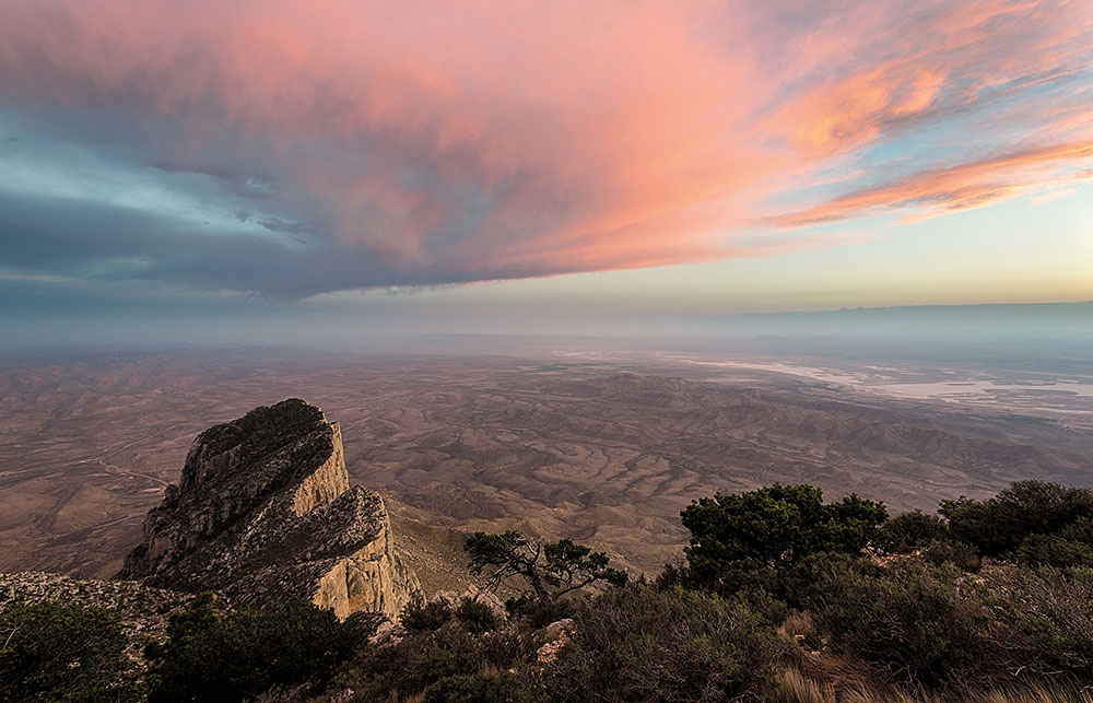
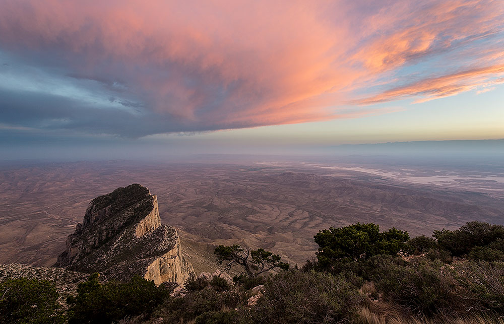
What was happening in both examples is that when several distinct out-of-gamut colors get mapped to the same in-gamut color, what in the original image exhibited gradations and texture will be reproduced in the print as a more uniform color area, losing fine differentiations. Since saturated colors are much more likely to be out of gamut than unsaturated colors, often slightly desaturating the problematic colors is enough to fix the problem. In fine printmaking, often less is more!