My Quest for the Ultimate Tripod
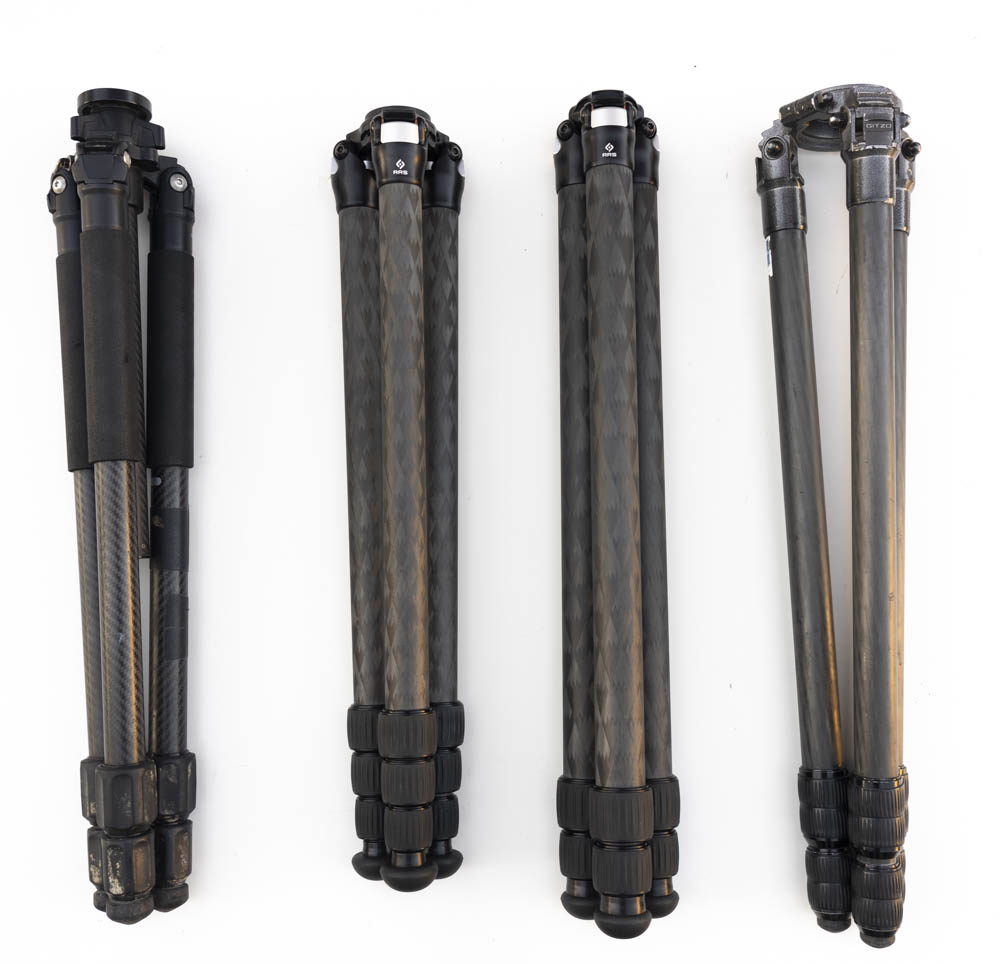
Induro CLT203, RRS TVC-24L, RSS TFC-33, Gitzo 325
Feature requirements
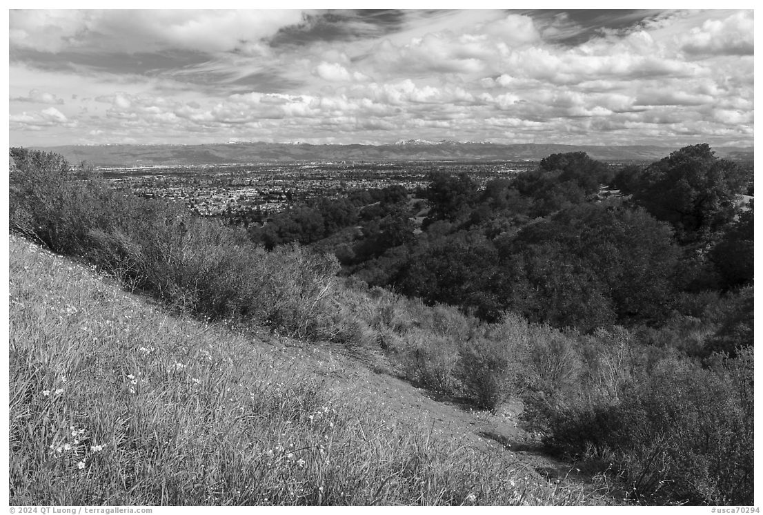
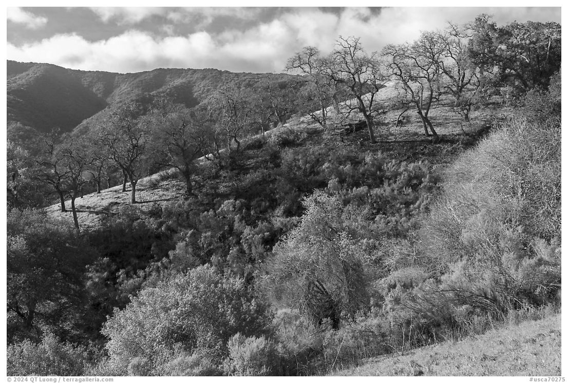
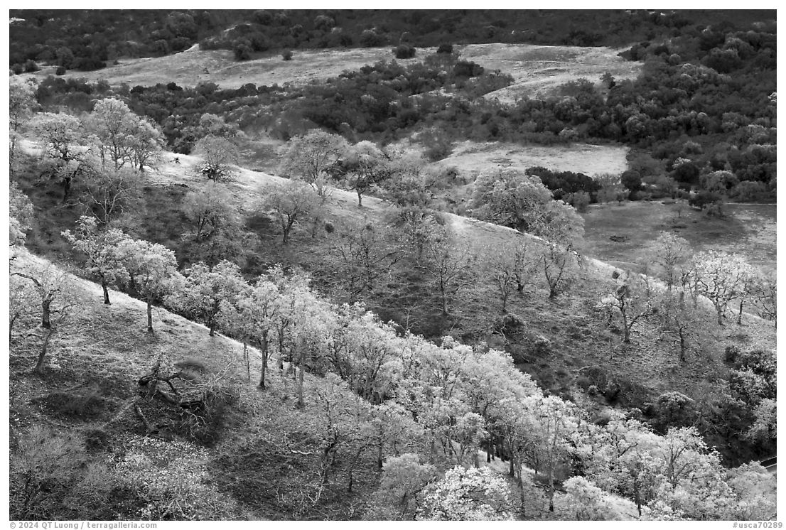
Horses for course. There is no perfect tripod for every photographer and every situation. Knowing that in some travel and outdoor contexts I will have to compromise for a lighter or smaller tripod (if any at all), I looked for one that would work best for me when carrying a full-size tripod is feasible, which is most of the time. Personal preferences vary, but having used a lot of different tripods, I have a good idea of the features I wanted. The following are easy to assess:- No center column. Having owned tripods with and without a center column, I’ve occasionally found the column useful for a quick adjustment or to reach more height, but those situations are rare enough that I prefer the weight savings, lower minimum height, simplicity, and higher rigidity of a tripod without a center column. A small, but significant advantage of tripods without a center column is that they are easier to carry by hand when folded because there is a space between the legs for your fingers.
- Three leg sections. Having owned both three-section and four-section tripods, I have developed a strong preference for the three-section tripods: faster to set up and fold, and higher rigidity. Compactness matters only in urban settings.
- Eye-level height. I am 5’11” (70″ or 1.8 m) tall. To be able to look into the viewfinder while standing straight, I need a tripod at least 58″ tall. Except for the series 3 Gitzo, all the full-size tripods I have owned reach about 52-54″. Even after adding the height of the ballhead, this required me to stoop down a little when using the tripod at full extension. While this sounds like a minor inconvenience, if I spend a lot of time composing, the discomfort adds up to my posture problem, and aging has not improved matters.
- Smooth operation. This means how easy it is to lock and unlock the legs, slide the legs in and out, and adjust the leg angle.
- Stiffness. The tripod has to hold a camera steadily and produce a sharp picture with long exposures even in windy conditions – not a given even with a good-quality tripod. This is subjective because no tripod will work in gale-force winds, so it is a question of “how good is good enough”.
- Lightest possible weight given the previous requirements.
Narrowing the choice
Thirty years ago, it was next to impossible to find tripods below series 3 without a center column. Fortunately now one can choose from several manufacturers. Because of my previous experience, I eliminated Feisol. FLM CP30-L4 II and CP34-L4 II tripods looked promising, but unfortunately, they have four sections, and if used as three-section tripods (with the last section retracted) reach only 51.5″. In addition, their stiffness is slightly subpar. Likewise, Gitzo doesn’t have a series 2 without a center column, and I had reservations about the Gitzos I owned. This left two main contenders, Really Right Stuff (RSS) and Pro Media Gear (PMG). Both are family-owned companies that manufacture their tripods in the USA to exacting standards. They charge premium prices that in the past had deterred me because of my unfortunate tendency to damage or lose tripods. With a much more extensive product line, RSS is much better known, but as a result, I am prejudiced against them because of the owner’s politics. In addition, PMG was more responsive to queries.RRS offers a full range of tripods from series 1 to series 5. Many consider them to be the best in the business. Examining the tripods quickly shows why. Besides impeccable build and operation, they feature a leg diameter larger than any other tripods of the same class. For instance, the series 2 RSS TVC-23 leg diameters of the top section are 33mm as compared to 28mm for a Gitzo series 2 and 32mm for a Gitzo series 3. By the way, in case you are wondering about the word “series”, initially series 2 referred to a tripod having a top leg diameter in the 20-29mm range, series 3 in the 30-39mm range, etc… If one ascribes a cross-manufacturer significance to this nomenclature, it could be argued that RSS labeling of their tripods is an anomaly. It also helps that RRS was the first to offer tripods of series 2 and smaller without a center column and chose a wide leg angle spread – more on this point later. The best series 2 tripod is probably the RSS TVC-23 which extends to 52″ and would be perfect for someone about 5’4″. But for someone taller, any series 2 tripods with three sections and no center column do not quite reach eye level. The TVC-24L needs all four sections to reach eye level and isn’t all that light or stiff.
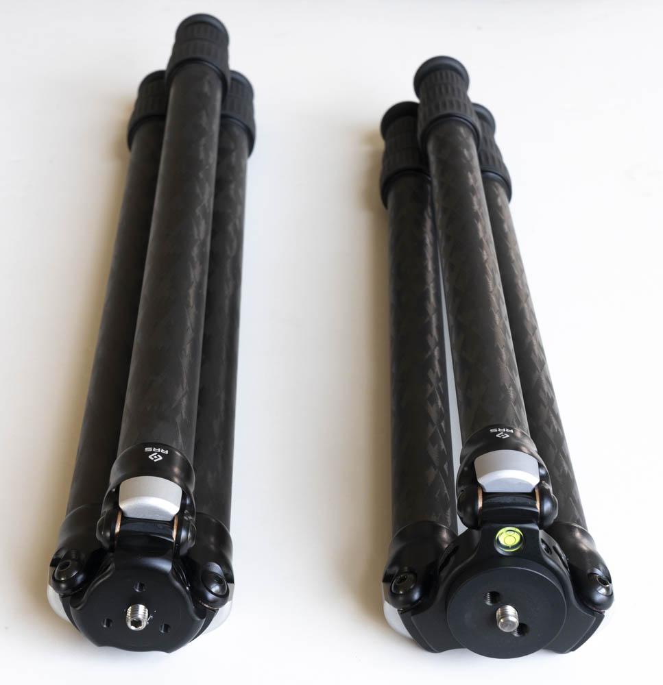
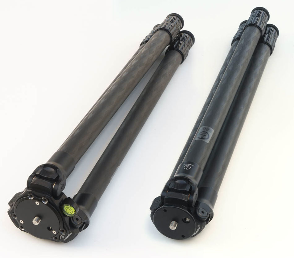
RSS TFC-33 and TVC-24L tripods
Series 3 options
This led me to series 3 tripods, which are offered by both RSS and PMG. Both manufacturers offer short legs (RRS TVC-33S, PMG TR343) and full-size legs (RRS TVC-33, PMG TR343L), the latter extending to comparable heights of 58.4″ and 59.3″. In addition, there is the choice of two different apexes. The apex, also called the spider, is the part that holds the legs together. The wider apex is modular since its central plate can be removed to accommodate a center column, a leveling head, or a video bowl. Its width provides a larger base suitable for larger heads and adds stability because the pivot point of the legs is higher. The compact apex is lighter and results in a smaller folded diameter for the tripod.RRS wide-apex tripods are prefixed as “TVC”, while their compact apex series are prefixed as “TFC”. RSS lists the TVC-33 at 1890g and the TFC-33 at 1690g – I measured 1735g on my scale. PMG prefixes their wide-apex tripods TR and their compact apex tripods TRS. Some configurations do not have a compact apex offering, but to convert the relevant tripods from wide apex to compact apex or vice-versa, you can buy directly from their website the other apex and swap it in fifteen minutes. Although they don’t list them, RRS can also sell you an apex. The compact apexes of both brands are designed to be the most compact possible and keep the folded legs parallel. Personally, I would have preferred something slightly larger to leave just enough room for fingers between the folded legs.
PMG listed the weight of the TRS01 Compact Apex as 175g, and the T34A01 Wide Apex as 420g. This would have resulted in a weight savings of 245g, putting the weight of a TR343L with compact apex and without spikes at 1565g, less than my Induro CLT203, a series 2 tripod considerably less stiff and which doesn’t reach eye level without a center column. An easy choice! I was disappointed that the measured weights were 200g for the compact apex and 325g for the wide apex. Since the latter includes a large spirit level and a beefy hook (both removable, totaling 30g) absent in the compact apex, the real difference in weight of 1840g versus 1725g isn’t that significant.
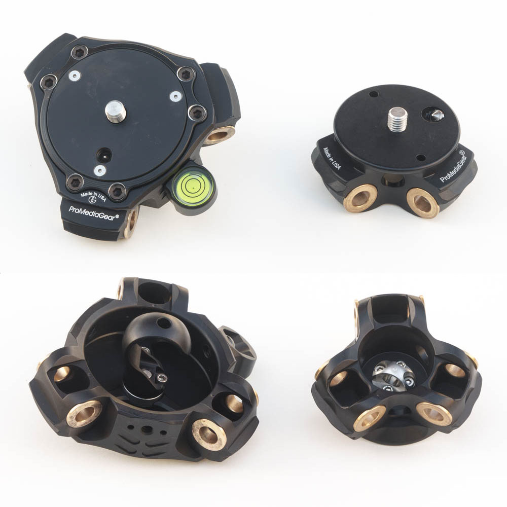
PMG T34A01 Wide Apex and TRS01 Compact Apex
Performance and Leg angle
Procedures for quantifying the performance of camera sensors or lenses are well-established and results abundant, but the same cannot be said of tripods. David Berryrieser was the first to create a framework for testing tripods that results in repeatable measurements. He created the excellent website thecentercolumn.com to publish his methodology and results while he was a physics graduate student at Stanford University. The irony is that in the site, he explains why using a center column invariably lowers tripod performance. David’s measurements are extensive, but he summarized the performance of a tripod in terms of stiffness with a single numerical score. Here are those numbers for some tripods:
tripod                height   weight sections stiffness
                     (inches)   (lbs)
RRS TVC-33	       58.4     4.30	 3       2184
Gitzo GT3533LS         59.7     4.58     3       2147
PMG TR343L	       59.3	4.12     3       1783
FLM CP34-L4 II	       68.0	4.17	 4       1393

RRS TVC-23	       51.9	3.37     3       1941
RRS TVC-24L	       66.1	3.97     4       1132
Gitzo GT2542           53.7	3.74	 4       1181
FLM CP30-L4 II	       68.0	3.23     4     	  792
Feisol CT-3342	       56.8	2.53     3        628
By David’s results, the RRS tripods have the best stiffness-to-weight ratio of any tripods. The PMG doesn’t perform as well as the RRS (and Gitzo), but still strong when compared to all other tripods. David notes:
I found that the leg angle has a dramatic effect on the stiffness of the tripod. The wider the stance the better. The PMG has a relatively narrow leg angle at 21.8 degrees. Compare this to 23 degrees for the Gitzo and 26 degrees for the top ranking RRS. If the PMG had a 26 degree leg angle, I estimate that the yaw stiffness would be roughly 25% better which would probably make the PMG the top performer. Its frustrating that so many manufacturers uses a narrow leg angle. I can understand the appeal, a smaller lighter, cheaper, taller tripod. But the yaw stiffness really takes a big hit for modest gains in those other categories. It is frustrating in the case of the PMG precisely because everything else about the tripod is exceptional.The comment about the leg angle correlates with my observation about the Feisol tripod. It looks like PMG has been paying attention since they subsequently switched to a 24-degree leg angle. After completing his PhD in 2021, David moved on, but so far the framework he created remains the only available. He has not updated thecentercolumn.com or re-tested the PMG, but I trust his prediction that the revised PMG performs in the same ballpark as the RRS. With that in mind, the PMG and RRS tripods with compact apex are the lightest meeting my requirements. They are a bit heavier than my series 2 tripods, but not by that much.
Features: RRS v. PMG
If not performance, here are the differences I saw between what RSS and PMG tripods:- RRS has a slightly larger leg diameter (37/32/28 mm vs 34/30/26 mm) and is slightly heavier.
- Unlike RSS and most of the competition, PMG’s leg locks are all metal and have no rubber parts. They may be more durable but less comfortable to operate, especially in cold temperatures.
- PMG’s tripod feet include spikes (for use on outdoor soft surfaces) that when not in use are cleverly stored inside the tripod tubes by screwing them in reverse to the inside part of the feet. Removing them for weight savings (60g) leaves holes in the feet that would have to be plugged, maybe with a short 3/8-16 screw. The downside it that the feet are non-standard. Most other high end tripods, including RRS, come with a 3/8″ screw hole at the bottom of each leg that can accept a much wider choice of feet with that thread.
- On each leg of a PMG tripod, one of the two main bolts serving as the pivot is secured in place by another smaller bolt, therefore ensuring that the main bolt will never rotate relative to the leg. That rotation of the bolt relative to the leg, and the resulting floppy legs was a major issue with one of my Gitzo tripods and a complaint I had read about RSS, so I welcome this design detail.
- Although both are some of the most expensive tripods, PMG is slightly less expensive ($1,100 v $1,165 for the wide apex version as of this writing), especially considering that if you want spikes, RSS charges an extra $100, and that PMG periodically offers special discounts in the 5-10% range for signing up for their mailing/SMS list.
PMG TR-343L with wide apex and compact apex