Examples: Two Nature Landscapes Processed in Lightroom
One Comment
I have often been asked about the processing I apply to my digital images. For the first time, I will provide two examples. The first one exemplifies the light processing typical of most of my images, while the second one illustrates how just a few processing steps can transform a difficult capture.
My processing tools have evolved over the years. Nowadays, I use almost exclusively Adobe Lightroom for preparing images for the web. The software is very efficient for bringing most RAW images to a satisfactory state (equivalent to a “work print” of old), and that stage of processing is the focus of this blog. Lightroom is the only processing app that most photographers will ever need, and it does so much more than processing. To take full advantage of its capabilities, and to maximize image quality, it is necessary to save camera images in the RAW format rather in jpg.
Example 1: light processing
Both images are from my previous post about the Carrizo Plain. The first image is from the Temblor Hills. My attention was caught by the patterns of alternating colors, and I used a short telephoto (85mm) to focus on the gully and compress the ridges. My goal here is to make those patterns stand out well.Here is the straight raw file, with none adjustments applied.

Raw files are pretty flat by design, so for almost all files, I start with a default S-shaped tone curve to increase the global contrast, and also +10 of “Clarity” to increase local contrast. In addition, for nature scenes, I add about +10 of both “Vibrance” and “Saturation”. This is of course a matter of personal taste, and varies with images, but it is often too tempting to push those sliders too much, to the point that color and contrast become unrealistic. One way to find the right amount is to refer to a set of existing images that you like. It is easier to judge that an image is over the top when compared with a group of images than when viewed individually. My reference is transparency film such as Velvia, which are vivid but remain realistic.

The image was shot around 4:30pm, and the light was warmer than at mid-day. Auto white balance accentuated the effect, resulting in an image which is too yellow, with the blues mutted and insufficient separation between green and yellows. This was fixed by adjusting the color temperature “Temp” from 4,450 to 3,925.

At this point, the image is satisfying, but it can use a bit of “pop”. From the left side of the histogram, you can see that there are no black areas in the image, and therefore the full range of tonalities is not used. Unless you have a light key or dark key effect in mind, using the full range of tonalities will yield a richer image. And for many images, having a pure black area adds depth, whereas pure whites are distracting, as the eyes are attracted to the brightest area of a given image. I moved the “Blacks” slider to -0.55, so that the three RGB channels are about to get clipped. This darked the image, so I compensated by moving “Exposure” to the opposite value, +0.55. I made sure highlights were not clipped in any channel.

Example 2: difficult capture
The second image is from a sunrise on the Carrizo Plain. I wanted to convey the impression of standing in a rich carpet of wildflowers stretching as far as the eye can see towards the horizon in a vast valley. I shot a Canon TSE-E 24mm II on a Sony A7R2 with Metabones adapter. The TSE-E lens has a tilt control analogous to that of a large format camera which allows to keep both foreground and background in sharp focus while using a moderate f/stop. The exposure was 1/15 sec at f/11, ISO 200.Here is the raw file, with the same default adjustments as before applied. The image looks dark because it was exposed to preserve all the light information in the scene rather than attempting to be faithful to it. As you can see in the histogram, the highlights are not clipped, and shadow clipping is minimal. With my other cameras such as the Canon EOS 5Dmk3, brightening the shadows would have resulted in excessive levels of noise, so I would have resorted to blending two or more exposures. The Sony A7R2 easily captures all the dynamic range in a single frame, and my goal is to reduce the extreme contrast in the scene.

First, as in most scenes with extreme dynamic range, I move “Highlights” to the lowest possible value -100. I then adjust “Exposure” with an eye for the sky, to +0.75.

Using the “Shadows” would do the job of brightening the foreground, but it would also brighten the sky, so I create a graduated filter with “Shadows” at +100, with the goal of adjusting only the foreground at the exclusion of the sky. The foreground is still a bit too dark, so I also increase “Exposure” to +0.40 in the filter. I make sure not to brighten the foreground too much in relation to the sky, since we expect the sky to be brighter.

The massive use of “Shadows” had resulted in an image with weak blacks, so I clip “Blacks” with a -35 value. Because the scene is a sunrise, the scene is just emerging from darkness, so I clip the blacks more than in the previous image.
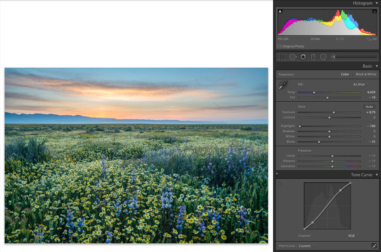
The final step is color correction to neutralize the blueish color cast. For reference, I take a white balance eyedropper reading on the white petals of the tidytip flowers (the daisy-like flowers) which calls for “Temp” 5,400 and “Tint” +40. Applying the correction to the whole image affects the color of the sky in an unwanted way, so I split it between the “Basic” panel and the graduated filter.

For the vast majority of images, that will be the total amount of processing I do. However, some images require more interpretive work. Preparing images for print also involves more fine-tuning to translate the image from the digital image seen via a computer screen to paper. The differences between the transmissive medium and the reflective medium often results in prints that “look too dark” or “not as sharp” with careless printmaking. For both tasks, I use the much finer controls provided by Photoshop, but that’s not a topic anybody could fit into a single post!

Thanks for sharing, it was a valuable insight in post-processing. Also was shocked how much detail can be brought back from shadows, impressing!