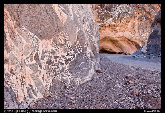
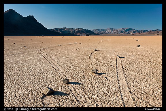
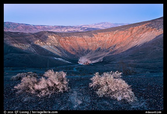
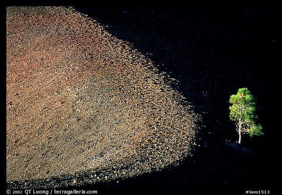
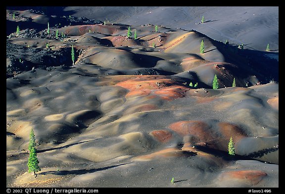
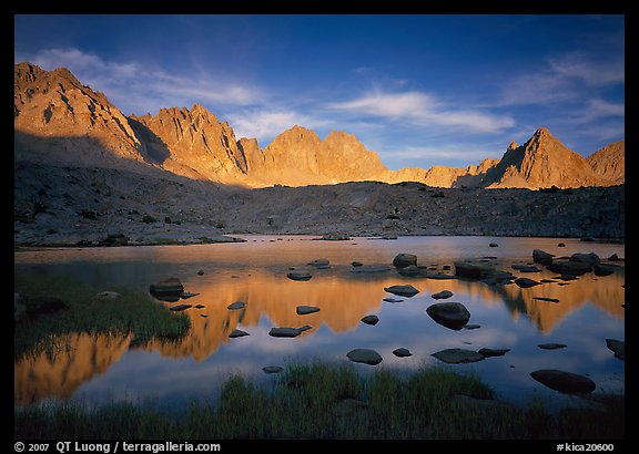
Last year, I licensed 12 images to a calendar company located in Europe for a 2010 National Parks calendar. As part of the deal, I received a limited number of copies (some are on sale here).
Upon opening the package, I was pleasantly surprised by the high quality of the production. The images are reproduced 23 inch wide on a very glossy paper. However the images didn’t look as I remember them.
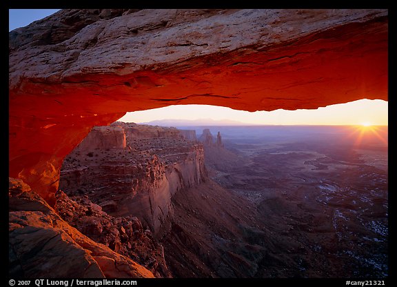
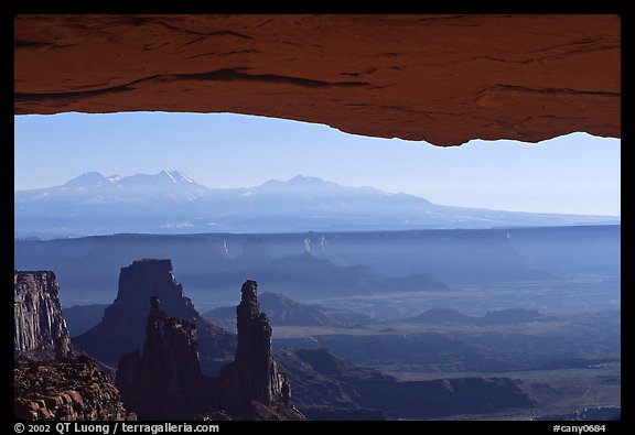
At first, I assumed poor color management, but then a comparison with my digital files showed that the colors had been systematically altered, with color warming and saturation increases, in particular in the yellows and oranges. “Calendar art” came to mind.
Because this is a high-end calendar company (judging by the production values), publishing annually dozens of calendars, I had to assume that they knew what they were doing. Yet I was wondering why they had to make those changes to the files I provided to them.
From a photographer’s point of view, there is one reason for increasing drama: emotions influence our reactions and remembrances of a scene. We are sometimes disappointed when an image doesn’t match the excitement that we felt at the scene, or fails to create that excitement in the viewer of our photographs. Enhancing the colors in an image can be a means to remedy the discrepancy between our emotional response, and a literal interpretation. When our experience at the scene was particularly memorable, it is tempting to summon vivid colors to match vivid memories and create impact. There are also individual factors. For instance, if we were hiking, the exhilaration of effort can also bring us to a state where our perception is more sensitive, and therefore the colors look more vivid to us.
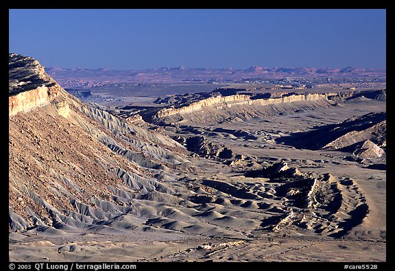
In the case of this calendar, the alterations were made by someone who was not present at the scene. Absent the artistic motivation previously described, the most likely reason for enhancing the colors is they thought the calendar would sell better.
It is well-known in the industry that more dramatic images edge others in the marketplace. The same can be observed on photo-sharing sites and contests. Velvia quickly displaced other films used in nature photography. In a world filled with more and more distractions, dramatic color catches your eye, particularly in small images, where there isn’t that much content to hold your attention. Since color photography has been arguably invented to serve commerce, it is not a surprise that “more” color will sell better. Selling is a matter of catching one’s attention fast.
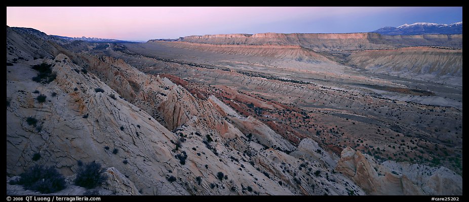
The risk is that there is an increasing “arms race” towards more saturation – and further from reality. This has been in great part aided by the ease of use of just a slider in software. Vibrant images are now expected in nature photography, creating a standard that is somehow arbitrary. If everybody else is offering images with vivid color, and you do not do the same, your images may be perceived as too flat compared to the mainstream.
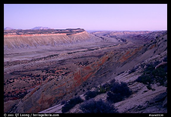
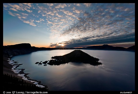
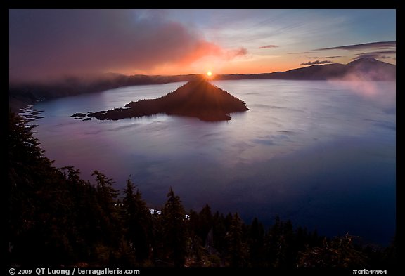
Since this blog does not let me format the images side by side, please
see the comparison here.
Update: After the initial day, the first 100 votes favored the “enhanced” versions by a margin of 56 to 44. This puts me in the minority, but I stand by my original versions. I favor clarity and truthfulness over impact. I try to create images that endure a sustained viewing, rather than attract the eye. I’d like to believe that one of the reasons why the vivid images were favored by the majority is that both series were presented as small web images, whereas I prepare my images for prints. I have found that as the print size increases, and the image is given more consideration, the “wow” factor caused by dramatic color wear out.