Terra Galleria Photography

How to create a useful watermark

Maybe my previous post in which I explain why I use watermarks has confirmed or convinced you of their relevance for you ? In this post, I’ll look at the components of my own watermarks, and their function.

My watermark has four elements:

A valid copyright notice It used to be that to receive copyright protection in the United States, you needed a valid copyright notice. Since joining the Berne convention (1989), this is no longer the case: all photographs are automatically copyrighted at time of creation. In spite of that, displaying a copyright notice still provides you with legal benefits. Not any notice will do. In the US, the valid format of a notice is strictly defined by the US Copyright office. You need all of the following elements:

  • The word “Copyright” (abbreviation “Copr.”) or the copyright symbol &#169. Note in particular that (C) (C between parenthesis) is not valid. Many folks are not aware that photographs published on the web are copyrighted works. That’s a useful reminder for them.
  • The year of first publication of the copyrighted work, not the year of creation or registration. What is considered “published” for legal purposes is rather ambiguous. In general, putting up the image on the web is publication. If the image is offered for sale – as is always the case on terragalleria.com, it is definitively published.
  • Identification of the owner of copyright

Website URL Once you release an image on the web, you loose control over where it will appear. Many sites – search engines, Pinterest, etc.. – display images outside of their initial context. Having the URL of your website provides a measure of branding and allows a potential user to come back to your site for more, and, in the most favorable cases, to purchase the image from you.

Photo ID # People and social media sites often resave images under a different name, or incorporate them in documents. If you have a lot of images, a Photo ID let you reference the image easily, again independently from the context in which it appears.

A border For web images, my preference is to write the watermark in a border frame rather than on the image itself. Fine art prints are usually presented with a matte, and signed either on a reveal or on the matte rather than in the image area. This way, the integrity of the image itself is not compromised and the legibility of the watermark does not depend on the image content. I also feel that the border enhances the image: it can bring the colors and contrasts out, get the eye get drawn further into the image, give more depth. More importantly, the border helps separate the image from the background. It is true that a border watermark is more easily removed than an image watermark. However, most people will not even try, and those who do incriminate themselves in the process.

How to actually create the watermark ? While all the common image editing programs such as Photoshop or Lightroom can be used to good effect, I personally use the free Imagemagick. As it is a command-line program, I can incorporate it into a script which manages all the different versions of the image on my website. This is a very powerful (and therefore complex) piece of software, so I won’t try to explain how to use it. Instead, here is the piece of code which is used to create the web image displayed above:

convert -interlace NONE -comment copyright 2007 Quang-Tuan Luong, all rights reserved. This image from http://www.terragalleria.com/photo/?ref=yose40017 -profile /Library/ColorSync/profiles/sRGB.icc -unsharp 1x2+1+.10 -quality 85 -border 13x13 -bordercolor black -fill grey -font @/Users/luong/Library/Fonts/ttf/TAHOMABD.TTF -pointsize 10 -draw text 13,390 "©" -draw text 51,390 "QT Luong / terragalleria.com" -pointsize 8 -draw text 25,390 "2007" -pointsize 9 -draw text 501,390 #yose40017 /tmp/master_image.ppm /Users/luong/Sites/local/images/np-pacific/yose40017.jpeg

If the above looks like gibberish to you, you can harness the power of ImageMagick to produce the same output entirely within Adobe Lightroom thanks to the LR Mogrify 2 pluggin.

My watermark format has been almost unchanged since the late 90s, except that initially I didn’t have the publication year nor the photo ID. Then I learned that the year was necessary for a valid notice. One day an art consultant sent me a PDF with dozens of my images, that I scrambled to identify. I was glad I had added the information when later a book publisher did the same with more than a hundred files.

Is there any information missing in your watermarks ? Do you use a border or do you watermark in the image ? Why ?

1 | 2 | 3

Vignettes from Seoul, South Korea

Last fall, before I traveled to Vietnam for a family visit, I noticed that most flights had connections in Seoul. Thanks to my wife and sister-in-law influences, I’ve watched a few 15-episode Korean TV dramas, but I’d never been in the country, so I was curious to check it out.

While on the Asiana (excellent service, Star Alliance) plane from Ho Chi Minh City, I browsed through the Lonely Planet guidebook and chose the Inn Daewon for its location and character – it is a hanok-style hostel (hanok are traditional houses). After picking up my luggage at the super-efficient Incheon international airport, I called the hostel to reserve a spot using my iPod Touch and free WiFi, then headed towards the help desk to get directions. The lady helpfully wrote down the shuttle number and I was on my way.

After a ride of about an hour – less than $10, individual TV screens – , the shuttle dropped me on the street. I was just a few blocks away from the hostel, but it was difficult to locate. Fortunately, despite the late hour (close to 11pm), the streets were still bustling with activity. I asked a local vendor, by showing him the guidebook, which has Korean script for all destinations, and although he didn’t speak English – like most people in Korea – he was kind enough to walk me half a block towards the right direction. The hostel owner was friendly, like the guidebook mentioned. He showed me with much gesticulations and sign language how to help myself to breakfast. Since there were no private rooms ($27) available that night, I settled for a spot in a dorm ($13). Generally speaking, I was surprised at the low cost of travel in South Korea. It was the lowest I’ve seen in all the developed countries I’ve visited – South Korea is a fully developed country, with an infrastructure often superior to the US.

This was going to be a quick trip of just 10 days with travel along the whole length of the country, so my time between visiting architectural sites – my main objectives – was limited. Along the way, I witnessed some slices of life in the city.

Cheonggyecheon is a stream running through downtown Seoul. Following the Korean War, it became filled with waste and was then covered with concrete and an elevated highway. In 2003, a project was initiated to bring nature back to Seoul and to promote a more eco-friendly urban design. The restoration of the stream was a great success as the Cheonggyecheon quays are filled with strolling people every time of the day.

Pensioners play Go in a public square. Go has been played for more than 2,000 years. Despite its extremely simple elements – a square grid, white and black stones – Go is possibly the most complex of board games. While a computer chess program running on a laptop has defeated the world champion in a match, computer go programs are still far from reaching professional levels of play. That was the first time I saw the game played in the street. When I played a bit of Go in my youth, it wasn’t easy to find partners.

South Korea has been a democracy only for a relatively short period of time. Seoul was the seat of the Joseon dynasty, one of several kingdoms that dominated the peninsula over time. Part of an effort to preserve history and culture, in front of the Gyeongbokgung Palace, the changing of the guard offers a lively pagentry which do not have anything to envy to the ceremony at the Buckingham Palace.

On a busy pedestrian alley lined up with glitzy modern stores and neon signs, shoppers line up at street stalls to buy traditional foods.

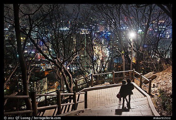
On a freezing night, a couple walks down the 1000 feet high stairs of Namsan Mountain, a hot dating place where I’ve seen more young couples together than anywhere else in the world.

On the sacred Inwangsan Mountain, shamanism – the belief that shamans are messengers between the human world and the spirit worlds – continues at the site of Seon-bawi, a Dali-esque outcrop of rocks. Wearing a thick parka, a young woman sits in prayer for a long time.

More pictures of Seoul, South Korea

1 | 2 | 3 | 4 | 5 | 6

Why I use Watermarks

Watermarks are often the subject of passionate debates amongst photographers. In this write-up, I am explaining my preferences, from the point of view of a modest photographer who derives almost the totality of his income from licensing and selling of images, in the hopes that it would be useful to those who try to go this path. For me, watermarks are not a philosophical matter. They are simply a good business practice.

Rather than writing from scratch, I though it would be more informative to write this as a reply to Trey Ratcliff’s popular post Why I don’t use watermarks. Let me preface this by saying that although I disagree with his points, I have tremendous respect for Trey’s art as well as his business savvy. I’ve chosen to react on his post (bold) because he is such a high-profile proponent of the “no watermark” approach, and his arguments make a such a well reasoned case for the opposite view – so that you can see both sides.

Why I Don’t use Watermarks

I get this question a lot, and I know it came up in the live hangout last night. I know my opinion is different than many other photographers, and that is okay.

It’s okay for Trey to explain what works for him. However Trey’s position is also different from many other photographers. He is a kind of “celebrity”, who has such recognizable artwork and numerous followers that he doesn’t need watermarks for recognition or protection. Although he doesn’t present his statements as recommendations, because of his influence, some are tempted to read them as such. Witness the number of comments to the tune of “until recently I used watermarks but after listening to Trey I dropped them”.

As you may know, my work is all Creative Commons Non-Commercial. That means people, as long as they give credit and link back to http://www.StuckInCustoms.com , can use my images on their blogs, wallpaper, personal use -anything – as long as it is not used commercially.

There are many misconceptions about “Creative Commons” (CC), including that it is a “new” thing which is an alternative to copyright. It’s not. I’ve encouraged personal use of my images many years before CC was officially created. You don’t need CC to specify how you want your images to be used. CC works well for many intellectual endeavors, but it is a cookie-cutter approach to stating “terms of use” which doesn’t apply very well to photography (that would be a topic worth several posts alone). I share my images in the same spirit as CC, but I prefer to make the decisions on who uses my images on my own terms. There are many more undesirable consequences of CC, but for an easy example, I’d rather not have my images used for free by some non-profit whose cause I disapprove and whose executive director makes a six figure salary. On the other hand, there may be some “branding” advantages with CC that I am investigating.

Every day, I upload a HUGE 6000+ pixel max-resolution image to the Internet. I do not have any fear at all – Believe me, it’s quite liberating living in a world without internet-stealth-fear.

I live in a nice neighborhood of San Jose, CA, the safest of the large US cities, yet when I go to sleep or leave the house, I lock the door. I don’t think it means that I live in fear. Like you all take common sense steps to protect your other possessions, if you are a professional or semi-professional photographer, it is just common sense to take some steps to protect your digital assets in the wild west of the internet.

Since I offer paid subscriptions that let members download higher resolution images as wallpaper, I don’t think it would make sense to offer free higher resolution images to everybody. Similarly, since I sell limited edition prints, I do not think it is appropriate to provide free high resolution files for anyone to make a print. Apparently, despite all the talk about “Creative Commons”, maybe because he sells prints – limited edition, no less – Trey discourages people from making prints made for their private homes by stating “Sample Use Requiring a License to Copyright: License to create an individual print for use in a private home” – although this is quite close to fair use territory ! I actually do not have such issues, and have for years explicitly listed personal print-making as a permitted use, so maybe I have less fear than it seems.

Last but not least, watermarking is not so much about fear and preventing “theft” than it is about advertising your name, and making sure your name remains attached to the image even when you do not have control of the contexts in which your image is used.

People that want to license our images regularly contact our licensing team – we get many of these every day of the week.

Yes, but people who don’t know that an image should be licensed wouldn’t contact you. They’d just use the image. Sure, professional image buyers know better, but it’s been argued (for instance by Dan Heller) that they don’t make up the majority of the market anymore. On the other hand, professional image buyers often seek exclusivity for the most expensive licenses, and it’s difficult to make a case that an un-watermarked, full-res image is exclusive… It’s great that Trey is doing so well that he can ignore the lost business, but that’s not the case for most artists.

So why don’t I use watermarks? It’s a multi-part philosophy – 1) Watermarks look ugly. Whenever I look at a photo with a watermark, often times, ALL I can think about is that watermark! It’s so distracting. Maybe this is just me.

This is purely a matter of personal preference. Some may even find them beautiful. Keep in mind that photographers – who are the ones vocal against watermarks – do not look at images the same way as other people, often concentrating on technical details rather than contents.

Personally, I find watermarks in the image area perfectly acceptable if tastefully executed, which mostly means small, in the periphery of the image, and low contrast. Before the rise of the internet, the primarily means for dissemination of photographs were magazines. Have you seen many images reproduced as double spreads with no text super-imposed ? Most painters sign on the canvas. Do you find that their signatures ruin their paintings ?

What I prefer to do is to put the watermarks in a border surrounding the image – I call that a “signature” rather than a watermark, but let’s lump they together to keep things easy. The image area stays free of text. The frame arguably enhances the image in several ways: it can bring the colors and contrasts out, get the eye get drawn further into the image, give more depth. More importantly, the frame helps separate the image from the background, which in case of an uncontrolled webpage can be messy. For instance, it prevents whites in the image from blending with a white page. There must be a reason whey the traditional way to present a print is with a matte and a frame. There also must be a reason why most fine art prints are signed. If your prints are hung unsigned in a show, there is a pretty good chance that there will be a sign identifying you as the author.

2) Legitimate companies do not steal images to use commercially. So I don’t have any logical fear there. *In case of emergency, break glass and see #4

It is well documented that many large US companies have infringed copyrights. In other countries copyright laws are even much less strict and remedies not readily available (the motivation for a recently discredited law proposal). I have found quite a few US law firms that use my images in an unauthorized way (half a dozen of them used the same image !). Lawyers are the last persons who can claim not to know about copyright law, yet the fact that they’ve infringed copyrights do not make their businesses illegitimate.

Besides, there are many people who don’t know about licensing and copyrights, who assume that everything on the internet is for the taking (“information wants to be free”) or that anything that does not bear a copyright sign is not copyrighted. Some of those people work at legitimate companies. Mistakes happen all the time.

3) There are other services, like Tineye (and Google) that can help my team easily find bottom-feeders.

When a single image is used on hundreds of sites, like some of mine, and even more so Trey’s, it takes a lot time to separate “bottom-feeders” from legitimate users. Trey has stated that he has a team of ten people working for him, but an individual artist might prefer not to spend his time on those kind of pursuits – you’d be surprised at how rude some of the copyright infringers are.

4) We do register our images with the copyright office, so if someone uses an image commercially without a proper license, it is an easy lawsuit.

Registration is useful only in the US. In the US, it may be easy but if the image was properly watermarked, it will be much easier. First, one of the key factors in a copyright infringement lawsuit is to establish that the infringement is willful, as this opens to door to much higher penalties. Not any watermark will do (more on that in a future post), but if your image had a proper copyright mark, the fact that the infringer removes it makes the infringement automatically willful. It is much easier to claim innocent infringement if the image had no copyright mark. Second, removal of the identifying information is a DMCA violation, which in itself is a serious offense.

5) I don’t have to maintain two versions of each image – one with a watermark and one without.

Neither do I. My CMS (content management system) does it for me. On the terragalleria.com site, I already have 9 versions of each image: small thumbnail for search results, large thumbnail for index pages, 550 pix image for normal display, 1000 pix image for enhanced display, plus 4 different sizes of wallpaper images – I plan to add more soon -, full resolution. Trey has 7 sizes. Do you really think it’s a big deal to have one more version ?

6) NOT using watermarks and using creative commons helps more and more people to use your image freely for fun, which increases traffic and builds something I call “internet-trust.”

It would be nice if each time someone uses your image on the web, they credited it and linked to your site next to the image as required by Creative Commons. Unfortunately, that’s not how the real world works. In the real world, many images are used without credit. In the real world, once the image appears uncredited, others copy it without regard for the Creative Commons requirements, since they are not attached to the image. When this happens, if someone stumbles upon your image and likes it, there is no obvious way for them to even contact you (not everybody is aware of reverse image search).

Even if you are not trying to sell your images, wouldn’t it be nice to see your name mentioned each time your image is used ? If it went “viral” ? It’s great to have millions of views, but if your association with the image is lost, what good does it for you ? The only practical way to ensure that association is to have your name on the image. Of course, watermarks can be removed, even more easily when they are in a border. But even though you may omit an attribution notice in good faith (esp. if you found the image with none), you don’t remove a watermark with a copyright sign in good faith. I do trust the vast majority of people to be honest.

What about non-web uses ? I’d submit that for people who gather photos for fun, the watermark is useful as a reminder of where they got it (and can get more).

7) As image search and image recognition get better and better, there will be no need to watermark things. In 1 year+, we’ll be able to r-click an image and choose “Google-find the original creator” — there is a bit trail to first-on-the-internet.

Actually Picscout already offers a similar service – although not for free to the image owners. However, do you think that the average image user – even in good faith – would bother ? You don’t want users to have to look for your brand. It should be obvious. Why do all other brands on the planet put their names prominently on their products ?

8)Yes, last, there will be bottom-feeders that steal your stuff. I call this the cost of doing business on the internet. These are the Tic-Tacs that are stolen from the 7-11. It is impossible to maintain 100% of your digital inventory, so wanting “perfection” in your online strategy is an illusion.

A study by Picscout has shown that 90% of image uses on the web are un-authorized. If the rate of shoplifting was that high at 7-11, I think they’d take some action.

Watermarking is an effective solution. There are quite a few of people who don’t know how to remove the watermark – however easy it may seem to a photographer, so they will contact us to get an unwatermarked version. For those who do, the watermark acts as a useful reminder that the image is copyrighted. Last, for those who go ahead anyways, I do not harbor any ill-feelings or animosity towards them. I do not call them names, nor does my attorney. If I determine that their use of the image is egregiously commercial, I just try to make them pay. For that the watermark helps as explained in #4. There is no need to get emotional about copyright infringement – or watermarks. It’s just business.

The reality is that it is very difficult to have a good business selling digital media if you are not willing to have a strategy to protect your work. I believe that watermarking should be part of that strategy. Do you agree with me ?

1 | 2 | 3

Advertising shot at Stanford

Here’s something a bit different from what I usually post: an advertising photo shoot with models and lights. Although in the past I haven’t actively sought assignments (not even mentioning my availability for them), I was still occasionally contacted to create commissioned images. In this case, what led to the job was my great familiarity with the Stanford University campus.

You probably know me for my landscape images, but as a photographer I enjoy the challenge of being versatile and reasonably proficient in all aspects of the craft. It’s like when you go to graduate school, you end up doing extremely specialized research in a sub-sub-sub area of a discipline, but you still have to demonstrate an understanding of your whole discipline so that you can see the whole picture and benefit from cross-fertilization of ideas. Besides travel and adventure situations, I actually photograph people quite a bit. Often those people are my family, and so far I haven’t released those images to the public (maybe one day…).

Those images were shot for a local bank’s advertising campaign at several locations, including a bank branch and various places on the Stanford campus. On advertising shots, many people (in this case the art director and models) need to be present. This generally leads to strict time constraints. I normally prefer to photograph using natural light, but because the shot had to take place in a single day, I sometimes had to work in difficult lighting rather than picking the conditions. This meant that it would be necessary to use supplementary lights. Because I had to work fast, I relied on small flashes and the Canon wireless TTL system. Although I could have done the job by myself with light stands, having my assistant to hold one of the lights on a pole significantly sped up the sessions. In the end, I delivered a final edit of more than a hundred images (out of about a thousand usable and processed images) encompassing more than twenty different set-ups.

Do you see something in common between this shot and the rest of my work ?

Sequoias and stars, Kings Canyon NP

Although they are not as tall as the coastal redwoods, the giant sequoia trees still reach impressively into the sky. I found it difficult to convey the sense of cosmic height in daylight images. The usually blue sky isn’t visually that interesting, there are almost always harsh shadows or dappled light on a part of the trunks, and it is difficult to avoid visual clutter when trying to include the entire tree. I’ve come to prefer night photographs, because they do not suffer from those shortcomings. Do you agree ? Here are some variations on this theme, from two trips to Kings Canyon National Park last year. All images were photographed on Canon EOS 5D mk2 with 24/1.4 II lens, except last one.

Image 1. Shot using only natural light from the moon, this required careful planning to find a well-lit tree, as a balanced exposure. ISO 800, f2.8 4min.

Image 2. Light painted with a flashlight. Thanks to the spot lighting, the tree (General Grant), which is depicted almost entirely, is better separated from the surrounding forest than in a daylight shot. Beyond ISO 1600 noise becomes objectionable to me on the 5Dmk2. Beyond 30s star streaking is more noticeable, so ISO 1600, f1.4 30s.

Image 3. This is a closer angle on the General Grant tree, pointing more upwards. I used less even lighting, shining the light on some areas more than others, and emphasized the leaves. ISO 1600, f1.4 30s.

Image 4. This unnamed tree was lighted more laterally, providing more texture for the trunk. I lighted from the right so that the left side would be shaded in order to add contrast with the bright celestial body. ISO 1600, f1.4 30s.

Image 5. Looking for a more complex subject, I included a group of three sequoia trees. More neutral filtration results here in colors closer to moonlight. ISO 1600, f1.4 30s.

Image 6. I found a tree with an impressive opening (caused by fire) at the base. To make the opening more prominent, as well as including a sliver of sky in the opening, I had to get closer to the tree, therefore using a wider lens (zoom set at 19mm). Because the f1.4 aperture is not available on that lens, the exposure is much longer, resulting in short star streaks instead of point stars. ISO 1600. f4 4min.

(if you don’t see the poll question, please vote here for your favorite)

Do you find the light-painted images artificial, or is using lighting in nature photography fair game, like in most other areas of photography ?

More night photos of Sequoias

Cedar Grove Rims, Kings Canyon NP

Last year, I spent some time in Cedar Grove, Kings Canyon National Park, trying to find out whether it was another Yosemite Valley. In the previous post, I reported about my explorations of the Cedar Grove valley floor. In this post, I am describing some of my findings on the Cedar Grove rims from a trip later in the year.

From Cedar Grove, there are just two trails that climb from the valley floor to rim views. The easiest is the Hotel Creek trail, which is best hiked in early morning, as it climbs, via switchbacks through chaparral, a south-facing side of the valley.

After 1200 feet of elevation gain and 2.5 miles, I reached the Cedar Grove Overlook. The light would probably be better in late afternoon – in the morning, the view towards Cedar Grove is backlit – but I was more interesting in exploring the loop in daylight than waiting there and hiking down in the dark. Although this is the closest high vantage point to the valley, I found that from this it perspective lacked impressive features. Using a wide-angle lens, I waited for a cloud to shade the foreground, as I didn’t want the brightness of the light rock to overwhelm the image. The eye is always attracted to the brightest areas in an image, and when such areas happen to be in a corner, they can lead the eye out of the image.

I went back to the trail junction, and continued past the turn-off to Cedar Grove Overlook, crossing a lovely forest beyond which the Monarch Divide came to view.

After 1.25 miles, the Hotel Creek Trail drops down to join the Lewis Creek Trail. Along the descent towards the Valley, there were some interesting downstream views, but since that was from a side valley, it consisted mostly of ridges. The last 2 miles, from the Lewis Creek Trailhead back to the starting point followed a trail above the roadway. The total hiking distance was about 8 miles.

Yosemite has Tunnel View and a number of rim overlooks easily accessible from the Glacier Point Road, including Glacier Point itself with its panoramic, 270 degrees views. Although Cedar Grove does not have such a rim road, there is a relatively accessible panoramic view from Lookout Peak – although a bit distant. Unlike Glacier Point, chances are you’ll have it all to yourself like I did. Because the viewpoint is located almost straight west from the very deep Cedar Grove valley, I didn’t think that the early morning or evening light would be favorable, so I chose to come mid-day. Like at Cedar Grove overlook, I waited for the background to be shaded by a thin cloud.

As Lookout Peak is some distance from the valley, I switched to a telephoto lens for a closer view of the glacially carved valley, and lingered on the summit for a long time, observing the play of light and shadows as the clouds moved.

At first, it doesn’t look like Lookout Peak is that easy to access, since from Cedar Grove, the roundtrip hike through the Don Cecil trail – the other trail to climb out of the valley – is about 14 miles and climbs 4,000 feet.

However, after a bit of research, I found out a little-known shortcut. Lookout Peak is on the border of Sequoia National Forest and Kings Canyon National Park. By driving through National Forest roads, I was able to get to park my car within 1/2 mile of the top of the Lookout Peak, from which there was a steep but easy non-maintained trail to the summit, home to prominent radio towers. Take the Big Meadows Road (14S11) east of the General’s Highway almost exactly half-way between Grant Grove in Kings Canyon National Park and Lodgepole in Sequoia National Park for about 15 miles, passing a large campground. The road starts paved and turns to dirt, but a regular car can make it with careful driving. When you reach the road end, turn back, and within 1/4 mile, near a prominent turn, you’ll see a large turnout on the east side.

More Cedar Grove Rim Views
More images of Kings Canyon National Park

Canon 70-200/2.8 IS II, 70-200/2.8 IS, and 70-200/4 IS: comparison/review

The short 70-200 tele-zoom is one of the most popular professional lenses. It covers a useful focal length range, good from portrait work to sports shooting and also for distant landscapes as well as details.

Canon makes four of such lenses. All of them use a ring USM motor which offers fast, silent focus plus full time manual focus override, and have internal focus. They come in f2.8 and f4.0 versions, with and without Image Stabilization (IS). The versions without IS are less expensive and slightly lighter. Personally I think that IS is such a useful feature that I think it is well worth the additional price.

Since the f4 lenses are more recent that the venerable first 70-200 f2.8 lens, they benefit from some improvements, for instance sporting a more efficient IS. The advantage of the f4 lenses are: lower price (however the tripod collar is not included), slightly smaller size, and half the weight. The advantage of the f2.8 lenses are: half shutter speed wide open, greater background blur wide open to isolate subject, auto-focus operation at all fstops (works in lower light, faster, more precise, works with 2x TC).

I read everywhere that the 70-200 f2.8L IS USM is one of Canon’s best lenses. That isn’t my experience, and mine ended up one of my least used lenses. While its construction and operation are superb, I was disappointed by its lack of sharpness. It could certainly be that I had a bad sample – at the time when I acquired it, I didn’t test lenses like I do now. But to me it looks like that Canon themselves recognized that they could do better, since last year they released the 70-200 f2.8L IS II USM.

I passed on the 70-200 f4, since, for a lighter lens, I preferred the longer reach of the 70-300/4-5.6 IS USM lens, which by the way, I did not find optically inferior. Last December, my friend Regis, who carefully hand-picked his 70-200 f4 IS, brought two copies of the new 70-200 f2.8L IS II USM.

The two f2.8 lenses look almost identical. The only visible difference are that the focusing ring on the II version is a bit wider, and the switches are lower profile, but the lens has been in fact totally redesigned: besides additional special lens elements, the II lens has better focus distance and magnification, AF (improved speed through new algorithms), and IS.

We used Imatest to measure the MTF 50 (the most accurate numerical indicator of sharpness/contrast, see this post for details) of the four lenses at 70mm, 135mm, and 200m:

  • A/C: two new 70-200 f2.8 II
  • B: 70-200 f2.8
  • D: 70-200 f4

Main conclusions from the graphs:

  • The new 70-200/2.8 II improves considerably on the old 70-200/2.8, in particular at wide apertures. It also beats the 70-200/4 (hand-picked, unlike the 70-200/2.8) which came in second place. Canon did deliver on their promise of a better lens.
  • While results at 70mm and 135mm are roughly comparable, there is a significant sample-to-sample variation between the two copies of the 70-200/2.8 II at 200mm. In fact, there is as much difference between the two (identical) lens samples than between a 70-200/2.8 and the 70-200/4. Test your lenses !

Summary:

70-200 f/2.8 II 70-200 f/2.8 70-200 f/4
Maximum aperture f2.8 f2.8 f4.0
Close Focus 3.9 ft./1.2m 5 ft./1.5m 3.9 fr./1.2m
Max. Magnification 0.21x 0.16x 0.21x
Lens construction 23 elements, 19 groups 23 elements, 19 groups 20 elements, 15 groups
Special Elements 1 Fluorite, 5 UD 4 UD 1 Fluorite, 2 UD
Image stabilizaton 4 stops 3 stops 4 stops
Filter size 77mm 77mm 67mm
Size DxL 3.4 x 7.7 in/ 86 x 197mm 3.4 x 7.7 in/ 86 x 197mm 3 x 6.8 in/ 76 x 172mm
Weight 52oz / 1490g 51oz / 1470g 27oz / 760g
Distortion 70mm: 1.4 (barrel)
135mm: 0.7 (pincushion)
200mm: 1.3 (pincushion)
70mm: 1.4 (barrel)
135mm: 0.8 (pincushion)
200mm: 1.3 (pincushion)
70mm: 1.6 (barrel)
135mm: 1.3 (pincushion)
200mm: 1.8 (pincushion)
Sharpness Best (see graphs) Good (see graphs) Better (see graphs)
Price (01/2012) $2069 @ BH
$2069 @ amazon
discontinued $1131 @ BH
$1131 @ amazon

Year 2011 in review and favorite images

A lot of plan changes occurred in 2011, so that I have not really accomplished what I set out to do, yet I’m still lucky that I got to go around and experiment a bit. Here’s a chronological selection of some favorites taken during the year 2011, which also serves as a kind of (*) “year in review”. Most of them were shot at 24mm on Canon 5Dmk2. Links point to blog entries where you can see more images and read background about them.

Most popular blog entries in 2011: Six-part series about my photography business on the internet (start here), Best ISO for low noise on Canon 5D mk2.

February. I traveled to Jackson, Wyoming, which I had never visited in winter. In Grand Teton National Park, I got to see the Grand Teton only for a few hours during my week and half stay, leading me to more minimal and tighter compositions than I usually seek.

In Yellowstone National Park, the sky cleared up only during one night, when I made this moonlit exposure of Old Faithful. But getting there was already quite an experience.

April/May I spent a week on the island of Kauai. I revisited the Na Pali Coast, however from a photographic point of view, the most interesting was the realization that I could create beautifully flowing seascapes in mid-day.

One of my main emphasis this year was on night sky photography (thanks to a recently acquired EF 24/1.4 II) and time-lapses. On this visit to Hawaii, I rented a Jeep, which made it possible to visit the Mauna Kea Summit, home to the finest telescopes on the planet. This also saved a long walk to the Green Sand Beach.

I returned to Hawaii Volcanoes National Park, mostly for the new Halemaumau vent which wasn’t present during my past visit. This exposure was made unattended, a first for me. I also photographed the rainforest, using flash techniques rekindled by attending a Flashbus McNally/Strobist presentation.

The third Hawaiian island I visited was Maui, for Haleakala National Park, where I photographed in stormy conditions both the Haleakala Crater and Kipahulu, linked by a drive on South Maui that I haven’t done before. However, the highlight was to see this group of Nene birds. The world’s rarest goose, it came to the brink of extinction in mid 20th century, when only 30 birds remained. Since then, the species has rebounded, but it is still a rare an treat to spot them.

June. Since my Yosemite book was published, I decided to spend more time in Kings Canyon National Park and adjacent Sequoia National Park, where I caught this grove of Giant Sequoias trees behind a veil of dogwood blooms.

August. We took off for a family road trip in the Northwest, visiting the eastern part of Oregon (including the Lake Owyhee area and Hells Canyon) and the three National Parks in Washington State. The lower water conditions at Marymere Falls in Olympic National Park gave rise to divided channels which created a totally different liquid effect than when I previously photographed there in the spring.

September. I returned to Acadia National Park for a third straight consecutive year, but in different seasonal conditions, as it was still summer (it was early in the month).

This was on the occasion of an invitation to lecture at the National Heritage Museum. After the event, I spent some time to photograph Lexington, MA. I supplemented moonlight with a bit of light painting to create this new view of Louisa May Alcott’s house.

(*) I haven’t yet processed the images created during the last quarter of 2011, which focused on cultural subjects mostly absent from the rest of the year: a stay in Vietnam was followed by a wide-ranging trip to South Korea, where I visited 9 out of the country’s 10 World Heritage sites. This was bracketed by trips to Kings Canyon National Park and Reno.

That situation was the same in previous years, which is why I hadn’t made such “year in review” posts. I prefer to let images sit a bit after a trip, so that I can look at them more objectively. The proximity of a trip makes it more difficult to distinguish the excitement of the experience from the visual strength of images. I process images in block, as my work is often about a story rather than a single image. Because of those two reasons, I rarely post images which are less than a quarter old, but this year I realized that 9 months was already plenty of images for such a short selection.

Let me know if you have a favorite!

Happy New Year 2012

I wish everyone a year 2012 full of happiness, health, and success. My sincere thanks for your continuing readership and interest in my photography.

A day in Acadia National Park

On the occasion of a return to Lexington, I walked the Freedom Trail and the Black Heritage Trail in Boston, before taking again a trip to Acadia National Park – for a third consecutive year. As I set up my camera bag on a slope on the shores of Jordan Pond, it toppled, a lens spilled out, and I could only watch as it rolled down into the lake! Later, as I was getting ready to set-up a time-lapse, I downloaded hurriedly a 32GB memory card on two hard drives in order to free-up the space, then reformatted it. Normally, I visually check images, but it was already 11pm, and I was going to get up for sunrise. When I returned home, I realized that I had downloaded the wrong card. My images were overwritten, so no recovery was possible from the card: four days of photography were wiped out. The only images remaining from that Acadia visit are almost all from the last day. Lesson learned! This post presents photographs from my last day in Acadia, the one that followed the memory card incident and therefore was the only one preserved in pixels.

A decade and half ago, I photographed on Ocean Drive the first rays of sun illuminating granite slabs, then afterwards noticed a beach covered with large round pebbles. Since then, I had waited quite a few times there for the light of sunrise – even in the rain. That morning, with a bit of color on the horizon, the dawn was promising.

However, the sunrise time turned out to be misty.

Acadia National Park is known for its jagged coastline of granite, but the park actually includes a sand beach, simply named … “Sand Beach”. I guess there aren’t too many of them around, and being in New England, that’s normally a popular spot, but in early morning, it was totally deserted.

I hiked on a short, but rugged trail to one of the tallest headlands, the Great Head. Just half a mile away from the crowded (and often traffic-jammed) Ocean Drive, the small peninsula has retained its wild character.

By the time I returned to Sand Beach, vacationers had arrived.

I headed towards the quieter part of the Park, along the carriage roads. The weather was cloudy, but looking towards the East, I could see a clearing, so I decided to try and find a wide scenic view.

I hiked to the top of South Bubble, but the view wasn’t great. It was much more interesting from North Bubble, as I could see the Ocean beyond Jordan Pond. I arrived there just in time for some sunset colors. Due to the late hour, beyond the trail junction of the two Bubbles, I didn’t see anybody. I stayed until dark, hiked down, and drove south as I had to be at the museum at noon the next day.

More images of Acadia National Park