Processing tip: Brightening in Lightroom Explained
3 Comments
Brightening an image in Lightroom with sliders looks like a straightforward task, yet there are two ways of doing it, and they can yield very different results, as illustrated with images and stepcharts. This framework is also used to examine the most useful Lightroom slider.
Brightening an under-exposed image
This image of the White Cliffs in Hanford Reach National Monument is too dark. The abundance of empty space on the right of the histogram indicates that there is a lot of room for brightening.

The most natural way to brighten is is by adding exposure, right? However, as you can see below, moving “Exposure” to the right results in an image which looks “washed out”, even though there is still plenty of room at the right of the histogram, which means that the highlights are far from clipped.

Instead of using the “Exposure” slider, let’s use the “Whites” slider. Even if we slide it to the right to the point where there is a bit of highlight clipping, the image looks much better!

Analyzing the effect with a step-chart
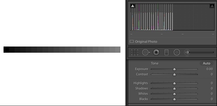
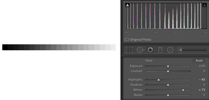
To understand what is going on here, let’s use the stepchart below, where the leftmost patch is pure black (0), the rightmost patch is pure white (255), and steps are in equal increments of 5%.

To create an under-exposed image, we reduce the brightness of the stepchart by 50%.
When we brighten it with the “Exposure” slider, notice how the spikes on the right, which correspond to the bright patches, tend to bunch together. The consequence of that is that those bright values lose differentiation, as the bright tones merge together. That, and not clipping, is what causes highlight detail to be lost.
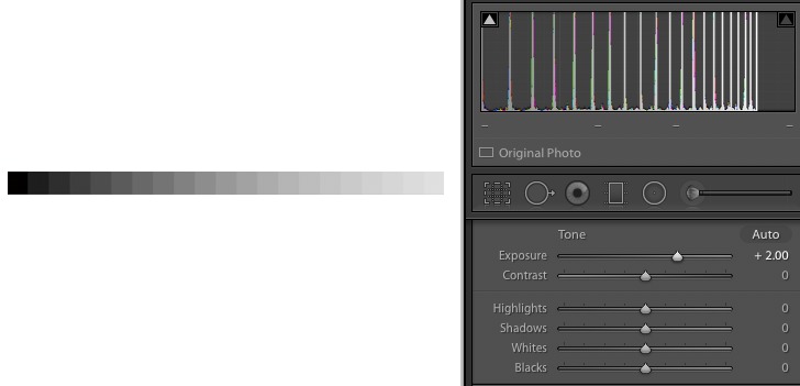
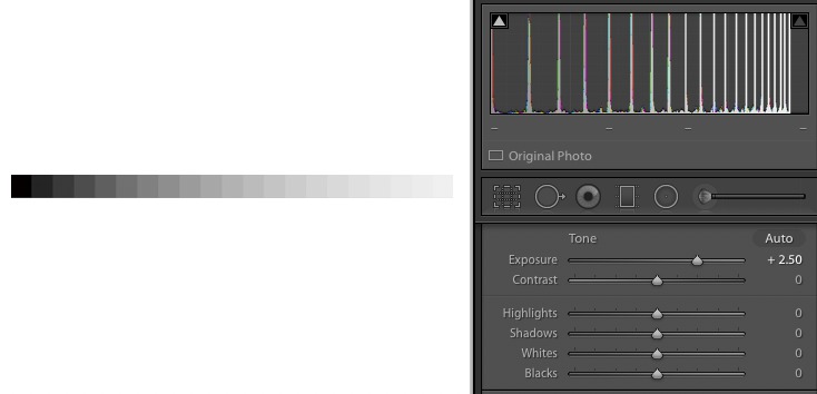
If we brighten the image further with the “Exposure” slider, the effect becomes even more pronounced.
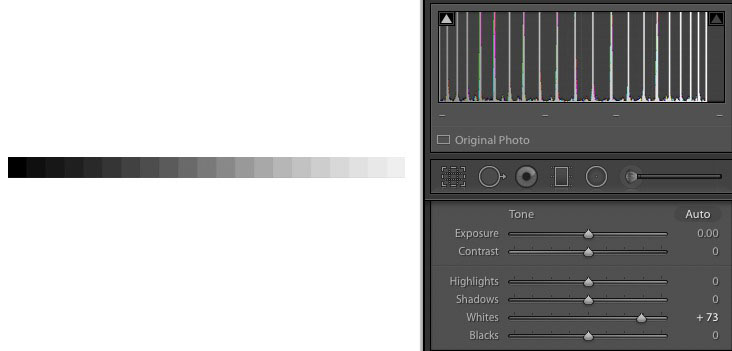
Now if instead we use the “Whites” slider, the spikes are more evenly distributed. The dark values are less separated than with the “Exposure” slider, but the bright values are more separated, in fact about the same as the dark values, with the mid-tones receiving the most separation, which is what we generally want, since they are the most important in the image.

If we brighten the image further, to the point where the brightest highlights match those in the image brightened further with the “Exposure” slider, we can see that better highlight separation is still retained.
Brightening a normally exposed image
This forest scene from Cuyahoga Valley National park is almost correctly exposed, with highlights quite close to the right edge of the histogram, but it still looks a bit dark.

However, if we move the “Exposure” slider to the right, we can notice that the bright greens in the image have now lost detail and look too bright.

You’d think that by brightening something with a slider called “Whites” would negatively affect bright areas, but they actually hold more detail compared to brightening with the “Exposure” slider.

In the finished image, to recover even more highlights, I’ve moved the “Highlights” slider to the left in the opposite direction from the “Whites” slider, a move that will be more clearly seen in the next example.

Brightening while maintaining highlight detail
This waterfall from Cuyahoga Valley National park is also almost correctly exposed, but still looks a bit dark.

The “Exposure” slider brightens the dark and mid tones, but the highlights lost detail.

We recover them by moving “Highlights” to the extreme left, illustrating again why Lightroom’s “Highlights” is one of the most efficient tools at your disposal in the digital darkroom. While it is also possible to move “Highlights” to the right to brighten light tones, there are better ways to do so. Therefore, when using Lightroom, I always move “Highlights” only to the left.

The highlights now look a bit dull. This is remedied by a “Whites” move – which I use almost exclusively to the right. That Whites/Highlight opposite move is similar to the Shadows/Blacks opposite moves described in the previous post

To understand what is the effect of this combination, let’s go back to the stepchart. Compared to the previous stepchart, moving “Highlights” to the left has the effect of creating more separation between the bright values. The brightest highlights have almost not been darkened, but the other highlights have, and therefore the range of highlight is larger than before, which is what creates the impression of better highlight detail.
To gain insight into the effect of sliders in your processing software, I invite you to download the stepchart and observe how the histogram changes when you move them, like we did in this post.

i Started editing my photos in this manner after reading Michael Frye’s “Landscapes in Lightroom” ebook. While he explains the reasoning for editing in this manner, your use of the stepchart is extremely informative and helpful. Great post!
Thanks. Michael Frye’s “Landscapes in Lightroom” ebook is a great resource, maybe the best on this topic!
Thanks for this and the other post mentioned in your current emails. I’ll definitely look to see how they compare to how I’ve edited some problem images.