Driving the Dalton Highway in Winter
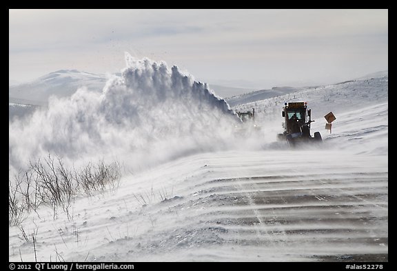
The Dalton Highway has the reputation of being one of the most dangerous roads in the world. It is one of the northernmost roads, crossing well into the Arctic, and reaching the highest road point in Alaska that is maintained throughout the year, Atigun Pass. Then there is the extreme remoteness. Along its 414 miles there are services only at one place in winter: Coldfoot (population 13). The 240 mile stretch north of Coldfoot is the longest in North America without services. The Dalton Highway was not designed for personal vehicles, but rather as an industrial road for trucks. It was built in 1974 to support the Prudhoe Bay oil fields and Trans-Alaska pipeline. For the first twenty years it was closed to public traffic. Those speeding 18 wheelers can add to the hazards of the road. In summer, gravel flies and windshield damage is likely.
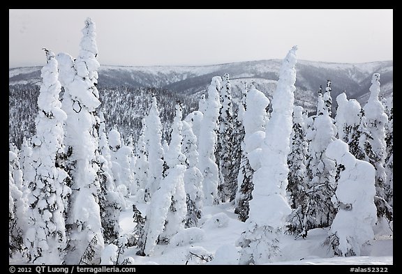
In winter, temperatures become extreme, creating hazardous road conditions. The Wikitravel article on the Dalton Highway warns: “travel from late September through early May is frigid and lethally cold during the heart of winter. Temperatures below -40ºF (-40ºC) are very common and temperatures as low as -60ºF (-57ºC) are certainly possible–before factoring in windchill. The record low windchill in Deadhorse was -102ºF(-74ºC) on February 28, 1989! A chart record of windchill at ARCO’s facility in Prudhoe Bay on 1/13/1975 shows -128. Such temperatures are lethal in less than 1 minute if not prepared for such temperature. Unless experienced with polar temperatures and gear, DO NOT attempt to traverse the highway between November and March! “.
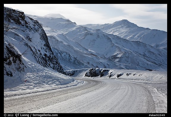
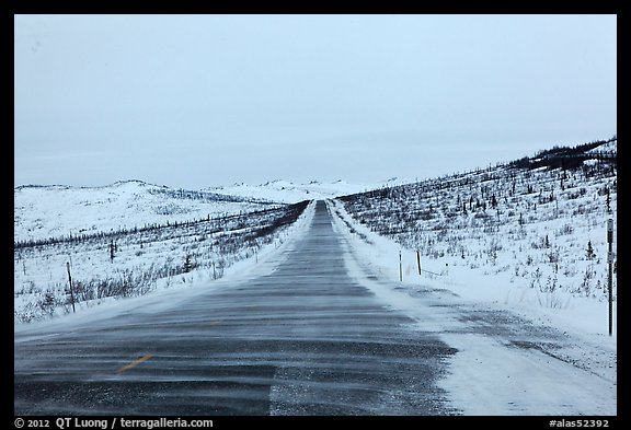
 -32F temperature north of Atigun Pass on a sunny day
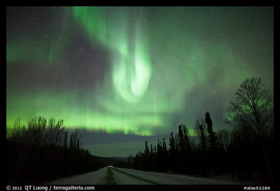
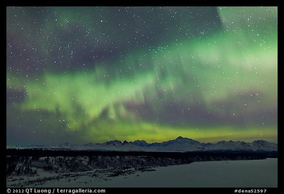
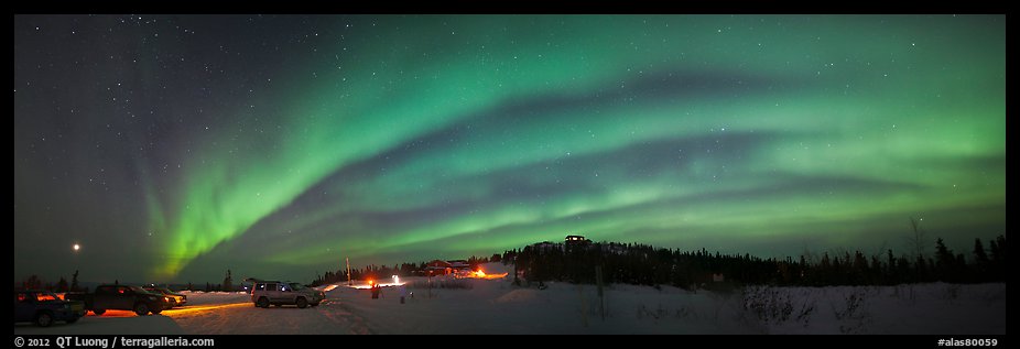
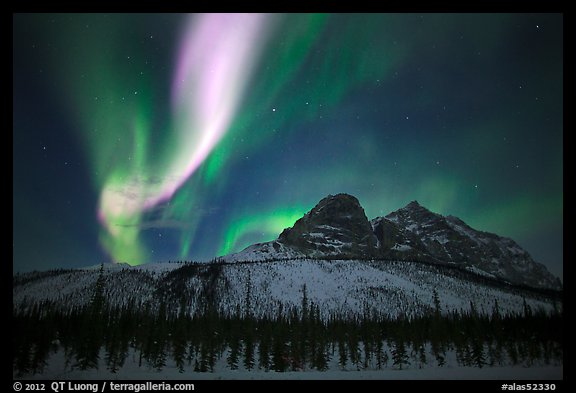
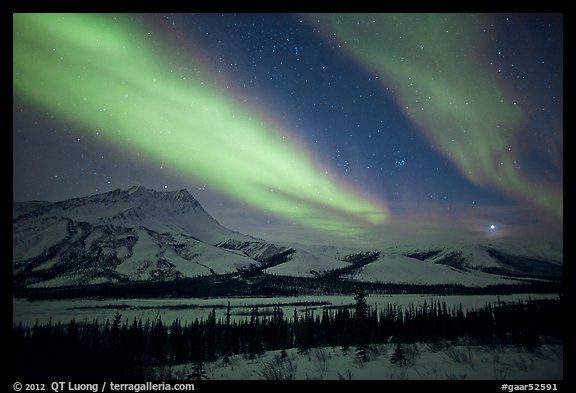
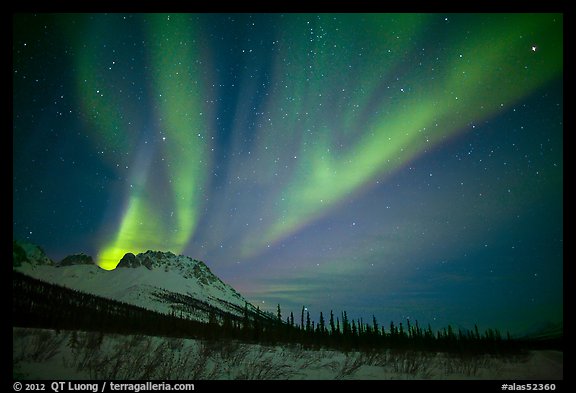
Why would someone want to drive the Dalton Highway ? It is the only road in the US (and one of only two in North America) which cross the Arctic Circle, providing access to unique landscapes of the far north. In winter, this is one of the best places in the continent for observing the northern lights. At these latitudes, the Aurora is high above you, illuminating the whole landscape, instead of being low on the horizon. In this post, I’ll detail my experience of driving the Dalton Highway in winter and provide some practical information.
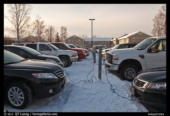
Fairbanks is the place to rent a vehicle. A local company specializes in renting cars equipped for the Dalton Highway, however their vehicles were too small for sleeping two, so we rented a full size SUV at the airport. Because the temperatures in Fairbanks are more frigid than in Anchorage (further south and situated on the ocean), all rental cars are better winterized. Amongst other things, they are equipped with a block-engine warmer. This prevents your engine from freezing solid when the temperatures dip below -20F. When parking overnight in the city you connect the warmer to an electrical plug using an extension cord. Such plugs are commonly found in hotel parking lots, near park meters on the street, or even on the Denali National Park visitor center parking lot.
However, when in the wilderness, there are no electric plugs, so to keep the engine – and yourself – from freezing overnight, your only solution is to start your engine every few hours and let it run some. To do that, you’d need to carry extra gas. We were disappointed that our SUV did not have any roof bars that we could use to strap gas containers. Fumes makes it unhealthy to carry gas in the car, so this limited our options for staying overnight. In order to prevent fuel from freezing, we used an additive called “Heet”, which apparently is quite popular since it was sold out at the Fairbanks Wall-Mart.
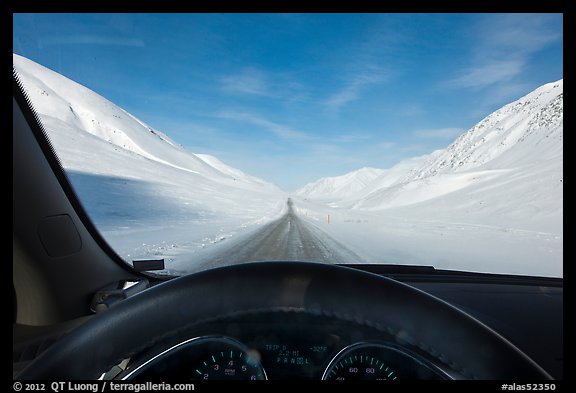
Having read that the road surface is rough enough that two rim-mounted spare tires are recommended, I found it surprisingly smooth. Possibly that was the benefit of driving on ice. On the flipside, ice made the road pretty slick and we could feel that we were often only a small margin from loosing control of the car. Because of that, we tried to avoid driving in the state of exhaustion which would have resulted from staying up all night for the aurora. Although our SUV was equipped with what would be considered winter tires in California, an Alaskan told us that those were summer tires by his standards.
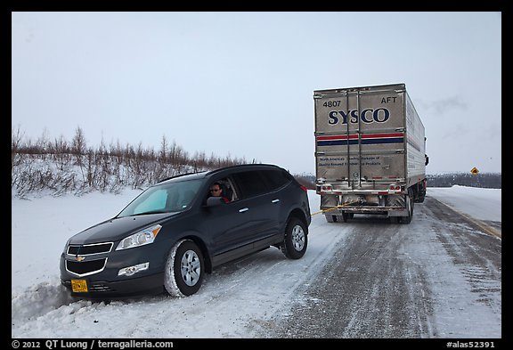
Cell phone coverage is not available along the Dalton Highway, but the SPOT satellite messenger worked. We also carried a CB radio to communicate with the truckers, but have not found it useful. Although it costs a bit for a heavy truck to stop and restart, in the far north people seem to look for each other. When we got stuck on a shoulder, the first truck who passed by rescued us. In normal conditions, there is enough truck traffic along the Dalton Highway that the wait wouldn’t be that long. However, severe weather or snow drifts could close the road for days in winter. We carried sleeping bags rated for -30F, as well as several days of non-perishable food, and two liquid-fuel stoves (butane/propane stove are useless in those temperatures). One of them quit working during the trip. Personal-size thermos allowed us to prepare hot food and drinks. Without them, they would get cold without a few minutes. Larger thermos bottles kept water from freezing. We bought in Fairbanks a spare battery (returned after the trip), shovel and tow rope – which turned out to be the most used emergency gear.
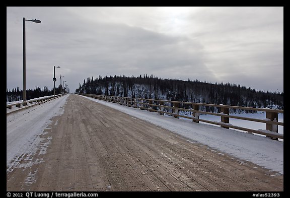
The Dalton Highway starts about 80 miles north of Fairbanks. In winter, the last gas station before Coldfoot is in Fox at junction of Eliott and Steese Highways just outside of Fairbanks. Until Coldfoot, the landscape is dominated by rolling hills of boreal forest. The first landmark is the long bridge across the 2000 mile-long Yukon River, which surprisingly features a wooden road surface (mile 56).
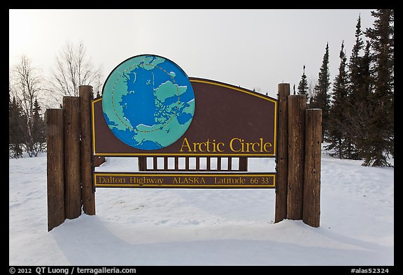 At mile 115, you cross the Arctic circle. This sign is found next to a pullout east of the highway.
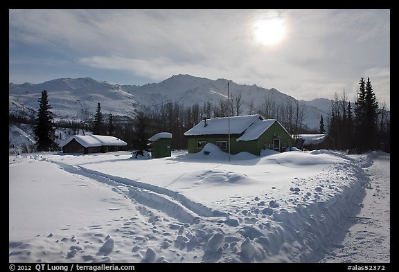
The only services between Fox and Deadhorse are found in Coldfoot (mile 175), which has a truck stop with gas, a restaurant, and a payphone which can be used with a calling card. Their motel, the Slate Creek Inn is expensive and uninviting. The better choices for accommodations are in the historic community of Wiseman (mile 188): Arctic Getaway Bed and Breakfast (we stayed there: friendly owners, cozy cabin, reasonable rates, satellite internet during breakfast) and Boreal Lodge.
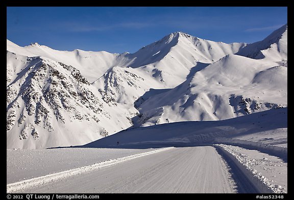
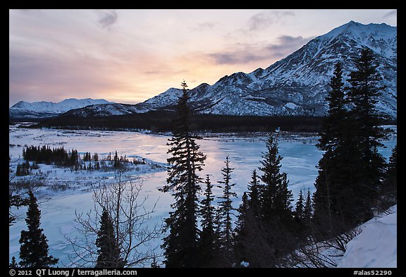
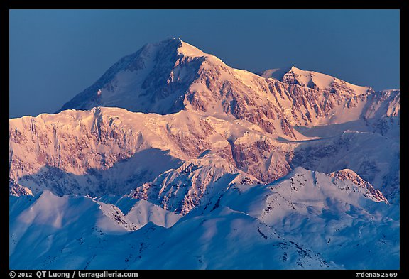
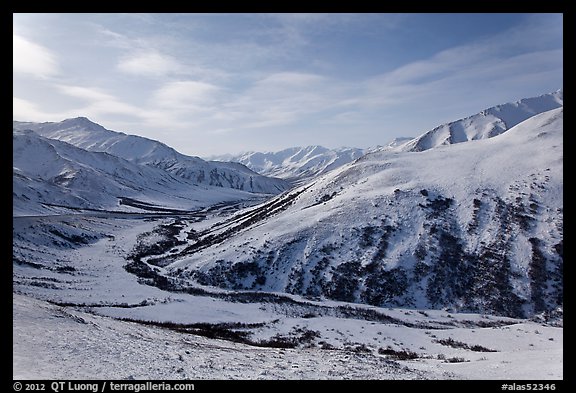
The most spectacular section is from Coldfoot to a few dozen miles north of Atigun Pass (mile 244), where the Dalton Highway crosses the Brooks Range. Since we could not carry enough gas to stay overnight north of Atigun Pass, we visited that section as a day out of Wiseman. We avoided driving the Atigun Pass at night as the pass is quite steep. It would have helped there to have better tires or chains. Further north, the landscape turns to flatter tundra terrain that we did not explore on that trip.
Thanks to good weather, our first drive up the Dalton Highway in winter turned out to be uneventful, however we came back with more respect for this harsh and inhospitable environment.
See more images of the Dalton Highway, images of Wiseman