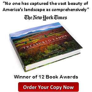
On the Outdoor Photographer Cover
3 Comments
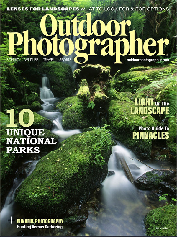
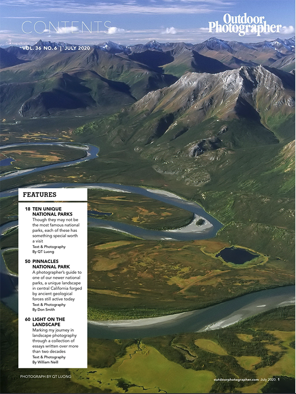
I am honored that the July 2020 issue of Outdoor Photographer includes not only as the opener my 32-page article “10 Unique National Parks”, but also features my image on the cover. Read my musings on cover images, as well as comments on the image.
Outdoor Photographer is the gold standard of magazines dedicated to nature and travel photography, and I’ve been a reader since the late 1990s, still remembering fondly the Galen Rowell columns from that time. Getting a cover shot is pretty hard. Over the last twenty years, I have licensed more than 5,000 images, yet I have only a few dozen covers to my credit. Not counting smaller contributions, that is my third full-length article in Outdoor Photographer (OP) or the fourth if you count a profile. The previous times I had submitted candidates for the cover without success. Is there something lacking with my photography? Not necessarily.
Covers and Type
Obviously, there is only one cover photo for a publication that may include a lot of interior photos. A cover image also has to work well with type. For instance, OP’s editor-in-chief Wes Pitts once wrote to me:
For covers, we’re looking for something that has space at the top for the OP logo and isn’t too busy on the left hand side where the main blurbs are typically placed. We also like them to be colorful and not too dark.
The flipside of those considerations is that cover photos are not necessarily the best photos. When paging through magazines, I often found stronger images inside. They would just not work well as a cover. I was pleased to see this observation corroborated by none other than Annie Leibowitz. In At Work, she reminisces not letting Cornell Capa use a nude pregnant portrait of Demi Moore for an exhibition at the International Center of Photography. She didn’t think that cover image for Vanity Fair was a “good photograph per se”, elaborating:
It’s a magazine cover … There are different criteria for magazine covers. They’re simple. The addition of type doesn’t destroy them. Sometimes they even need type.
Book covers are subject to fewer constraints than magazine covers. Type is often restricted to the title and author’s names, and can be chosen and placed to complement the photograph. Yet, during the design phase of Treasured Lands, of the hundreds of images in the book, we felt that only a handful were suitable for the cover. And then, there is no denying that the type diminishes the image. When in a recent conversation, I told Jack Dykinga that the cover image of Stone Canyons of the Colorado Plateau was my favorite of his, he replied that the publisher thought highly enough of the image to print the book cover without any type, a rarity. How many books in your library share that characteristic?
The observant reader may have noticed that one element of clutter that is not present in the OP cover is the barcode. That is the quarantine edition. Due to concerns with delivery and printing, OP has elected to temporarily switch over to electronic delivery. While it is personally disappointing to me that there is no printed copy of this particular issue, and maybe to readers that the issue will not be available on the newsstands, some trees were saved, and electrons being cheap, subscribers get to enjoy a 32-page page article with generous double-spreads, while printed issues have only 64 pages. The article can be read on OP’s website.
Trillium Falls
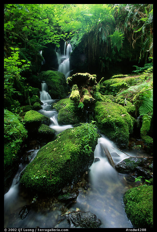
I was pleased that rather than an icon, OP chose an image of a lesser-known spot, Trillium Falls, in Redwood National and State Parks, itself in the bottom half of national parks per visitation. Nowadays, even lesser-known spots are abundantly documented, and you’ll find plenty of photos on the Internet. What you will not find, however, is my composition. Since the image was photographed almost 20 years ago, it was a bit of challenge to remember how I worked the scene, but surprisingly, looking at other photos helped jog memories. Most of them are made from the footbridge that provides a straightforward view of Trillium Falls. From that high and distant vantage point, the perspective must have appeared static, so I tried to do more, which meant walking down to place the tripod right into the creek. Besides leading lines and sense of height, the close foreground helps create depth in the photograph via a strong perspective with the stream shrinking from the width of the image in the foreground to a small ribbon in the background. In other photos, the fallen log in the streambed is quite distracting, but my viewpoint transforms it into an intriguing shape. When faced with an already pleasing subject, ask yourself what more can you do!
Hi QT,
Congratulations on being featured on the cover. I am an online member of this journal, but am unable to find the ’10 unique NP’ article online. Is it a print only article?
Thanks.
-Ramen
If you are a subscriber, you should have received an email with a link to read the July issue. I am unfamiliar with online memberships, so I don’t know when they will make it available there.
OP has now published the article on their website: https://www.outdoorphotographer.com/on-location/travel/10-unique-national-parks/